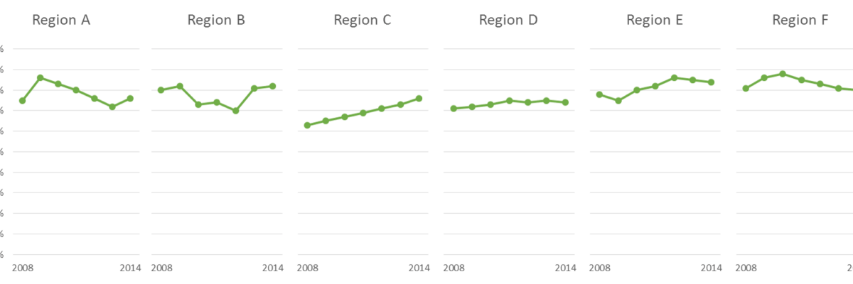
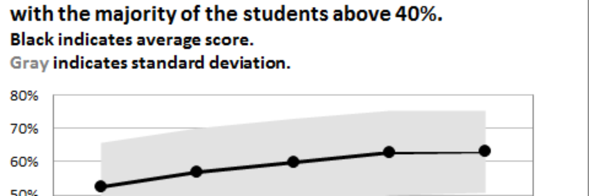
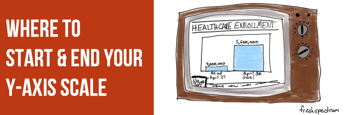
The Y-Axis Debate is one of the most hotly discussed among cool data nerds, like me and my friends. Going out for drinks with me is either a blast or a bore, depending on your nerd level. So let me clarify the parameters of the debate, including where nerds mainly…
graphs
508 Compliance & Data Visualization
508 Compliance became A Thing to Deal With in 2000 and 15 years later people still have questions about how it works. I get questions about how to be 508 compliant in nearly every workshop. 508 compliance essentially means that people who produce things on the web for any federal…
Make a Slopegraph in Excel
Slopegraphs are a newer graph type with powerhouse capabilities. They rely on Excel’s line graphing feature but they don’t necessarily have to show change over time. Slopegraphs play into our ability to judge slope fairly well. For this reason, they are perfect for highlighting the story of how just one…
Directly Labeling in Excel
It’s time to ditch the legend. You know – the legend, the key, the thing to the right of the graph that tells the reader what each piece of your graph means. We don’t need it. Legends are actually hard for many people to work with because they put a…
When It’s OK to NOT Start Your Axis at Zero
UPDATE: This post was written in 2014 and my thinking has evolved since then. Here’s the newest post on how to handle all of your axes. You can also join us at the Evergreen Data Visualization Academy where we banter back and forth about these ideas and apply…
Declutter Dataviz with Small Multiples
Are you making graphs that look like this crap? I won’t make you raise your hand. But let’s just agree not to do this, yeah? It’s SUPER hard to compare the tops of a bunch of bars. Two side by side bars per region ain’t so bad but beyond…
How to Rock the Text in your Data Visualization
You only get a little bit of text in your graph. Here’s how to make sure you get the most mileage out of it.
Adding Standard Deviation to a Dataviz
Do you need to communicate your standard deviations to your audience? No, I mean, really DO YOU? Think hard about that because chances are your audience doesn’t give a crap. They want to know you calculated your standard deviations. They want to know you were meticulous in your number crunching.
Who Can Do Dataviz (or How a Field Evolves)
Wow, the action in the dataviz/tech world this past week has been awesome! A female programmer at a Python (that’s a programming language also used for dataviz) conference was fired after tweeting about the sexist jokes she was hearing from a largely white young male crowd, and Tableau’s…
Presenting Graphs with the Slow Reveal
Over here I talked about how important it is that we gradually introduce components of complex graphics – one-at-a-time – so as not to overwhelm the visual field and working memory of our audience members. We don’t want to slam our content in their faces all at…