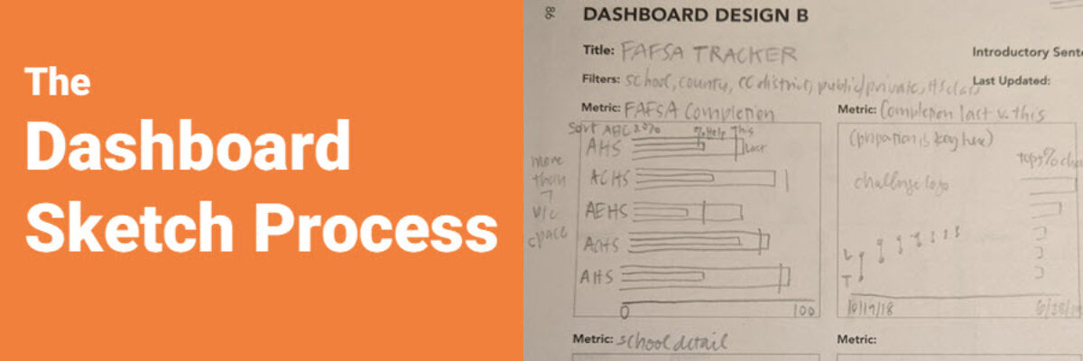
“I vote no.” This short answer speeds up the dashboard development process significantly. And I developed the question my client voted on in roughly 3 minutes, by showing her a quick sketch of some possible graph options. My client is in charge of a dashboard that tracks how high school…
graphs
Announcing The Chart Starter Series
So, hey, heads up: The Chart Starter Series is probably not for you. If you know my work well, you are probably already a dataviz whiz. The Chart Starter Series is for your colleague. You know the one. The one who keeps asking you to make their graphs. Tell…
Intentionally Order Your Data
Listen, no one cares about the order we listed the response options on the survey. But most graphs, especially those automatically generated from survey software, showcase the data in that order. And that isn’t useful for anyone trying to interpret the data. Instead, place the bars in order from…
We Need More Research on Data Visualization
Stephanie’s Note: Dr. Sena Sanjines just wrapped up her dissertation, part of which measured whether my Data Visualization Checklist is worth its salt. Here are her findings. My name is Sena Sanjines and I’m an evaluator in Hawai‘i slightly obsessed with figuring out what makes people use, or not use,…
Ways to Visualize Cost-Benefit
Cost-benefit analysis a way of saying “Yes, this program has great impacts… but it’s super expensive.” You’ll often hear the results of cost-benefit analysis in the news, phrased as “For every dollar we spend on this program, we save $$$.” Clients at the University of Alaska, Anchorage (I HAVE THE…
Use Proximity for Better Data Storytelling
Recent clients, Planned Parenthood Federation of America, faced a design problem so common they didn’t even know it was a problem. They were working on communicating some data from a program that aims to educate on healthy sexuality and reproductive health. They surveyed participants at the start and end of…
Makeover: Health Data Edition
By far, my favorite emails to receive are from clients bragging about the beauty and impact of their work after our workshop. I just got one of these the other day from Becca Scranton at Arizona Department of Health Services. After thanking me for the workshop, she wrote, “Thanks to…
Spectrum Displays
When presenting qualitative data, choose visuals that are broad enough to display the full set of data but are also visualized in a way that allows viewers to pull stories from the data. This is a hard balance to strike, and a spectrum display can do so very well. A…
Don’t Visualize
Here’s the deal: People primarily look at pictures. That’s why we visualize data – to get people to look at it. But if we waste the short amount of attention people are willing to extend to us by showing them visuals that don’t convey…
Adding Confidence Intervals to a Dot Plot
Evergreen Data Visualization Academy member Dana McGuire recently wrote me to ask about her dot plot. She said, “Would there be a way to show the bar or confidence interval somewhere? I have gotten positive feedback on the look of the graph overall, but it is a scientific conference…