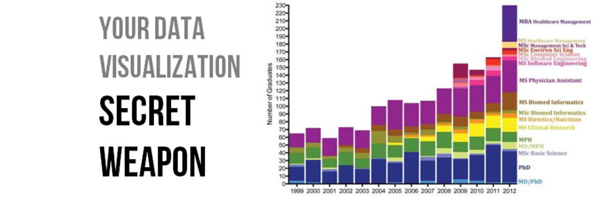
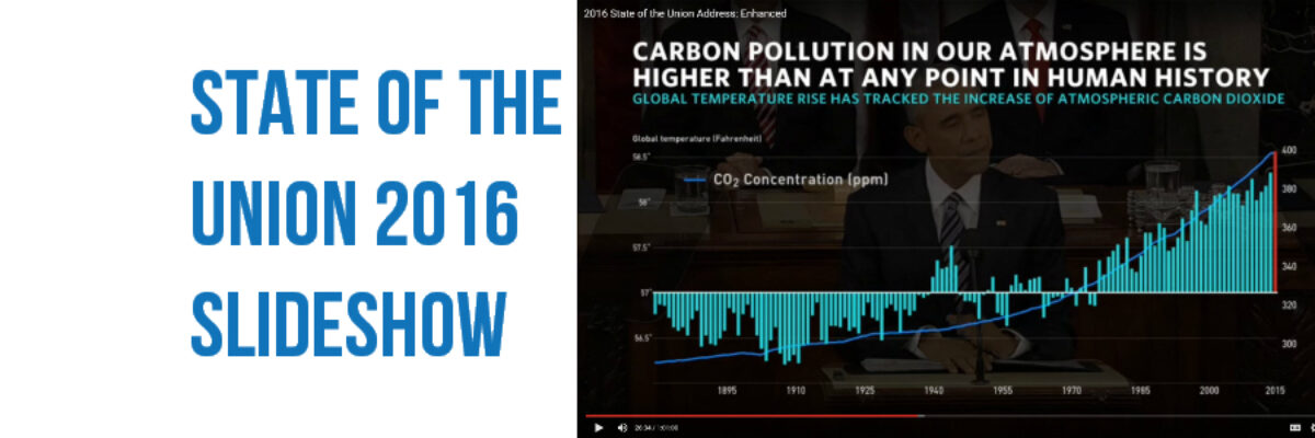
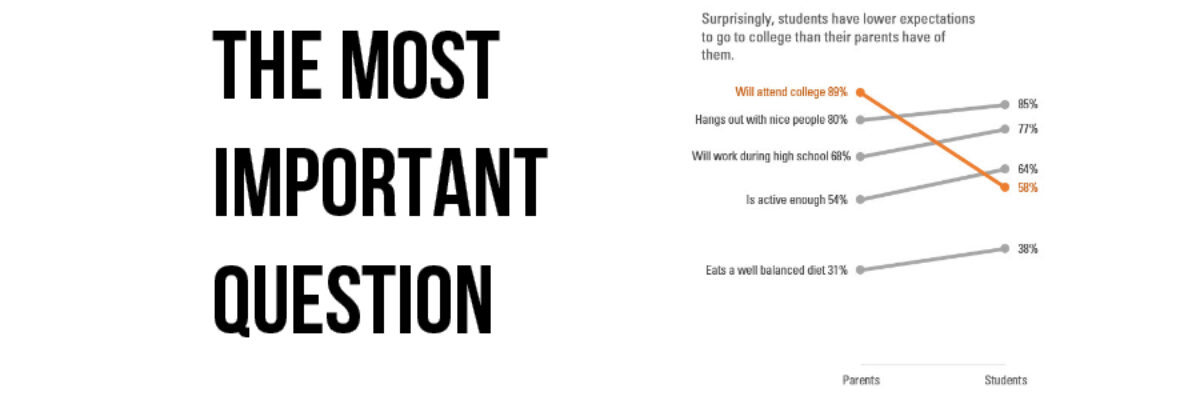
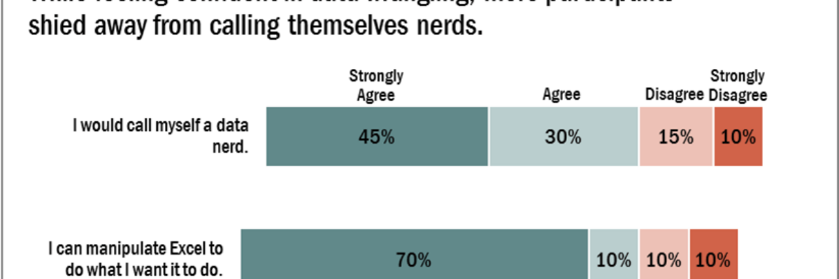
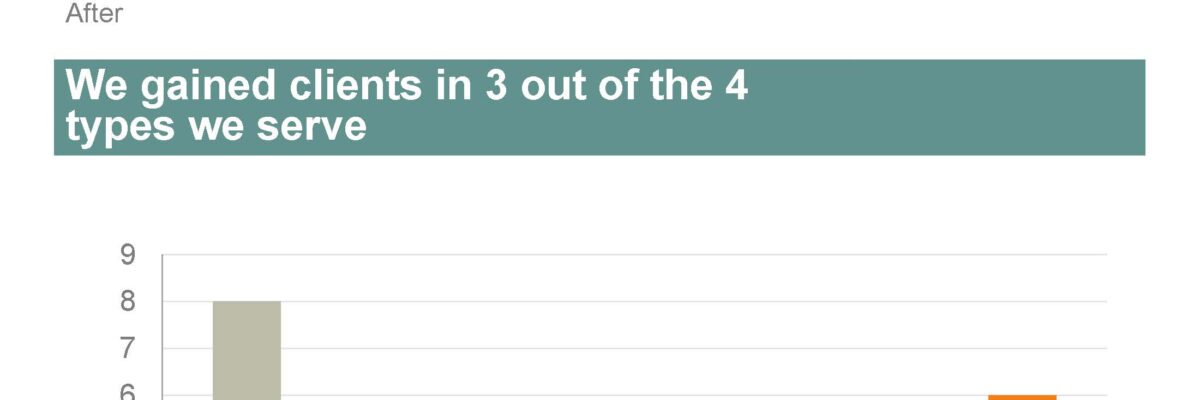
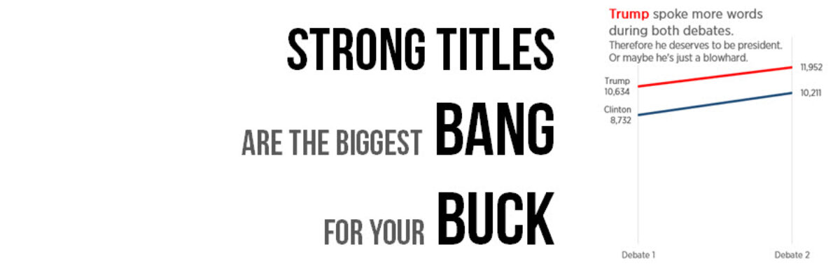
If you do nothing else to improve a weak visualization, you’ll still seriously improve its interpretability by giving it an awesome title. Generally we use weak titles that don’t really tell us the point of the visualization: I think this is because we make our graphs in Excel,…
graph
Your Data Visualization Secret Weapon
You want to know the trick to fixing most scary data visualizations? The answer to horrifying stuff like this? What does one do when the graph gives you the shivers? http://viz.wtf/post/142740495532/spaghetti-sans-meatball The answer is always going to be:…
Evergreen Data Visualization Academy
The Data Visualization Academy is only open for enrollment twice a year. Come get select access to my best data visualization tutorials and advice. Four years ago today, I took the leap from salaried employee to independent consultant. Since then, I’ve worked with scores of organizations to help them use…
Exporting Graphs from Excel
I love when readers send me questions that I can turn into blog posts. The question: We often make our graphs in Excel and pop them in to reports or slides, but the transfer usually causes the formatting to get all wonky. How can we get print-quality graphics out of…
My New Favorite Graph Type: Overlapping Bars
Why have I fallen in love with this graph type? I think its because its such a great way to visualize the comparison between two things, when one is inherently a part of the other. In recent client projects, I’ve used these to show actual v. budgeted amounts. Or individual…
Guest Post: Best Practices for Control, Run, and Pareto Charts
Nicole contacted me with an email subject line: Thank you for the Data Viz Checklist! and she said she’d been using the checklist to overhaul some of her organization’s data visualizations. I’ve invited her here to showcase her before and afters. I’m Nicole Huggett and I recently transitioned…
State of the Union 2016 Slideshow
Dudes, the State of the Union is my Superbowl. I look forward to this event like some people anticipate the Oscars. This is my deal. Why? Because the enhanced version of the SOTU features a data-based slideshow, a perfect study in how graphics can help underscore a point. And, as…
The Most Important Question in Data Visualization
What’s your point? Seriously, that’s the most important question to ask when creating a data visualization. And its the first thing I ask a client who sends me data for redesign. What’s your point? The answers drive nearly everything about visualizing that data. Here’s how that conversation often goes: Client:…
How to Make a Diverging Stacked Bar Chart in Excel
Last week my friend Ann Emery posted a dataviz challenge on something I’d been wanting to figure out for a long time: how to make a diverging stacked bar chart in Excel (I’d also heard of them as sliding bar charts, but getting our dataviz terminology on the same…
Before & After Slides: Stay on the Side of Simplicity
My friend, Kurt Wilson, and I just wrapped up a contract to revise a set of slides – and the graphs within – for a big international client I can’t name. Here I’ll walk through one of the original slides and our revision of it. Keep in mind that these…