This graph type goes by a lot of names: isotype chart, pictograph, or pictogram. Whichever way, it allows us to use symbols rather than stick with the squares that make up the waffle chart. And it is especially well suited to representing small counts of things that can otherwise be…
graph
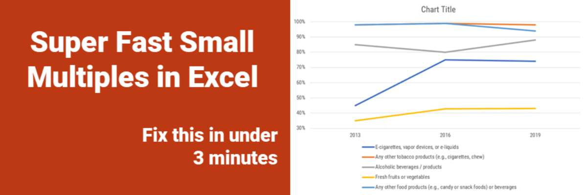
Super Fast Small Multiple Graphs in Excel
Every time I show this trick to even veteran Excel ninjas, their heads explode. So you have probably heard me preach the gospel of small multiples once or twice before. Breaking a clutter-y graph into a lot of smaller graphs that show one piece of data at…
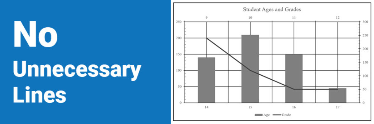
No Unnecessary Lines
The Lines section of the Data Visualization Checklist helps us enhance reader interpretability by handling a lot of the junk, or what Edward Tufte called the “noise” in the graph. I’m referring to all of the parts of the graph that don’t actually display data or assist reader cognition. Create more readability by deleting unnecessary lines. The default…
Graph Text Should Be Horizontal
In languages based on the Latin alphabet, we read horizontally, from left to right. Reading on a diagonal produces cramped necks. Reading vertical text is just not going to happen. So, as much as possible, the text in our graphs should be horizontal. Let’s walk through a demo. I was…
Announcing The Interactive Data Visualization Checklist
If you’ve been anywhere near the world of graph making in the past several years, at some point someone probably sent you the Data Visualization Checklist, developed first in 2014 by me and Ann Emery. We built the checklist based on the best available research I was seeing via…
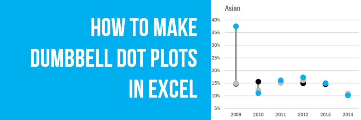
How to Make Dumbbell Dot Plots in Excel
Data visualization is so cool because it helps you see things that would otherwise take a looooooot of effort. Here’s an example. Some very sweet clients in Maricopa County, Arizona (that’s the greater Phoenix area, friends) had a habit of presenting super important data in the most hard to digest…
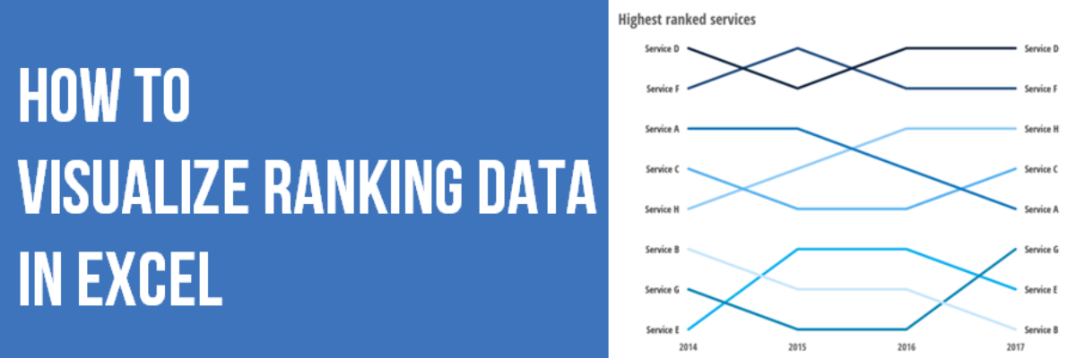
How to Show Ranking Data in Excel
Danielle, a member of my Evergreen Data Visualization Academy, submitted a question to our monthly Office Hours webinar about how to show ranking data. She sent this survey question: There are eight categories below. Rank each item to continue to the next page. Rank the following services in order…
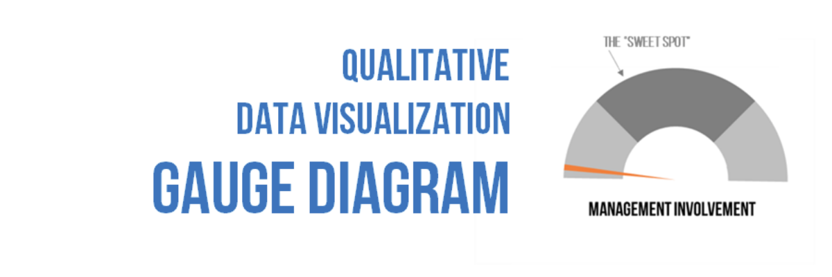
Qualitative Data Visualization: The Gauge Diagram
When we debuted our Qualitative Chart Chooser, we promised to dive into detail on specific visualizations, so let’s kick it off by discussing how and when to use one of the most derided charts of all: the gauge diagram. I know, I know… I am sure you are…
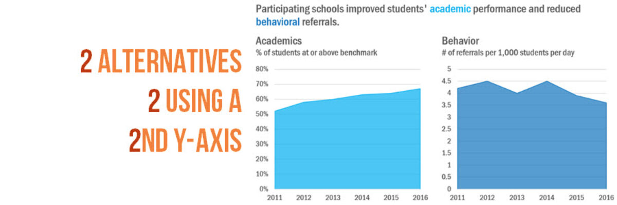
Two Alternatives to Using a Second Y-Axis
Almost as often as I see a pie chart with a hundred tiny slivers, I see line graphs using two y-axes. And it is just as bad. Graphs like this appear in every industry, everywhere I consult all around the globe. Using two y-axes is not a great idea…
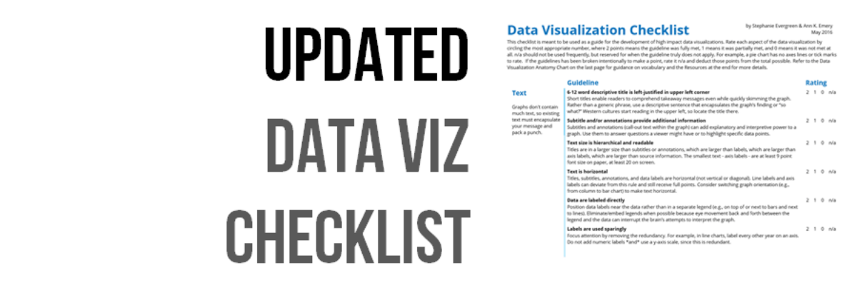
The Data Visualization Checklist
HEY THERE: This checklist is now a website where you can upload your image and we will walk you through each checkpoint, helping you rate yourself. This post has been a long time coming. We knew that people had a thirst for better…

