Alternatives to a Log Scale

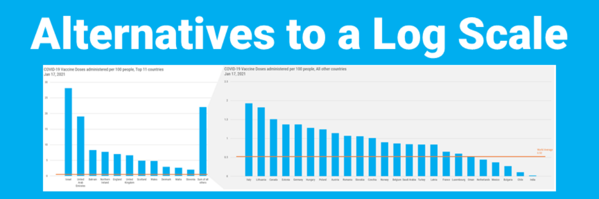
Over in our private Academy Slack group, one of our members asked a solid, totally not snarky question about log scales. They’ve been common in visuals about COVID and there’s a fair question out there about how appropriate those are in graphs aimed at public consumption.

Read More

Title Charts Like A Journalist

When you spend the bulk of young adulthood in research-focused academic institutions, like I did, you are steeped in a culture that tells you, explicitly or implicitly, that you can’t ever really make a claim. Taking a position on something can be seen as biased. Claiming an insight can be…

Read More

My Cringe-Worthy Choices

The theme of this blog post can be summed up with one emoji: >.< If you aren’t emoji-fluent, that’s the facepalm, a gesture made when you are internally dying of embarrassment over someone’s incompetence. In this case, that someone is me. I have failed to recognize when I was using…

Read More

Proportion Plots

Proportion plots help us compare the share of a population between two metrics. It uses length on the left and right side of the chart and connects the lengths by a band in the middle that swoops a lot if there is disproportionality and stays pretty even if the proportions…

Read More

Communicating Data is About Handling Egos and Emotions

Behind every furrowed brow and annoying question about your slide is someone’s ego getting dinged. People don’t like their egos dinged. This tiny bit of emotional intelligence will give you massive insight into how to handle tough data communication scenarios we all find ourselves in at one point or…

Read More

So COVID Interrupted Your Data Collection…

Kristi is a researcher in the Truman School of Public Policy and a rockstar member of my Data Visualization Academy. She was working on a study of an after school sexual health program when COVID happened, knocking her data collection strategy to its knees and leaving her without much…

Read More

Data Viz Rockstars Change Conversations

Audrey Juhasz has been in The Evergreen Data Certification Program for about 4 months. In that time, she has learned some super do-able and highly effective lessons that have totally changed the way she and her team are able to talk to each other. This data viz rockstar is changing…

Read More

Go Beyond “The Data Varied”

The quickest way to tell a story with your data is to use the title space to literally tell the story. Identify the insights you see in the data and write them out as a full sentence, framing the take-away ideas, sharing with your viewers what you know. This step,…

Read More

Asked and Answered: Visualizing Demographic Data

This blog post is part of a series called Asked and Answered, about writing great survey questions and visualizing the results with high impact graphs. Dr. Sheila B. Robinson is authoring the Asked series, on writing great questions. Dr. Stephanie Evergreen is authoring the Answered series, on data visualization.

Read More