When it comes to your graphs, you need condensed fonts.
Fonts for Graphs
Read More
When it comes to your graphs, you need condensed fonts.
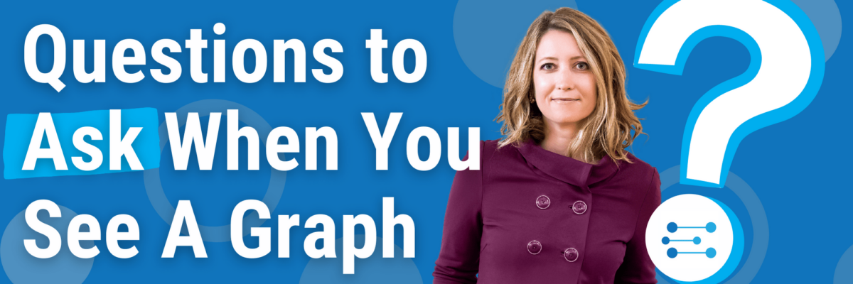
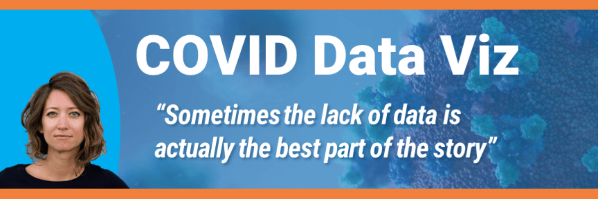
Does the story told in the headline match the data used to bolster it? It’s really common for people to read a tweet and take it as the truth. Especially when it comes from official accounts like the White House. And while the Trump White House was notorious for it’s…
Clutter shows up as all the unnecessary little things in your graph – anything that isn’t contributing to engagement with the data. You might think the little stuff can be overlooked but when you accumulate multiple graphs and their clutter into a dashboard, it feels too busy and overwhelming and…
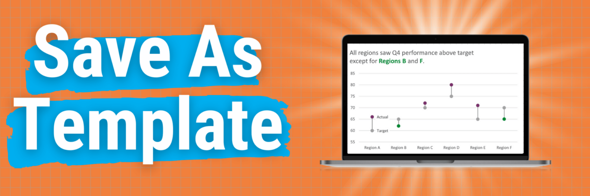
This is my A+ #1 100% best time-saving hack for making graphs in Excel. When you go through the process of making that one graph that’s totally perfect, you can save it as a template so it becomes, essentially, your new default graph. Here’s how. Right-click somewhere in…
I wish that every awesome data viz presentation ended with each coworker blasting a confetti popper over your head. The reality is that when your data viz sucks, you know it loud and clear. When it sings, you often can’t tell. This post is not going to provide an anatomy…
You might have landed here because you thought this was going to be a post full of snarky commentary on mediocre graphs. It isn’t. In fact, I’m not going to include a single data viz. Because what makes a data viz suck or sing isn’t just about its outward…
When people aren’t 100% sure you are talking to them, they ignore you. (Heck, when I’m jogging and the dude in the car is clearly talking to me, I still ignore him.) You want your audience to immediately see themselves in your data and how that data story is relevant…
Star Wars or Star Trek? I totally wasn’t expecting this MD to pitch me that question on live TV. Good thing I have a teenage son who has spent years preparing me for the right answer. The docs on the Medical News Network brought me on to talk…
Here’s the thing: Your graph isn’t ever just going to chill out in your Excel file or Tableau worksheet. It’s going to live a life elsewhere, like in a dashboard, a slide, or a webpage. So when we make our graphs, we have to think about their future home environment.
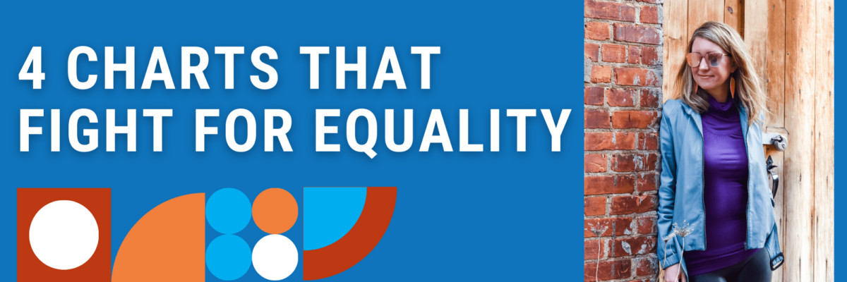
While ANY chart can fight for equality, if you plug the right data into it, these four in particular make the story jump off the screen.