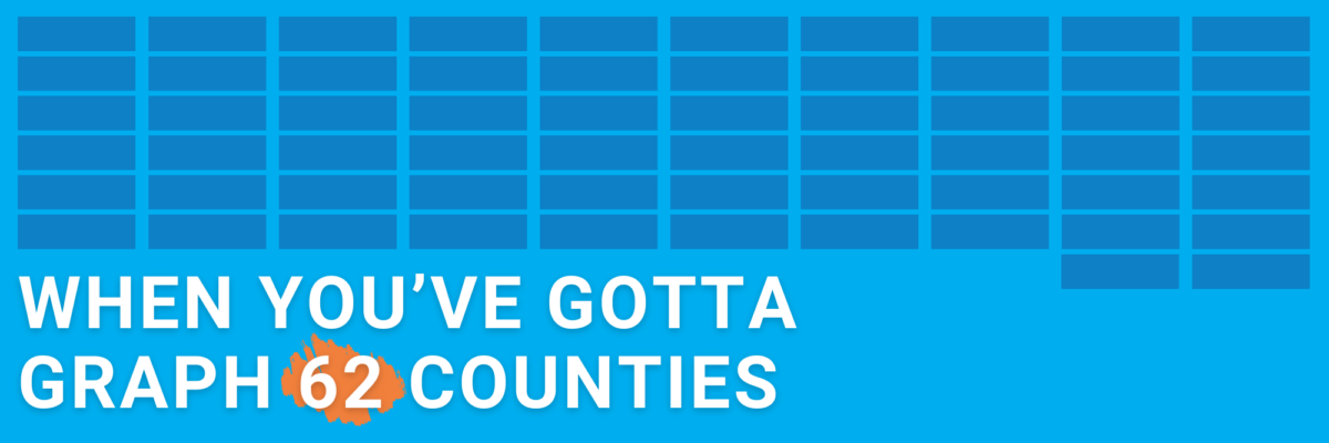
or countries or students or departments or… you just have a lot of categories to squeeze into your chart. How to proceed without creating a hot mess?
When You’ve Gotta Graph 62 Counties
Read More
or countries or students or departments or… you just have a lot of categories to squeeze into your chart. How to proceed without creating a hot mess?
People interpret symbols as pictures, not words. That makes symbols, like $, more instantly recognized and understood than words, like dollar.
I gave two AI tools – ChatGPT and Gemini – two simple datasets and asked them to generate insightful titles.
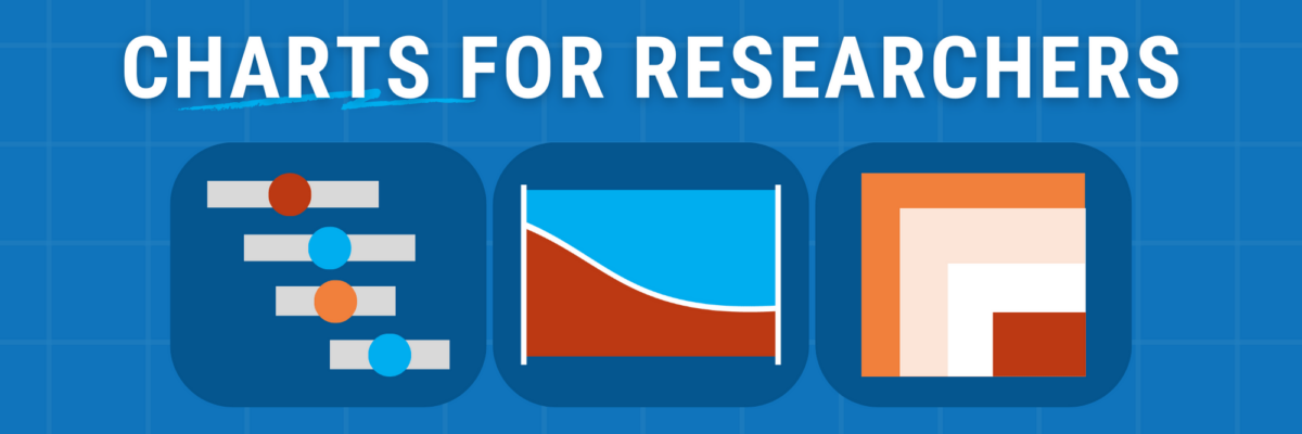
Announcing my new chart chooser with 22 qualitative data visualization options.
If you’ve passed the two criteria for communicating statistical significance, here are four ideas for ways to indicate it in your data visualizations.
Use your chart title to communicate a takeaway idea. What if your takeaway idea is complex or multi-part? Employ three dots.
If you want your data to get consumed by more people, you have to design it for viewing on social media platforms where they consume visuals.
Henceforth I’m calling for a ban on pie charts in annual reports. The ban will be lifted when a company is able to credit a data viz designer (even an internal one) as a contributor to the report.
So what do you do if your audience is asking you to show all the data? Here are a few solid ideas plus one key question to ask.
Of course your chart arsenal includes your trusty bars & scatters. Add these 3 to your mix to gain clarity, get more eyeballs, be better understood.