You only get a little bit of text in your graph. Here’s how to make sure you get the most mileage out of it.
How to Rock the Text in your Data Visualization
Read More
You only get a little bit of text in your graph. Here’s how to make sure you get the most mileage out of it.
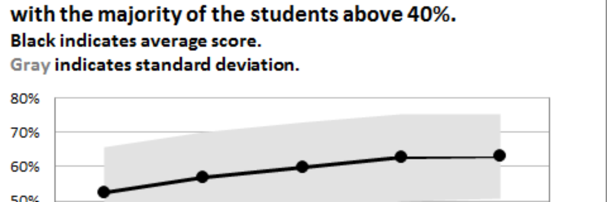
Do you need to communicate your standard deviations to your audience? No, I mean, really DO YOU? Think hard about that because chances are your audience doesn’t give a crap. They want to know you calculated your standard deviations. They want to know you were meticulous in your number crunching.
Last week my friend Ann Emery posted a dataviz challenge on something I’d been wanting to figure out for a long time: how to make a diverging stacked bar chart in Excel (I’d also heard of them as sliding bar charts, but getting our dataviz terminology on the same…
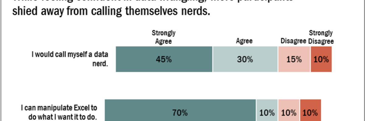
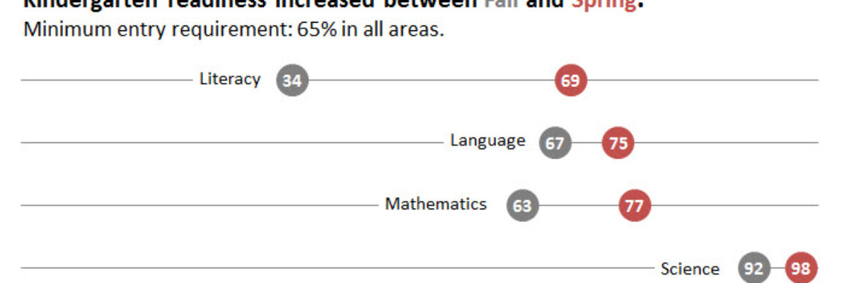
We don’t just report the facts, ma’am. We use a set of values to make judgments about the data, like which of these results is good or needs improvement, etc. We set benchmarks and cut points so our clients can understand when action needs to be taken and where. Yet…
A while ago I was at a Naomi Robbins’ workshop and she was pretty emphatic that dot plots are the better method of visualization, as compared to bar charts. The reason goes back to Cleveland’s early experiments on visual perception, which found that humans most accurately interpret locations on line,…
Wow, the action in the dataviz/tech world this past week has been awesome! A female programmer at a Python (that’s a programming language also used for dataviz) conference was fired after tweeting about the sexist jokes she was hearing from a largely white young male crowd, and Tableau’s…
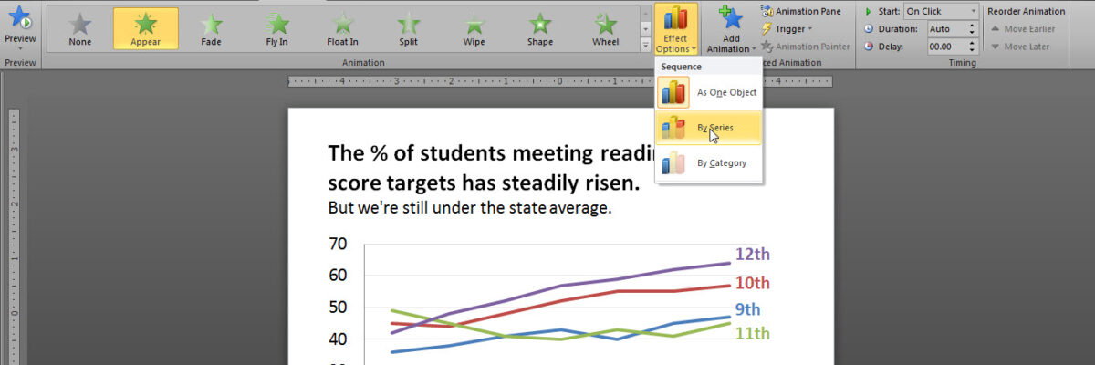
Over here I talked about how important it is that we gradually introduce components of complex graphics – one-at-a-time – so as not to overwhelm the visual field and working memory of our audience members. We don’t want to slam our content in their faces all at…
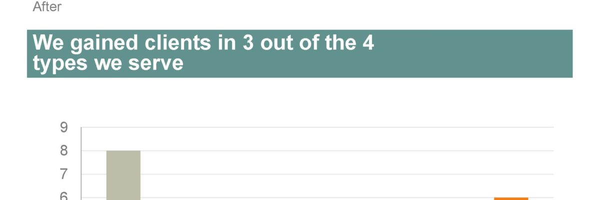
My friend, Kurt Wilson, and I just wrapped up a contract to revise a set of slides – and the graphs within – for a big international client I can’t name. Here I’ll walk through one of the original slides and our revision of it. Keep in mind that these…
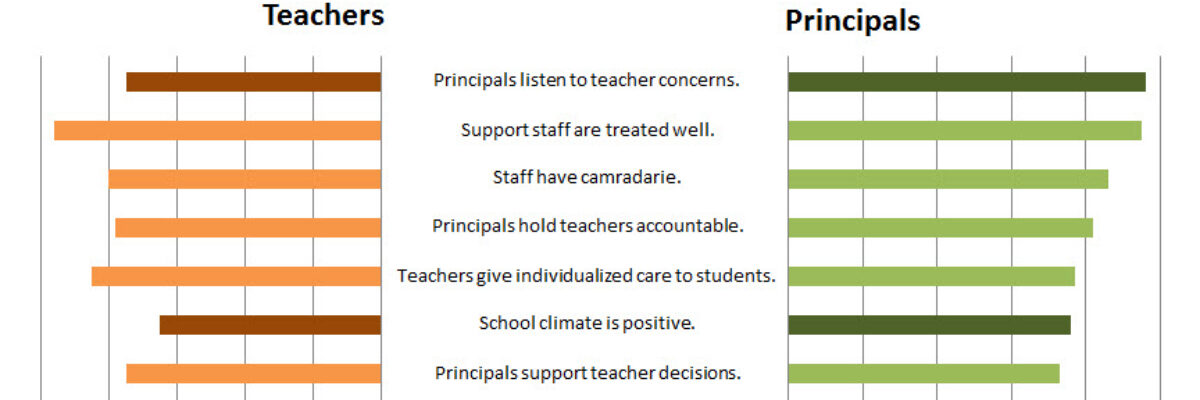
Let’s say we’re interested in comparing how two groups – oh, teachers and principals – responded to a survey. One way to visually display that comparison would be a bar graph, where each question had two bars, one for teachers and one for principals. It’s helpful in some ways, but…
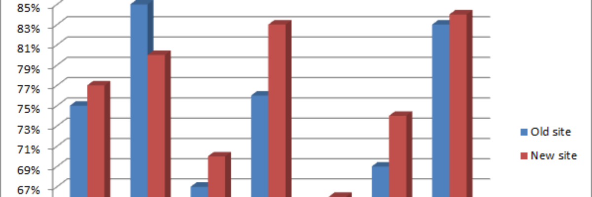
When giving advice about chart styles, one of my friends likes to say “save 3D for the movies.” She’s right – research shows that 3D charts actually slow reader comprehension. I’ve long advocated for the use of ChartTamer as a friendly way to restrict data visualization to that which will…