How a Dashboard Changes the Conversation

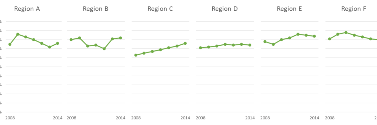
Presenting data effectively changes the kinds of conversations that can happen inside organizations. Better presentations shape an improved culture of decision-making. Let me tell you about a recent example of this. Late 2012 I got a call from an evaluation officer who was working at the Walton Family…

Read More

Customizing Colors in Excel

Few things scream “I didn’t try very hard” more than using the Excel default color schemes. Good news is that changing them up isn’t really very hard at all. First, decide what other colors you would like. Maybe pick something from your organizational brand. I used ColorBrewer to come…

Read More

Directly Labeling in Excel

It’s time to ditch the legend. You know – the legend, the key, the thing to the right of the graph that tells the reader what each piece of your graph means. We don’t need it. Legends are actually hard for many people to work with because they put a…

Read More

Visualizing Likert-type Data: Try Aggregated Stacked Bars

Man, do researchers love Likert-type data! You know what I mean – the kind of survey response options that range from Strongly Agree to Strongly Disagree (or vice versa, depending on your allegiances). Probably the most common way of visualizing that data is via a stacked bar chart, just like…

Read More

When It’s OK to NOT Start Your Axis at Zero

UPDATE: This post was written in 2014 and my thinking has evolved since then. Here’s the newest post on how to handle all of your axes. You can also join us at the Evergreen Data Visualization Academy where we banter back and forth about these ideas and apply…

Read More

Declutter Dataviz with Small Multiples

Are you making graphs that look like this crap? I won’t make you raise your hand. But let’s just agree not to do this, yeah? It’s SUPER hard to compare the tops of a bunch of bars. Two side by side bars per region ain’t so bad but beyond…

Read More

The Easiest Way to Make Bullet Charts in Excel

There are lots of ways to make bullet charts, some easier than others, some better suited for specific visualization contexts. Hell, there are plug-ins you can purchase that make it a snap. Except when my plug-in broke and I had to remake about a…

Read More

Adding a Benchmark Line to a Graph

This simple line packs so much power. Adding a benchmark line to a graph gives loads of context for the viewer. Here’s how to make one right inside Excel. It’s so easy you might pass out. My data table looks like this: I have my data and I have the benchmark…

Read More

Labels are Used Sparingly

This post is about how to avoid inducing claustrophobia in your data visualizations. Too much text on a graph clutters it up, making readers feel suffocated. So let’s address the checklist item Labels are used sparingly. Sometimes, too much text isn’t the issue. Take…

Read More