Make A Lollipop Graph in Excel

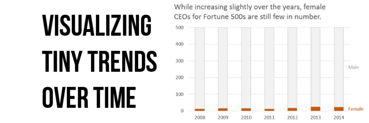
The simplest way to show many types of data is through a column or bar chart, ordered greatest to least. These will work just fine, most of the time. When do they fall short? Well, when the values are all high, such as in the 80-90% range (out of 100%). Then…

Read More

State of the Union 2016 Slideshow

Dudes, the State of the Union is my Superbowl. I look forward to this event like some people anticipate the Oscars. This is my deal. Why? Because the enhanced version of the SOTU features a data-based slideshow, a perfect study in how graphics can help underscore a point. And, as…

Read More

No More Red Yellow Green

Listen we absolutely must stop using the stoplight color system in our data visualizations and dashboards. You know what I’m talking about. It’s stuff like this: and this It’s the worst thing ever. For several reasons. Here’s they are: The red-yellow-green color coding system isn’t…

Read More

508 Compliance & Data Visualization

508 Compliance became A Thing to Deal With in 2000 and 15 years later people still have questions about how it works. I get questions about how to be 508 compliant in nearly every workshop. 508 compliance essentially means that people who produce things on the web for any federal…

Read More

Three Ways to Show Down is Good

Humans in the western culture tend to see things that trend upward as positive and lines that trend downward as bad. But what if bad is good? And not like my college boyfriend. But in the sense that a decrease is a good thing. Let’s use the example of weight…

Read More

Make a Slopegraph in Excel

Slopegraphs are a newer graph type with powerhouse capabilities. They rely on Excel’s line graphing feature but they don’t necessarily have to show change over time. Slopegraphs play into our ability to judge slope fairly well. For this reason, they are perfect for highlighting the story of how just one…

Read More

President Obama’s Data Visualization

I realize it’s completely taboo to write about current events six months after they’ve happen but I DON’T CARE. One of my favorite events of the year is watching the enhanced version of the State of the Union. Not the regular view – the enhanced view. One side of the…

Read More

When I Don’t Mind Radar Graphs

Most of the time, I think radar graph are deployed wrong. They are designed to show percentages along several categories – like a bar graph could – but the axis are distributed around a central point, such that the percentages link together and create a shape. Choosing a radar graph,…

Read More

Visualizing Tiny Trends Over Time

I say: Trend over time? You say: Line graph! I know, that’s how it goes, right? We are so used to seeing trends over time visualized as line graphs that even my 3rd grader can interpret them with ease. But sometimes it helps to have other options that better fit your…

Read More

The Most Important Question in Data Visualization

What’s your point? Seriously, that’s the most important question to ask when creating a data visualization. And its the first thing I ask a client who sends me data for redesign. What’s your point? The answers drive nearly everything about visualizing that data. Here’s how that conversation often goes: Client:…

Read More