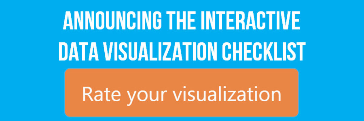
Announcing The Interactive Data Visualization Checklist

If you’ve been anywhere near the world of graph making in the past several years, at some point someone probably sent you the Data Visualization Checklist, developed first in 2014 by me and Ann Emery. We built the checklist based on the best available research I was seeing via…

Read More

How to Make Dumbbell Dot Plots in Excel

Data visualization is so cool because it helps you see things that would otherwise take a looooooot of effort. Here’s an example. Some very sweet clients in Maricopa County, Arizona (that’s the greater Phoenix area, friends) had a habit of presenting super important data in the most hard to digest…

Read More

Don’t Visualize

Here’s the deal: People primarily look at pictures. That’s why we visualize data – to get people to look at it. But if we waste the short amount of attention people are willing to extend to us by showing them visuals that don’t convey…

Read More

Evergreen Collections

The end of August marks an important moment for me because it is when I quit my salaried job to work on data visualization and design full time. 5 years! It remains one of my best decisions. So, I like to celebrate it with you. Last year, I launched the Evergreen Data…

Read More

Visualizing Not Applicable or Missing Data

Yes, I know the jig is up. All of my examples in books and workshops are pretty tidy, as if every response options was addressed by every single respondent. The truth is that life and data collection are messy. How can we show that different questions have different sample…

Read More

The 1-3-25 Reporting Model

It’s time to talk about how a highly visual, well-formatted recommendations page doesn’t have much impact when it is buried on page 104. This is how we make reporting less cumbersome, particularly in a digital reporting era. Of course your reporting will probably include a slidedeck. I mean, you could…

Read More

Adding Confidence Intervals to a Dot Plot

Evergreen Data Visualization Academy member Dana McGuire recently wrote me to ask about her dot plot. She said, “Would there be a way to show the bar or confidence interval somewhere? I have gotten positive feedback on the look of the graph overall, but it is a scientific conference…

Read More

How to Show Ranking Data in Excel

Danielle, a member of my Evergreen Data Visualization Academy, submitted a question to our monthly Office Hours webinar about how to show ranking data. She sent this survey question: There are eight categories below.  Rank each item to continue to the next page.  Rank the following services in order…

Read More

Where to Start and End Your Y-Axis Scale

The Y-Axis Debate is one of the most hotly discussed among cool data nerds, like me and my friends. Going out for drinks with me is either a blast or a bore, depending on your nerd level. So let me clarify the parameters of the debate, including where nerds mainly…

Read More

One Free Pie Chart

If I could, I’d ban pie charts. Not because they are inherently bad, but because most people don’t know the pie chart’s tiny range of acceptability. Here it is: Pie charts are ok if you don’t need the numbers on the wedges to get the story. That usually means you’ll…

Read More