Data visualization workshops are an investment into your growth as a leader in your field. They should, if they are good, produce immediate returns on your investment which should show up as significantly increased use of your work, attention from existing and potential customers and partners, and more revenue.
Excel
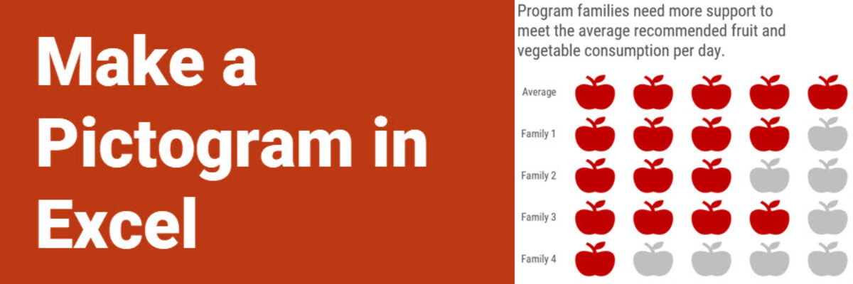
Make a Pictogram in Excel
This graph type goes by a lot of names: isotype chart, pictograph, or pictogram. Whichever way, it allows us to use symbols rather than stick with the squares that make up the waffle chart. And it is especially well suited to representing small counts of things that can otherwise be…
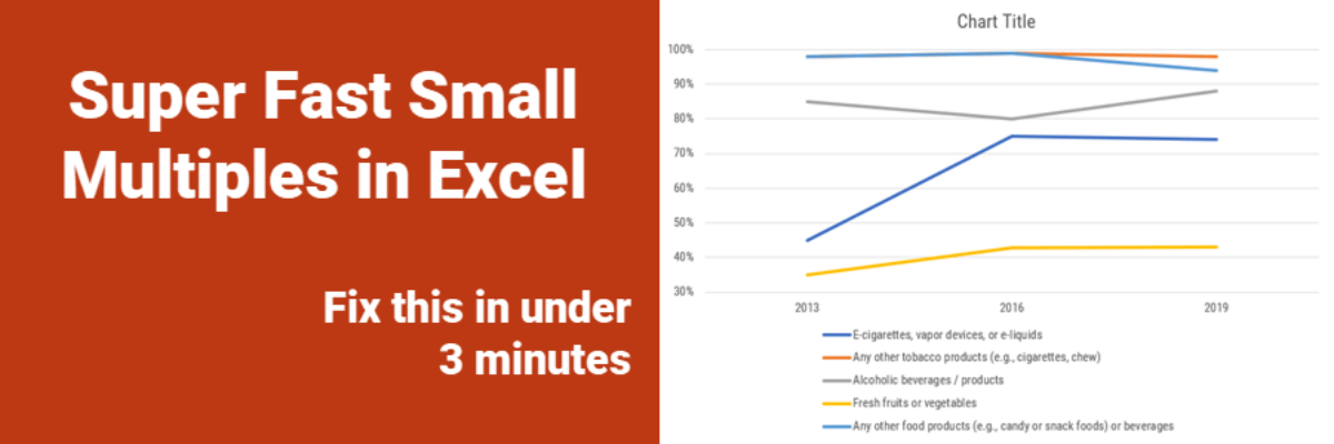
Super Fast Small Multiple Graphs in Excel
Every time I show this trick to even veteran Excel ninjas, their heads explode. So you have probably heard me preach the gospel of small multiples once or twice before. Breaking a clutter-y graph into a lot of smaller graphs that show one piece of data at…
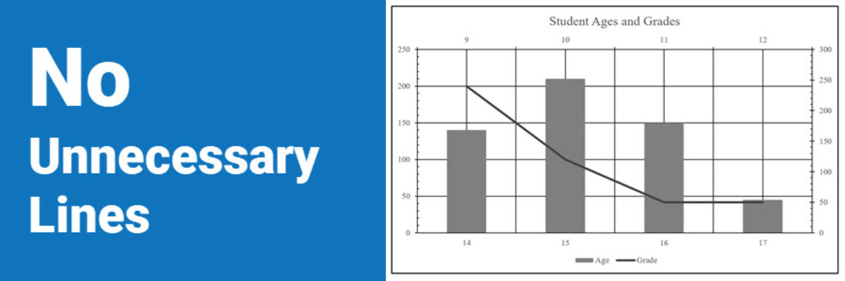
No Unnecessary Lines
The Lines section of the Data Visualization Checklist helps us enhance reader interpretability by handling a lot of the junk, or what Edward Tufte called the “noise” in the graph. I’m referring to all of the parts of the graph that don’t actually display data or assist reader cognition. Create more readability by deleting unnecessary lines. The default…
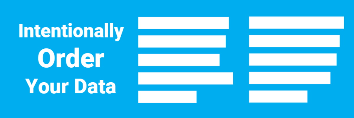
Intentionally Order Your Data
Listen, no one cares about the order we listed the response options on the survey. But most graphs, especially those automatically generated from survey software, showcase the data in that order. And that isn’t useful for anyone trying to interpret the data. Instead, place the bars in order from…
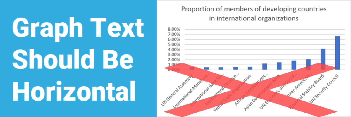
Graph Text Should Be Horizontal
In languages based on the Latin alphabet, we read horizontally, from left to right. Reading on a diagonal produces cramped necks. Reading vertical text is just not going to happen. So, as much as possible, the text in our graphs should be horizontal. Let’s walk through a demo. I was…
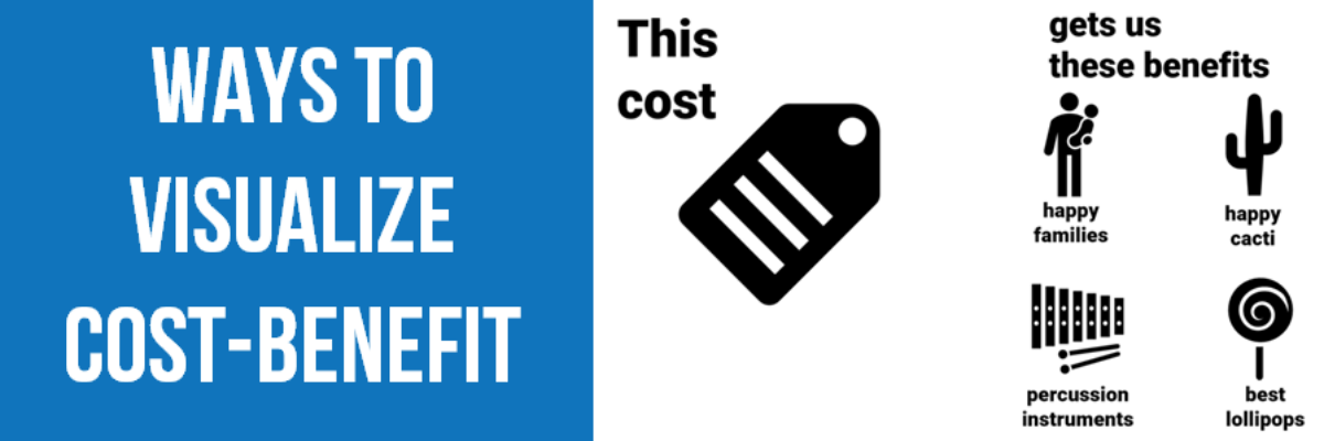
Ways to Visualize Cost-Benefit
Cost-benefit analysis a way of saying “Yes, this program has great impacts… but it’s super expensive.” You’ll often hear the results of cost-benefit analysis in the news, phrased as “For every dollar we spend on this program, we save $$$.” Clients at the University of Alaska, Anchorage (I HAVE THE…
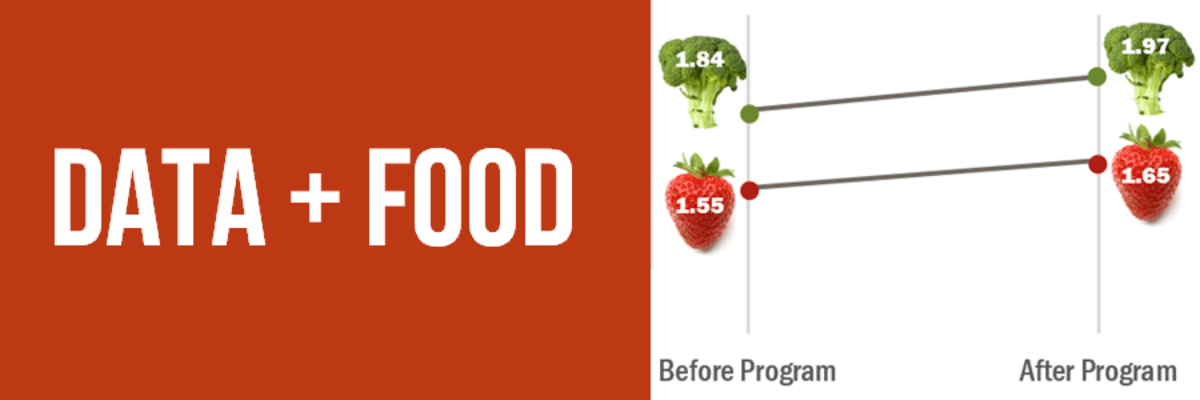
Data + Food
I like to think I’m a foodie but actually I just love to eat. We all do! Food gets people to the meeting. Food grabs folks’ attention. Food gets people talking (between bites, let’s hope). So let’s play to the player and figure out how to get people engaged in…
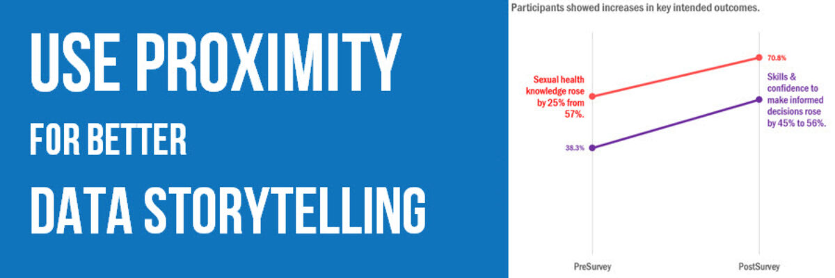
Use Proximity for Better Data Storytelling
Recent clients, Planned Parenthood Federation of America, faced a design problem so common they didn’t even know it was a problem. They were working on communicating some data from a program that aims to educate on healthy sexuality and reproductive health. They surveyed participants at the start and end of…
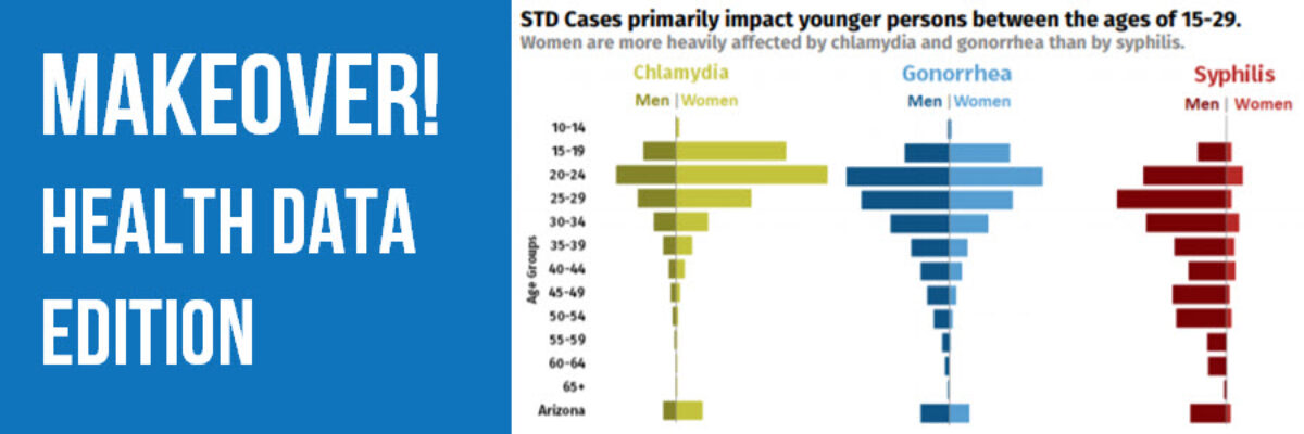
Makeover: Health Data Edition
By far, my favorite emails to receive are from clients bragging about the beauty and impact of their work after our workshop. I just got one of these the other day from Becca Scranton at Arizona Department of Health Services. After thanking me for the workshop, she wrote, “Thanks to…
