You Probably Need Gridlines

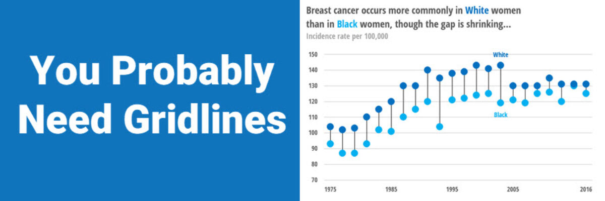
A while back, I published a blog post on how Better Charts Tell Clearer Stories, in which I made over some breast cancer data from Komen into this graph: and when I posted this image on Instagram, someone commented that they didn’t understand why I had used gridlines, apparently…

Read More

Asked and Answered: Visualizing Check All That Apply

This blog post is part of a series called Asked and Answered, about writing great survey questions and visualizing the results with high impact graphs. Dr. Sheila B. Robinson is authoring the Asked series, on writing great questions. Dr. Stephanie Evergreen is authoring the Answered series, on data visualization. View…

Read More

Asked and Answered: Visualizing Rating Data

This blog post is part of a series called Asked and Answered, about writing great survey questions and visualizing the results with high impact graphs. Dr. Sheila B. Robinson is authoring the Asked series, on writing great questions. Dr. Stephanie Evergreen is authoring the Answered series, on data visualization.

Read More

Announcing The Evergreen Data Certification Program

Have you ever signed up for an online course with really good intentions, only to find yourself barely checking in a couple months later? In The Evergreen Data Certification Program, we will not let you fade away. When you commit to The Evergreen Data Certification Program, you earn a…

Read More

Calling the Data Viz Curious

Ever spot those gorgeous graphs in the New York Times or the Washington Post and wish you could make them? You can. And you don’t need fancy software to do it. Good graphs, at their core, are based on a few fundamental principles of data visualization design, a structured…

Read More

Four Ways to Show Projections

Of course we all want to know what will happen in the future. These days folks are looking at data like it has a crystal ball. To the extent that we provide our audiences with projected data, let’s talk about ways to visualize the projected data. Because here’s the thing:…

Read More

Excel vs. Tableau vs. R

We are hard core believers that you should become the master of the tools you own. If your company relies on Microsoft, figure out how to use Excel to make amazing data visualizations. If your company invested in a site-wide license for Tableau, climb over that learning curve and master…

Read More

You Gotta Have An Equidistant Axis

Here’s the thing: The scale used on each axis must have equal intervals. It’s an easy mistake to make. Excel automatically spaces your intervals and labels equidistant from one another but it is assuming that your intervals actually are equidistant. In this graph, that’s not the case. We are missing…

Read More

Announcing The Chart Starter Series

So, hey, heads up: The Chart Starter Series is probably not for you. If you know my work well, you are probably already a dataviz whiz. The Chart Starter Series is for your colleague. You know the one. The one who keeps asking you to make their graphs. Tell…

Read More