Evergreen Collections

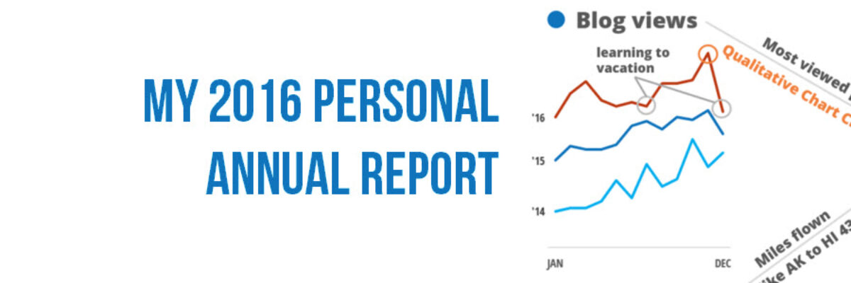
The end of August marks an important moment for me because it is when I quit my salaried job to work on data visualization and design full time. 5 years! It remains one of my best decisions. So, I like to celebrate it with you. Last year, I launched the Evergreen Data…
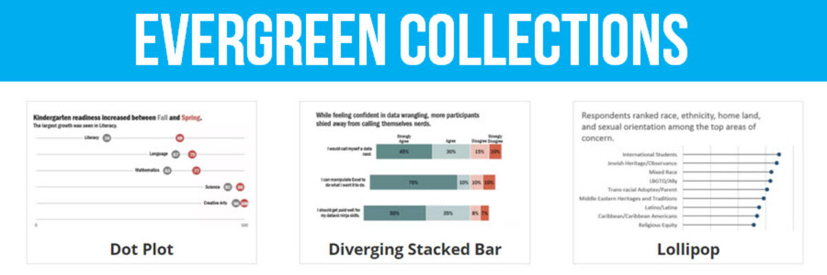
Read More

Interactive Heat Maps

One of the most common ways to analyze qualitative data is through thematic coding. Thematic coding allows us to move beyond the visualization of word or phrase frequency, like in a word cloud, and start to examine attributes and stories that emerge from the data. The New York Times…

Read More

Adding Confidence Intervals to a Dot Plot

Evergreen Data Visualization Academy member Dana McGuire recently wrote me to ask about her dot plot. She said, “Would there be a way to show the bar or confidence interval somewhere? I have gotten positive feedback on the look of the graph overall, but it is a scientific conference…

Read More

How to Show Ranking Data in Excel

Danielle, a member of my Evergreen Data Visualization Academy, submitted a question to our monthly Office Hours webinar about how to show ranking data. She sent this survey question: There are eight categories below.  Rank each item to continue to the next page.  Rank the following services in order…

Read More

Where to Start and End Your Y-Axis Scale

The Y-Axis Debate is one of the most hotly discussed among cool data nerds, like me and my friends. Going out for drinks with me is either a blast or a bore, depending on your nerd level. So let me clarify the parameters of the debate, including where nerds mainly…

Read More

Guest Post: Visualizing Regression Effectively

Updated Note from Stephanie: This blog post generated a lot of discussion. Some of that is in the comments here, some of that has been deleted, some of it came from Twitter and via my inbox. Be sure to read the comments to get a sense of the critique. At…

Read More

Qualitative Data Visualization: The Gauge Diagram

When we debuted our Qualitative Chart Chooser, we promised to dive into detail on specific visualizations, so let’s kick it off by discussing how and when to use one of the most derided charts of all: the gauge diagram. I know, I know… I am sure you are…

Read More

One Free Pie Chart

If I could, I’d ban pie charts. Not because they are inherently bad, but because most people don’t know the pie chart’s tiny range of acceptability. Here it is: Pie charts are ok if you don’t need the numbers on the wedges to get the story. That usually means you’ll…

Read More

How We Unintentionally Perpetuate Inequality Part 3

Last week a friend told me the story of a well-intentioned nonprofit that designed teaching materials for Native American populations, in which they unintentionally perpetuated inequality. He described one piece that included a picture of the scales of justice. I didn’t get the significance, so he explained that while most white…

Read More

My 2016 Personal Annual Report

Every year I say this has been the best year ever and every year it is true. Daily, I’m grateful for work I love with amazing people. Thanks for being a part of this with me! Since 2011, I’ve been creating a personal annual report. It’s a dashboard of sorts…

Read More