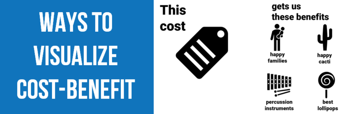
Cost-benefit analysis a way of saying “Yes, this program has great impacts… but it’s super expensive.” You’ll often hear the results of cost-benefit analysis in the news, phrased as “For every dollar we spend on this program, we save $$$.” Clients at the University of Alaska, Anchorage (I HAVE THE…
dataviz
Data + Food
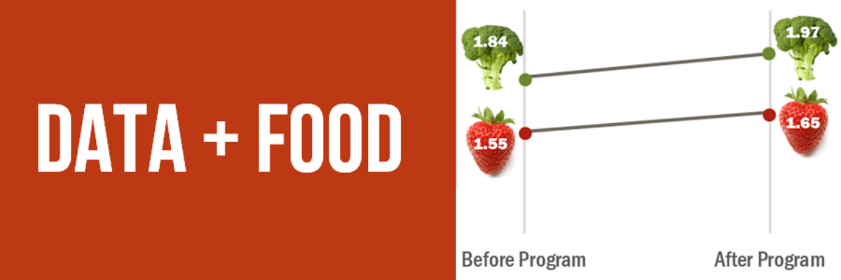
I like to think I’m a foodie but actually I just love to eat. We all do! Food gets people to the meeting. Food grabs folks’ attention. Food gets people talking (between bites, let’s hope). So let’s play to the player and figure out how to get people engaged in…
Use Proximity for Better Data Storytelling
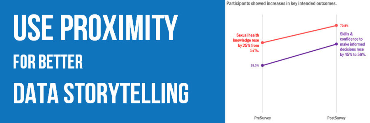
Recent clients, Planned Parenthood Federation of America, faced a design problem so common they didn’t even know it was a problem. They were working on communicating some data from a program that aims to educate on healthy sexuality and reproductive health. They surveyed participants at the start and end of…
Makeover: Health Data Edition
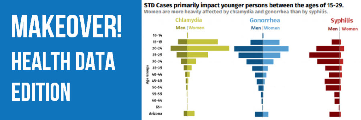
By far, my favorite emails to receive are from clients bragging about the beauty and impact of their work after our workshop. I just got one of these the other day from Becca Scranton at Arizona Department of Health Services. After thanking me for the workshop, she wrote, “Thanks to…
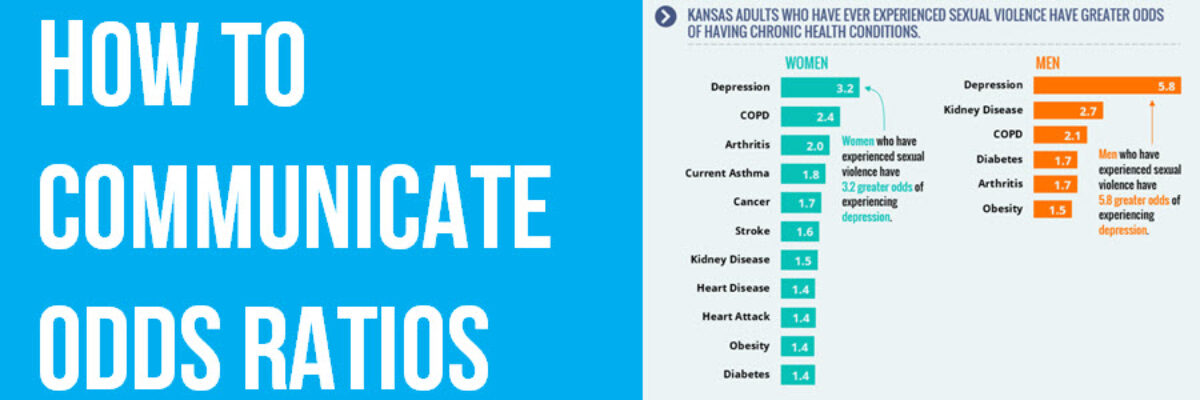
How to Communicate Odds Ratios
Odds ratios are tricky. It isn’t actually all that hard to come up with some decent ways to visualize them. The tricky part is interpreting the results in a way that makes sense to average readers. How do you put the phrase “odds ratio” into a clear and easily interpreted…
Announcing The Interactive Data Visualization Checklist
If you’ve been anywhere near the world of graph making in the past several years, at some point someone probably sent you the Data Visualization Checklist, developed first in 2014 by me and Ann Emery. We built the checklist based on the best available research I was seeing via…
Announcing: The Evergreen Mentoring Program
I can’t stop thinking about Harvey Weinstein. And as soon as I think of him, I remember all of the times I’ve been intimidated, harassed, undermined, or overlooked because I am a woman. With a deep breath, here are a couple of those experiences. When I was a graduate student,…
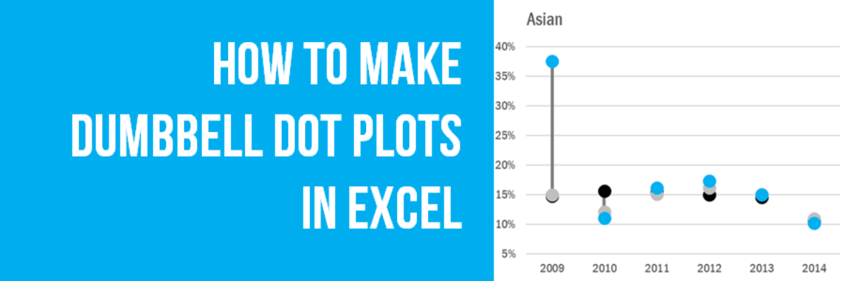
How to Make Dumbbell Dot Plots in Excel
Data visualization is so cool because it helps you see things that would otherwise take a looooooot of effort. Here’s an example. Some very sweet clients in Maricopa County, Arizona (that’s the greater Phoenix area, friends) had a habit of presenting super important data in the most hard to digest…
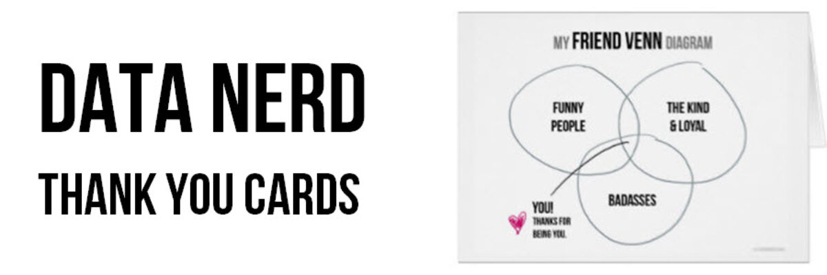
Data Nerd Thank You Cards
In years past, I designed for you cards to help you celebrate Valentine’s Day and the winter holidays like the data nerd you really are. But truth be told, my favorite holiday is Thanksgiving. I love the food, the focus on family, and the deep expressions of gratitude. Does your…
Don’t Visualize
Here’s the deal: People primarily look at pictures. That’s why we visualize data – to get people to look at it. But if we waste the short amount of attention people are willing to extend to us by showing them visuals that don’t convey…
