Ever Heard of a Dendrogram?

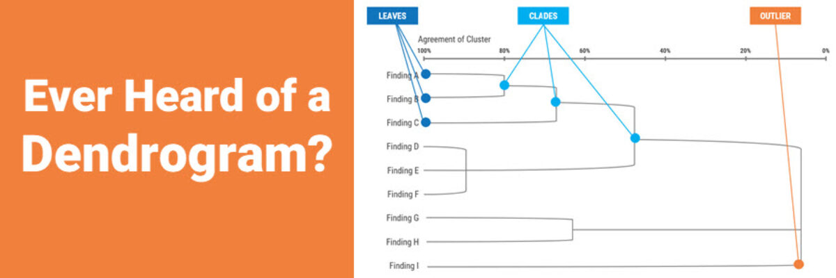
When Jenny Lyons and I were pulling together the revised chapter on Qualitative Visualization in Effective Data Visualization, 2nd edition, we ended up ditching this section on dendrograms. In the list of most-likely-to-use qualitative visuals, this one is probably not in anyone’s top ten. But we still wanted to…

Read More

Super Fast Small Multiple Graphs in Excel

Every time I show this trick to even veteran Excel ninjas, their heads explode. So you have probably heard me preach the gospel of small multiples once or twice before. Breaking a clutter-y graph into a lot of smaller graphs that show one piece of data at…

Read More

No Unnecessary Lines

The Lines section of the Data Visualization Checklist helps us enhance reader interpretability by handling a lot of the junk, or what Edward Tufte called the “noise” in the graph. I’m referring to all of the parts of the graph that don’t actually display data or assist reader cognition. Create more readability by deleting unnecessary lines.   The default…

Read More

Intentionally Order Your Data

Listen, no one cares about the order we listed the response options on the survey. But most graphs, especially those automatically generated from survey software, showcase the data in that order. And that isn’t useful for anyone trying to interpret the data. Instead, place the bars in order from…

Read More

I Failed

This is not news. Today. Yesterday. Every day. I fail all the time. Last week I was playing games that pay real money and failed to get anything out of them. This week, I have so many data visualization fails that I’m already planning a conference talk called The…

Read More

My 2018 Personal Annual Report

This is my last personal annual report. I’ll tell you why. This year most of my metrics went down. At first, due to cultural conditioning that says “more is always better,” I was like Oh no! Before I go further, let’s pause and break that down. I’ve been creating…

Read More

Building a Culture of Effective Data Visualization

The most frustrating part of attending one of my workshops is that you learn so many awesome ways of communicating data, you learn exactly what buttons to push to make it happen, you get hyped up on glee and data vizardry… and then the existing organizational culture stops you from…

Read More

Journey Maps

Journey maps are some of the most bad-ass visuals I know about. With origins in customer experience and human-centered design, a journey map shows how a client moves through your organization. Seeing the actual journey a customer takes can be eye-opening for people on staff who only work on one…

Read More

Graph Text Should Be Horizontal

In languages based on the Latin alphabet, we read horizontally, from left to right. Reading on a diagonal produces cramped necks. Reading vertical text is just not going to happen. So, as much as possible, the text in our graphs should be horizontal. Let’s walk through a demo. I was…

Read More

The Link Between Graphic Design and Report Use

Though I have a PhD, I left academia to become a consultant and it was the best decision I ever made. But I’m still a research nerd at heart so when I had a chance to run a study that examined the link between graphic design and report use, I…

Read More