This blog post is part of a series called Asked and Answered, about writing great survey questions and visualizing the results with high impact graphs. Dr. Sheila B. Robinson is authoring the Asked series, on writing great questions. Dr. Stephanie Evergreen is authoring the Answered series, on data visualization. View…
dataviz
Asked and Answered: Visualizing Rating Data
This blog post is part of a series called Asked and Answered, about writing great survey questions and visualizing the results with high impact graphs. Dr. Sheila B. Robinson is authoring the Asked series, on writing great questions. Dr. Stephanie Evergreen is authoring the Answered series, on data visualization.
Announcing The Evergreen Data Certification Program
Have you ever signed up for an online course with really good intentions, only to find yourself barely checking in a couple months later? In The Evergreen Data Certification Program, we will not let you fade away. When you commit to The Evergreen Data Certification Program, you earn a…
Calling the Data Viz Curious
Ever spot those gorgeous graphs in the New York Times or the Washington Post and wish you could make them? You can. And you don’t need fancy software to do it. Good graphs, at their core, are based on a few fundamental principles of data visualization design, a structured…
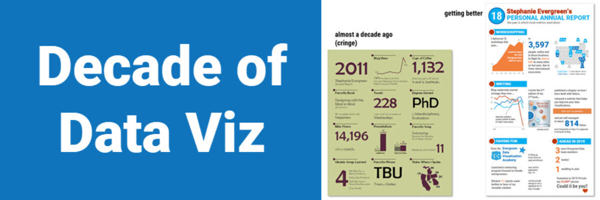
Decade of Data Viz
Well, that just flew by. Ten years ago, I was in the throes of writing my dissertation on Presenting Data Effectively, knowing I had focused on a topic that the world was hungry for, even if they didn’t know it yet. I had collected enough literature and data to know…
Four Ways to Show Projections
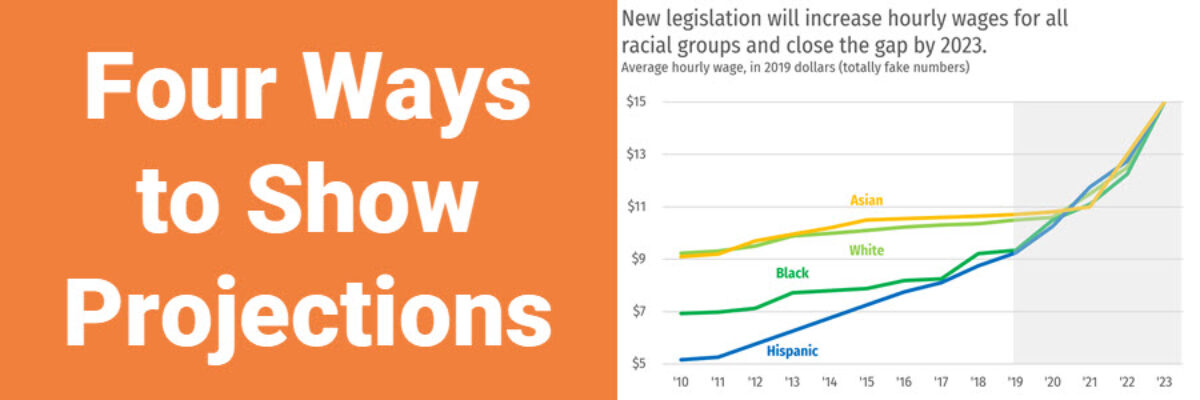
Of course we all want to know what will happen in the future. These days folks are looking at data like it has a crystal ball. To the extent that we provide our audiences with projected data, let’s talk about ways to visualize the projected data. Because here’s the thing:…
Better Graphs Tell Clearer Stories: The Breast Cancer Example
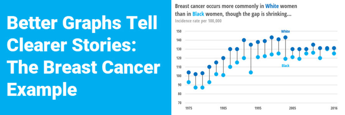
Nothing wrong with this breast cancer line chart, but it’ll only tell a certain data story. Learn some alternative chart types for better data storytelling.
Excel vs. Tableau vs. R
We are hard core believers that you should become the master of the tools you own. If your company relies on Microsoft, figure out how to use Excel to make amazing data visualizations. If your company invested in a site-wide license for Tableau, climb over that learning curve and master…
Data Fortune Tellers
Pick a color, any color. You know how this game goes. You pick a color, your friend opens and closes the fortune teller, spelling out the name of the color you selected. You pick a number from the visible choices, your friend opens and closes the fortune teller, until you…
Harvey Balls
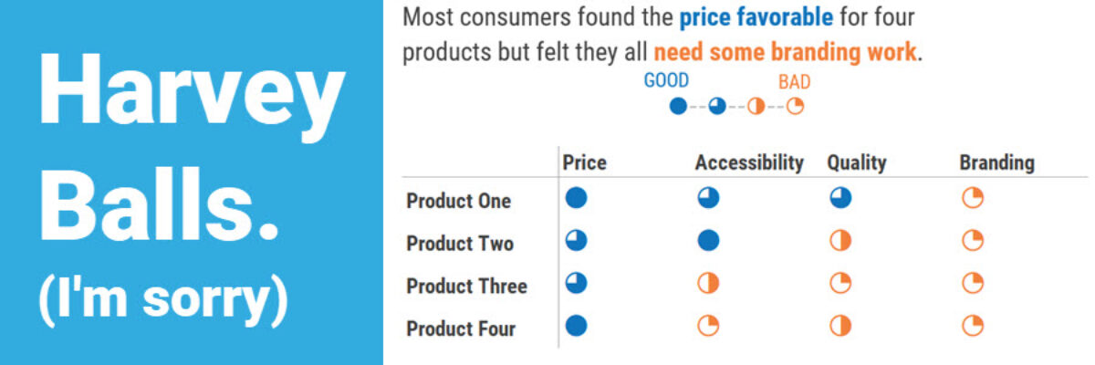
I’m guessing that 90% of the people who search on “Harvey Balls” and end up on this blog post are not here for the same reason I’m here. I’m here to talk to you about qualitative data. And this one can be a little NSFW. Harvey Balls are an…
