Everyone wants a dashboard. But making a GOOD dashboard can be as hard as snagging a selfie with Beyonce. The friction I see most often is because the dashboard software is confusing to use. It’ll get you feeling like you’re groping around in the dark for the light switch.
dataviz
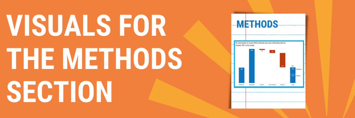
Visuals for the Methods Section
You can tell when someone is getting their data viz eye well-honed because they start asking where ELSE can I include visuals that will better explain my work? That’s Sue. She had grown comfortable with high-impact, story-telling charts in the Results section of her reporting but…
Graphic Designers Need To Learn Data Viz
I am a data nerd. I grew up, professionally speaking, designing studies, collecting data, and trying to get people to make use of the analysis and results. After I married a graphic designer, I realized that no one was going to pay attention to my amazing, glorious, wonderful data if my…
How To Teach People Data Visualization
Have you ever accidentally taken one step too far down the internet rabbit hole? This has happened to me more than once when I’m trying to google the solution to why my chart isn’t working. I click into a Q & A forum that teases the answer – but the…
COVID Data Viz
Star Wars or Star Trek? I totally wasn’t expecting this MD to pitch me that question on live TV. Good thing I have a teenage son who has spent years preparing me for the right answer. The docs on the Medical News Network brought me on to talk…
4 Chart Types that Fight for Equality
While ANY chart can fight for equality, if you plug the right data into it, these four in particular make the story jump off the screen.
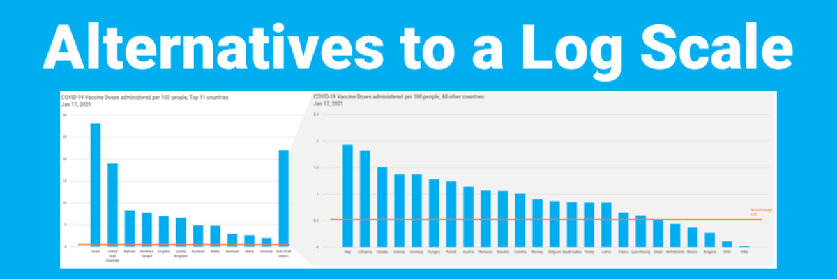
Alternatives to a Log Scale
Over in our private Academy Slack group, one of our members asked a solid, totally not snarky question about log scales. They’ve been common in visuals about COVID and there’s a fair question out there about how appropriate those are in graphs aimed at public consumption.
My Cringe-Worthy Choices
The theme of this blog post can be summed up with one emoji: >.< If you aren’t emoji-fluent, that’s the facepalm, a gesture made when you are internally dying of embarrassment over someone’s incompetence. In this case, that someone is me. I have failed to recognize when I was using…
Decolonizing Data Viz
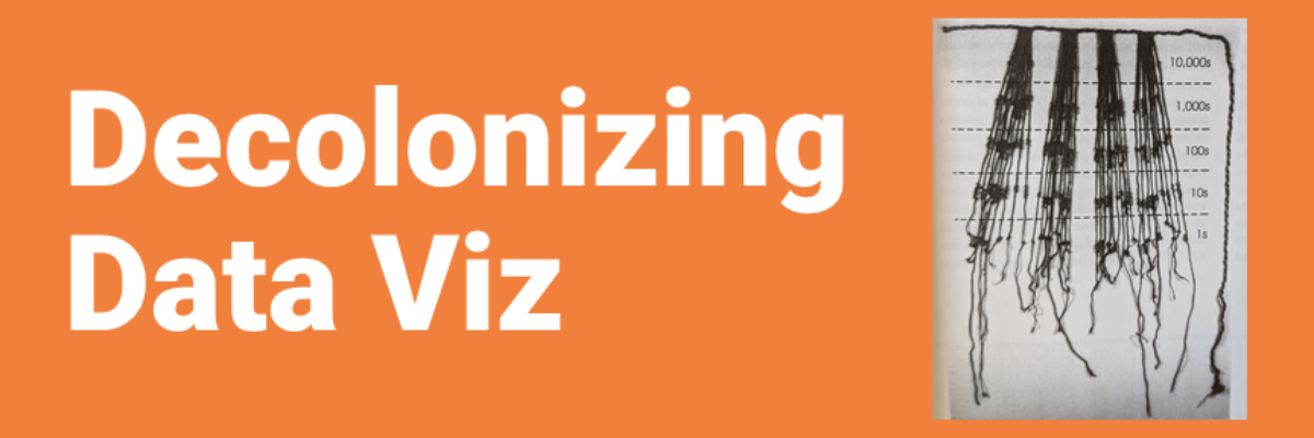
What is Data Visualization? A visual representation ofquantitative or qualitative data. so says Stephanie Evergreen. The strength of this definition is that it is so broad, lots of things fit under its umbrella. But perhaps that is also its weakness because it leaves what counts as data open to interpretation…
Communicating Data is About Handling Egos and Emotions
Behind every furrowed brow and annoying question about your slide is someone’s ego getting dinged. People don’t like their egos dinged. This tiny bit of emotional intelligence will give you massive insight into how to handle tough data communication scenarios we all find ourselves in at one point or…
