Before & After Slides: Stay on the Side of Simplicity

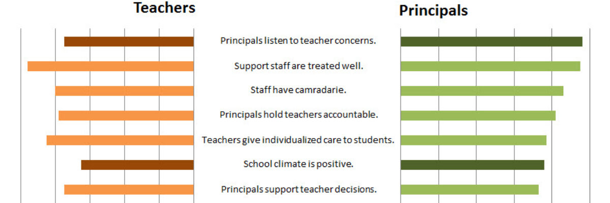
My friend, Kurt Wilson, and I just wrapped up a contract to revise a set of slides – and the graphs within – for a big international client I can’t name. Here I’ll walk through one of the original slides and our revision of it. Keep in mind that these…

Read More

Making Back-to-Back Graphs in Excel

Let’s say we’re interested in comparing how two groups – oh, teachers and principals – responded to a survey. One way to visually display that comparison would be a bar graph, where each question had two bars, one for teachers and one for principals. It’s helpful in some ways, but…

Read More

Bonus Post: Online Data Visualization and Reporting Classes

I’m taking my normal in-person speaking engagements online and you can come. I’ll be presenting one 90-minute class per month and repeating this entire series every 4 months. You’ll even get a sneak peek of examples from my forthcoming book (don’t tell Sage). Here is the lineup: Reporting to be…

Read More

The Year of Data Visualization and Reporting

On the plane, heading back from the American Evaluation Association’s annual conference in Anaheim. Long plane rides such a great opportunity for reflection. What’s on my mind? The overwhelming success of the Data Visualization and Reporting Topical Interest Group. We had so much support in getting this group launched…

Read More