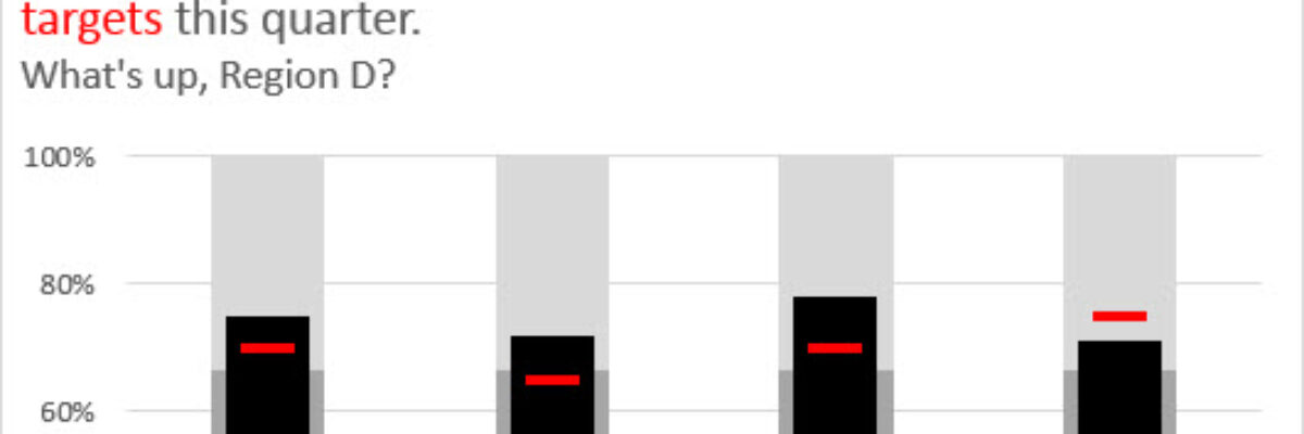
There are lots of ways to make bullet charts, some easier than others, some better suited for specific visualization contexts. Hell, there are plug-ins you can purchase that make it a snap. Except when my plug-in broke and I had to remake about a…
dataviz
Adding a Benchmark Line to a Graph
This simple line packs so much power. Adding a benchmark line to a graph gives loads of context for the viewer. Here’s how to make one right inside Excel. It’s so easy you might pass out. My data table looks like this: I have my data and I have the benchmark…
Embracing Data Visualization in Evaluation: A Management Perspective
Friends! I’m so happy to have Rakesh Mohan guest blogging for me. He is one helluva guy. He is the Director of the Office of Performance Evaluations, an independent agency of the Idaho State Legislature. In other words, his eval clients are lawmakers. You ask me for examples of reporting in…
An Incomplete List of Females in Data Visualization
I rewrote this post 4 times, in an effort to give it a calm and professional tone. And then I thought “Ah fuck it, this is my blog and I can say whatever I want.” I’m writing this post because I just listened to an interview about data visualization. It…
How to Rock the Text in your Data Visualization
You only get a little bit of text in your graph. Here’s how to make sure you get the most mileage out of it.
My 2013 Personal Annual Report
Holy crap, 2013 was a busy year! Look what I’ve been up to – and click around: [gview file=”http://www.stephanieevergreen.com/wp-content/uploads/2013/12/AnnualReport2013.pdf”] So, to recap, I’m prrrreeeetttttty sure I don’t have to publish one more thing until 2015. Whew. Some technical notes: Last…
Guest Post: Word Cloud Dog Vomit, An Illustrated Rant
My colleague Humphrey Costello delivers the funniest, snarkiest Ignite sessions at the American Evaluation Association’s annual conference. I’m so happy to give him this platform to articulate the answer to one of the questions I am asked the most, about the phenomenon known as word clouds. 1st ingredient: Long ago,…
Design for Federal Proposals (aka Design in a Black & White Environment)
I just finished a round of reviews for a major federal grant program and was, like every year, inspired to share guidance on how to design in such a restrictive environment. Issue: Federal grant programs tend to specify the page margins, typeface, and font size to make the amount of…
Dashboard Icons in Excel
We don’t just report the facts, ma’am. We use a set of values to make judgments about the data, like which of these results is good or needs improvement, etc. We set benchmarks and cut points so our clients can understand when action needs to be taken and where. Yet…
Who Can Do Dataviz (or How a Field Evolves)
Wow, the action in the dataviz/tech world this past week has been awesome! A female programmer at a Python (that’s a programming language also used for dataviz) conference was fired after tweeting about the sexist jokes she was hearing from a largely white young male crowd, and Tableau’s…