How Middle School Math Pays Off

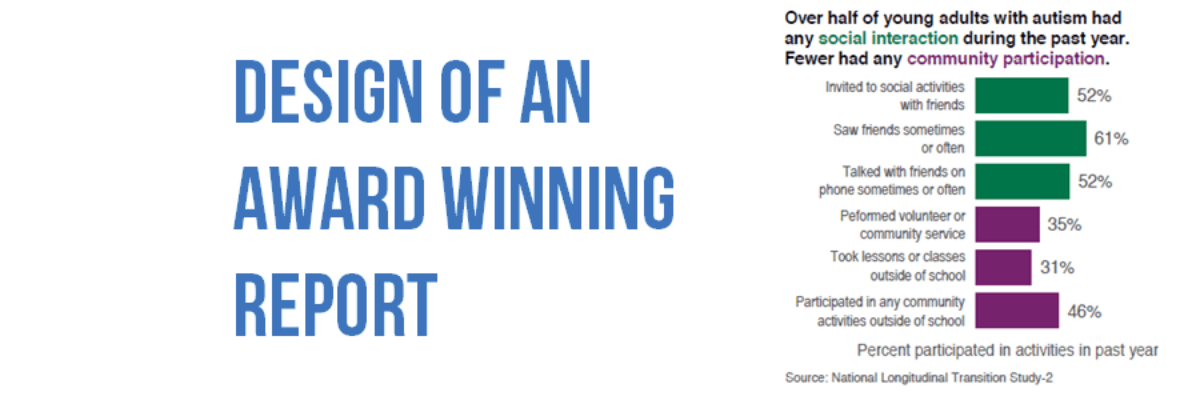
Dear Mrs. George’s students, Awhile ago I met your teacher at a wedding reception. Her bestie married my father. As one does when engaging in small talk, she asked me what I do for a living. Me: I teach people how to present data. Ever seen a really terrible PowerPoint?…

Read More

Design of an Award Winning Report

So long as we are going to write reports, we might as well make them heavy on the visuals and do everything in our power to make the report easy to navigate, especially in a mobile reading culture. There are lots of ways to do this but one of my…

Read More

Automatically Updating Graphs in Word or PowerPoint

I have so much money in the bank I’m going to give away my number one reporting time saving secret (HAHAHAHAH not at all! I’m giving it away because I love you and I want to make your life easier). This is how you link Excel to your other reporting…

Read More

How Dataviz Can Unintentionally Perpetuate Inequality Part 2

Last time Vidhya and I posted on this topic, we addressed how the use of color to visualize individuals can do more harm than good. This time Vidhya joins me again to talk about poverty and opportunity. Organizations in the Minneapolis-St. Paul metropolitan area community identified and started tracking indicators…

Read More

Guest Post: Best Practices for Control, Run, and Pareto Charts

Nicole contacted me with an email subject line: Thank you for the Data Viz Checklist! and she said she’d been using the checklist to overhaul some of her organization’s data visualizations. I’ve invited her here to showcase her before and afters. I’m Nicole Huggett and I recently transitioned…

Read More

Make A Lollipop Graph in Excel

The simplest way to show many types of data is through a column or bar chart, ordered greatest to least. These will work just fine, most of the time. When do they fall short? Well, when the values are all high, such as in the 80-90% range (out of 100%). Then…

Read More

Data Visualization for Non-Profit & Foundation Annual Reports

Annual reports are where non-profits and foundations pull out their designer big guns. This is where they show off their muscles, like studs on the beach. The annual report is the place where an organization oils its accomplishments til they shine. The annual report is so important, most organizations still…

Read More

Holiday Swag for Your Favorite Data Nerd

Introducing new designs on practical, household items. I’m talking about graphs on flasks! Your favorite data nerd is going to love one of these. BAM shopping done. Both designs says “DRINKS FOR DATA NERDS.” They have a y-axis which is the amount of liquid remaining in the flask and an…

Read More

Professional Standards for Data Visualizers

To my fellow data visualizers: As a field grows in size and maturity, there comes a time to set forth professional standards of conduct, to help us both align our practices and communicate to our potential clients that we are an organized and respectable group of colleagues. Standards need at…

Read More