My 2016 Personal Annual Report

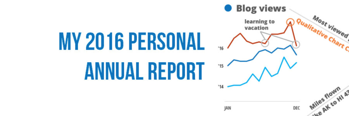
Every year I say this has been the best year ever and every year it is true. Daily, I’m grateful for work I love with amazing people. Thanks for being a part of this with me! Since 2011, I’ve been creating a personal annual report. It’s a dashboard of sorts…

Read More

Two Alternatives to Using a Second Y-Axis

Almost as often as I see a pie chart with a hundred tiny slivers, I see line graphs using two y-axes. And it is just as bad. Graphs like this appear in every industry, everywhere I consult all around the globe. Using two y-axes is not a great idea…

Read More

The Data Visualization Checklist

HEY THERE: This checklist is now a website where you can upload your image and we will walk you through each checkpoint, helping you rate yourself. This post has been a long time coming. We knew that people had a thirst for better…

Read More

Announcing Chart Chooser Cards

Update: After a successful Kickstarter campaign where we raised over 1,000% of our goal, the cards are in production and you can now order a deck, an infographic, and our templates from our permanent website. Thanks for your support, lovely people. Chart Chooser cards are simple and easy…

Read More

Strong Titles Are The Biggest Bang for Your Buck

If you do nothing else to improve a weak visualization, you’ll still seriously improve its interpretability by giving it an awesome title. Generally we use weak titles that don’t really tell us the point of the visualization: I think this is because we make our graphs in Excel,…

Read More

Your Data Visualization Secret Weapon

You want to know the trick to fixing most scary data visualizations? The answer to horrifying stuff like this?   What does one do when the graph gives you the shivers?   http://viz.wtf/post/142740495532/spaghetti-sans-meatball   The answer is always going to be:…

Read More

Evergreen Data Visualization Academy

The Data Visualization Academy is only open for enrollment twice a year. Come get select access to my best data visualization tutorials and advice. Four years ago today, I took the leap from salaried employee to independent consultant. Since then, I’ve worked with scores of organizations to help them use…

Read More

Make It A Game

I spend a lot of time talking about really serious data with incredibly focused people. I love them and I love my job. But sometimes I need to balance that out with some Lucky Charms. So while eating my bowlful of magically delicious sugar bombs the other day and looking at…

Read More

My New Favorite Graph Type: Overlapping Bars

Why have I fallen in love with this graph type? I think its because its such a great way to visualize the comparison between two things, when one is inherently a part of the other. In recent client projects, I’ve used these to show actual v. budgeted amounts. Or individual…

Read More

Book Club with Alberto, Andy, and Jorge

So far this year we’ve seen a ton of great books on data visualization published! What an awesome time! I got together with Alberto Cairo, Jorge Camoes, and Andy Kirk to talk about our books and the writing process in general. Not sure which of the latest…

Read More