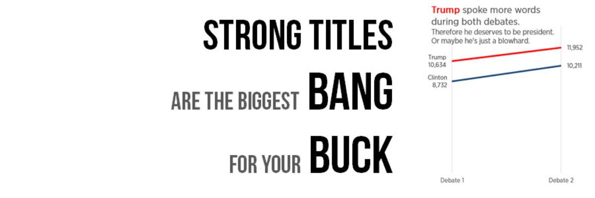
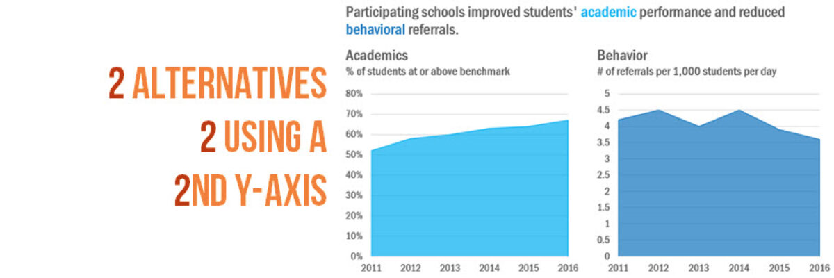
Almost as often as I see a pie chart with a hundred tiny slivers, I see line graphs using two y-axes. And it is just as bad. Graphs like this appear in every industry, everywhere I consult all around the globe. Using two y-axes is not a great idea…
datavis
The Data Visualization Checklist
HEY THERE: This checklist is now a website where you can upload your image and we will walk you through each checkpoint, helping you rate yourself. This post has been a long time coming. We knew that people had a thirst for better…
Announcing Chart Chooser Cards
Update: After a successful Kickstarter campaign where we raised over 1,000% of our goal, the cards are in production and you can now order a deck, an infographic, and our templates from our permanent website. Thanks for your support, lovely people. Chart Chooser cards are simple and easy…
Strong Titles Are The Biggest Bang for Your Buck
If you do nothing else to improve a weak visualization, you’ll still seriously improve its interpretability by giving it an awesome title. Generally we use weak titles that don’t really tell us the point of the visualization: I think this is because we make our graphs in Excel,…
Your Data Visualization Secret Weapon
You want to know the trick to fixing most scary data visualizations? The answer to horrifying stuff like this? What does one do when the graph gives you the shivers? http://viz.wtf/post/142740495532/spaghetti-sans-meatball The answer is always going to be:…
Book Club with Alberto, Andy, and Jorge
So far this year we’ve seen a ton of great books on data visualization published! What an awesome time! I got together with Alberto Cairo, Jorge Camoes, and Andy Kirk to talk about our books and the writing process in general. Not sure which of the latest…
Automatically Updating Graphs in Word or PowerPoint
I have so much money in the bank I’m going to give away my number one reporting time saving secret (HAHAHAHAH not at all! I’m giving it away because I love you and I want to make your life easier). This is how you link Excel to your other reporting…
Guest Post: Best Practices for Control, Run, and Pareto Charts
Nicole contacted me with an email subject line: Thank you for the Data Viz Checklist! and she said she’d been using the checklist to overhaul some of her organization’s data visualizations. I’ve invited her here to showcase her before and afters. I’m Nicole Huggett and I recently transitioned…
Holiday Swag for Your Favorite Data Nerd
Introducing new designs on practical, household items. I’m talking about graphs on flasks! Your favorite data nerd is going to love one of these. BAM shopping done. Both designs says “DRINKS FOR DATA NERDS.” They have a y-axis which is the amount of liquid remaining in the flask and an…
Professional Standards for Data Visualizers
To my fellow data visualizers: As a field grows in size and maturity, there comes a time to set forth professional standards of conduct, to help us both align our practices and communicate to our potential clients that we are an organized and respectable group of colleagues. Standards need at…