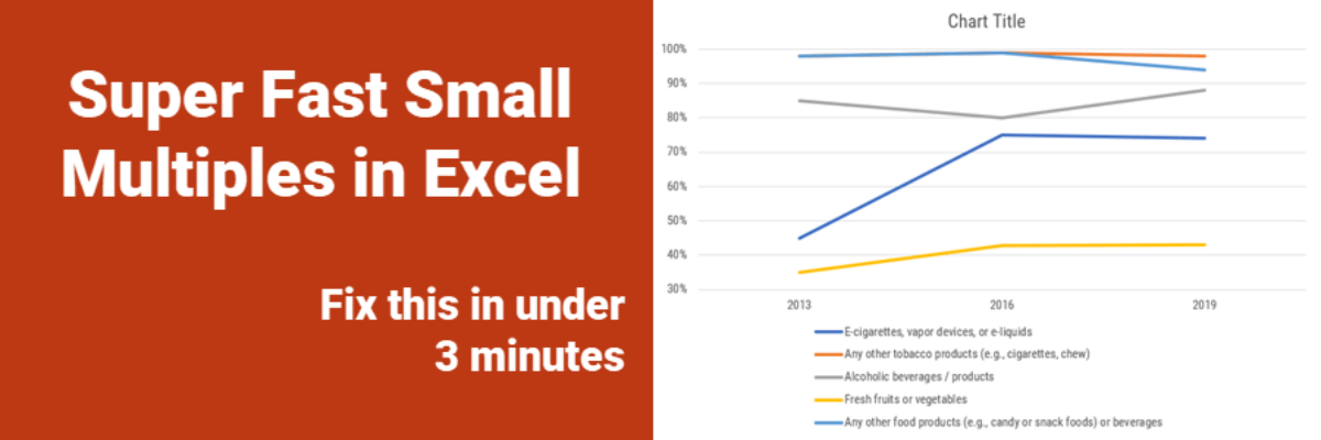
Every time I show this trick to even veteran Excel ninjas, their heads explode. So you have probably heard me preach the gospel of small multiples once or twice before. Breaking a clutter-y graph into a lot of smaller graphs that show one piece of data at…
datavis
No Unnecessary Lines
The Lines section of the Data Visualization Checklist helps us enhance reader interpretability by handling a lot of the junk, or what Edward Tufte called the “noise” in the graph. I’m referring to all of the parts of the graph that don’t actually display data or assist reader cognition. Create more readability by deleting unnecessary lines. The default…
I Failed
This is not news. Today. Yesterday. Every day. I fail all the time. Last week I was playing games that pay real money and failed to get anything out of them. This week, I have so many data visualization fails that I’m already planning a conference talk called The…
My 2018 Personal Annual Report
This is my last personal annual report. I’ll tell you why. This year most of my metrics went down. At first, due to cultural conditioning that says “more is always better,” I was like Oh no! Before I go further, let’s pause and break that down. I’ve been creating…
Building a Culture of Effective Data Visualization
The most frustrating part of attending one of my workshops is that you learn so many awesome ways of communicating data, you learn exactly what buttons to push to make it happen, you get hyped up on glee and data vizardry… and then the existing organizational culture stops you from…
Ways to Visualize Cost-Benefit
Cost-benefit analysis a way of saying “Yes, this program has great impacts… but it’s super expensive.” You’ll often hear the results of cost-benefit analysis in the news, phrased as “For every dollar we spend on this program, we save $$$.” Clients at the University of Alaska, Anchorage (I HAVE THE…
How to Make Dumbbell Dot Plots in Excel
Data visualization is so cool because it helps you see things that would otherwise take a looooooot of effort. Here’s an example. Some very sweet clients in Maricopa County, Arizona (that’s the greater Phoenix area, friends) had a habit of presenting super important data in the most hard to digest…
Qualitative Data Visualization: The Gauge Diagram
When we debuted our Qualitative Chart Chooser, we promised to dive into detail on specific visualizations, so let’s kick it off by discussing how and when to use one of the most derided charts of all: the gauge diagram. I know, I know… I am sure you are…
One Free Pie Chart
If I could, I’d ban pie charts. Not because they are inherently bad, but because most people don’t know the pie chart’s tiny range of acceptability. Here it is: Pie charts are ok if you don’t need the numbers on the wedges to get the story. That usually means you’ll…
My 2016 Personal Annual Report
Every year I say this has been the best year ever and every year it is true. Daily, I’m grateful for work I love with amazing people. Thanks for being a part of this with me! Since 2011, I’ve been creating a personal annual report. It’s a dashboard of sorts…