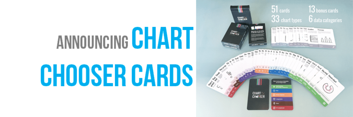
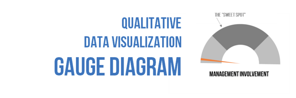
When we debuted our Qualitative Chart Chooser, we promised to dive into detail on specific visualizations, so let’s kick it off by discussing how and when to use one of the most derided charts of all: the gauge diagram. I know, I know… I am sure you are…
data visualization
One Free Pie Chart
If I could, I’d ban pie charts. Not because they are inherently bad, but because most people don’t know the pie chart’s tiny range of acceptability. Here it is: Pie charts are ok if you don’t need the numbers on the wedges to get the story. That usually means you’ll…
How We Unintentionally Perpetuate Inequality Part 3
Last week a friend told me the story of a well-intentioned nonprofit that designed teaching materials for Native American populations, in which they unintentionally perpetuated inequality. He described one piece that included a picture of the scales of justice. I didn’t get the significance, so he explained that while most white…
My 2016 Personal Annual Report
Every year I say this has been the best year ever and every year it is true. Daily, I’m grateful for work I love with amazing people. Thanks for being a part of this with me! Since 2011, I’ve been creating a personal annual report. It’s a dashboard of sorts…
Two Alternatives to Using a Second Y-Axis
Almost as often as I see a pie chart with a hundred tiny slivers, I see line graphs using two y-axes. And it is just as bad. Graphs like this appear in every industry, everywhere I consult all around the globe. Using two y-axes is not a great idea…
The Data Visualization Checklist
HEY THERE: This checklist is now a website where you can upload your image and we will walk you through each checkpoint, helping you rate yourself. This post has been a long time coming. We knew that people had a thirst for better…
Announcing Chart Chooser Cards
Update: After a successful Kickstarter campaign where we raised over 1,000% of our goal, the cards are in production and you can now order a deck, an infographic, and our templates from our permanent website. Thanks for your support, lovely people. Chart Chooser cards are simple and easy…
Strong Titles Are The Biggest Bang for Your Buck
If you do nothing else to improve a weak visualization, you’ll still seriously improve its interpretability by giving it an awesome title. Generally we use weak titles that don’t really tell us the point of the visualization: I think this is because we make our graphs in Excel,…
Your Data Visualization Secret Weapon
You want to know the trick to fixing most scary data visualizations? The answer to horrifying stuff like this? What does one do when the graph gives you the shivers? http://viz.wtf/post/142740495532/spaghetti-sans-meatball The answer is always going to be:…
Evergreen Data Visualization Academy
The Data Visualization Academy is only open for enrollment twice a year. Come get select access to my best data visualization tutorials and advice. Four years ago today, I took the leap from salaried employee to independent consultant. Since then, I’ve worked with scores of organizations to help them use…