I can’t stop thinking about Harvey Weinstein. And as soon as I think of him, I remember all of the times I’ve been intimidated, harassed, undermined, or overlooked because I am a woman. With a deep breath, here are a couple of those experiences. When I was a graduate student,…
data visualization
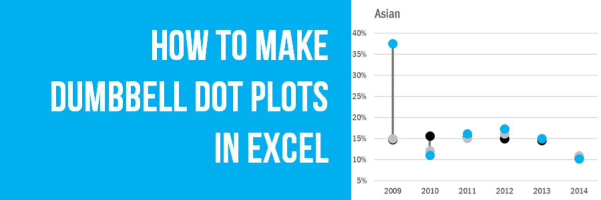
How to Make Dumbbell Dot Plots in Excel
Data visualization is so cool because it helps you see things that would otherwise take a looooooot of effort. Here’s an example. Some very sweet clients in Maricopa County, Arizona (that’s the greater Phoenix area, friends) had a habit of presenting super important data in the most hard to digest…
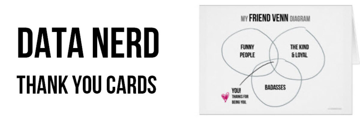
Data Nerd Thank You Cards
In years past, I designed for you cards to help you celebrate Valentine’s Day and the winter holidays like the data nerd you really are. But truth be told, my favorite holiday is Thanksgiving. I love the food, the focus on family, and the deep expressions of gratitude. Does your…
Don’t Visualize
Here’s the deal: People primarily look at pictures. That’s why we visualize data – to get people to look at it. But if we waste the short amount of attention people are willing to extend to us by showing them visuals that don’t convey…
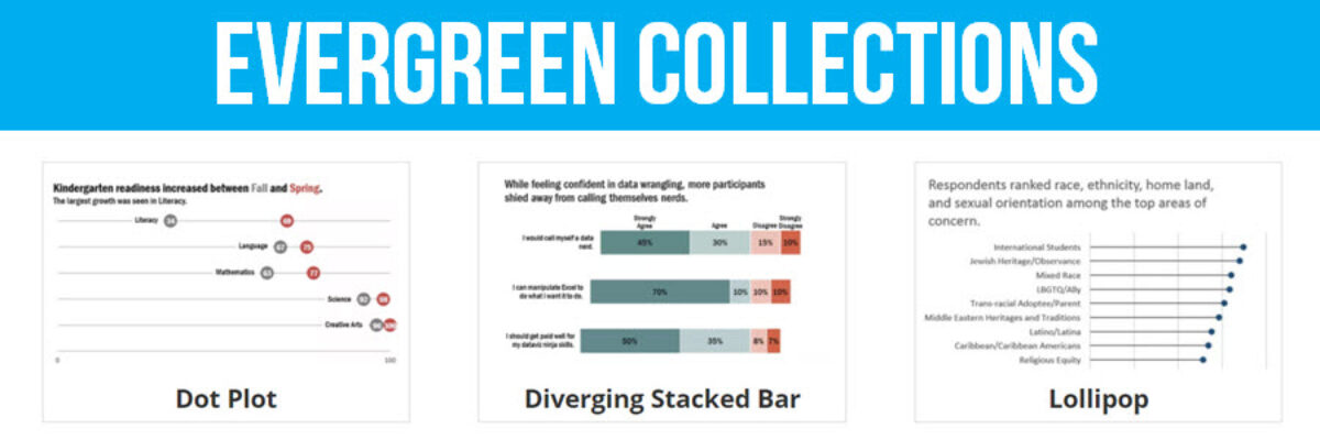
Evergreen Collections
The end of August marks an important moment for me because it is when I quit my salaried job to work on data visualization and design full time. 5 years! It remains one of my best decisions. So, I like to celebrate it with you. Last year, I launched the Evergreen Data…
Color Psychology
As I usually do in my workshops, I talked to a group in Warsaw, Poland about how we should use color intentionally in our data visualization and that, in fact, the color choice itself can help us tell our story. I prepared a little activity around this issue, in…
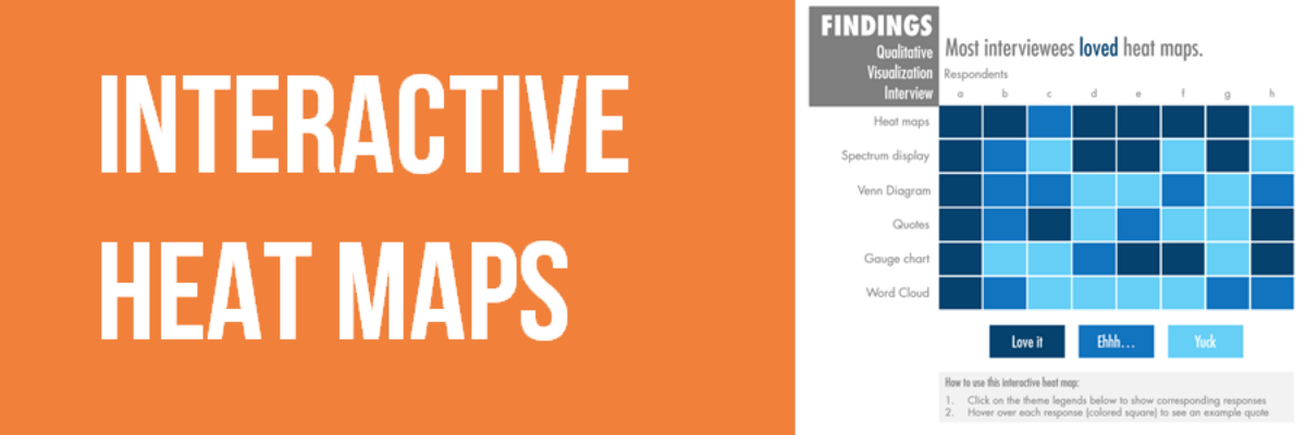
Interactive Heat Maps
One of the most common ways to analyze qualitative data is through thematic coding. Thematic coding allows us to move beyond the visualization of word or phrase frequency, like in a word cloud, and start to examine attributes and stories that emerge from the data. The New York Times…
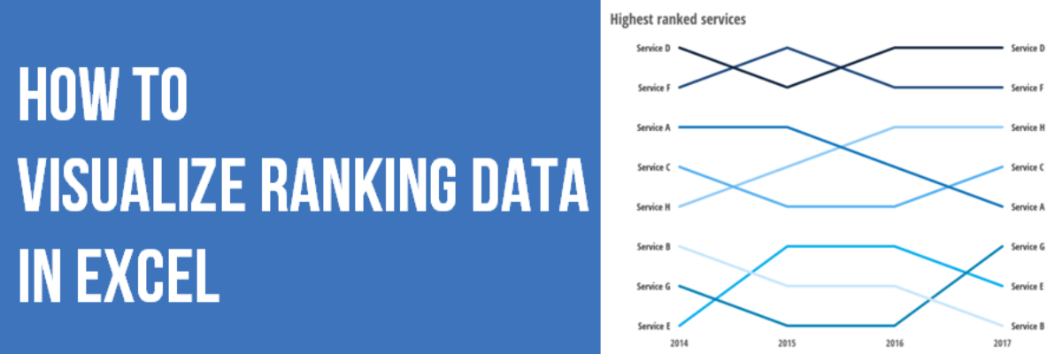
How to Show Ranking Data in Excel
Danielle, a member of my Evergreen Data Visualization Academy, submitted a question to our monthly Office Hours webinar about how to show ranking data. She sent this survey question: There are eight categories below. Rank each item to continue to the next page. Rank the following services in order…
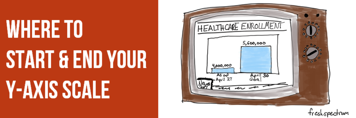
Where to Start and End Your Y-Axis Scale
The Y-Axis Debate is one of the most hotly discussed among cool data nerds, like me and my friends. Going out for drinks with me is either a blast or a bore, depending on your nerd level. So let me clarify the parameters of the debate, including where nerds mainly…
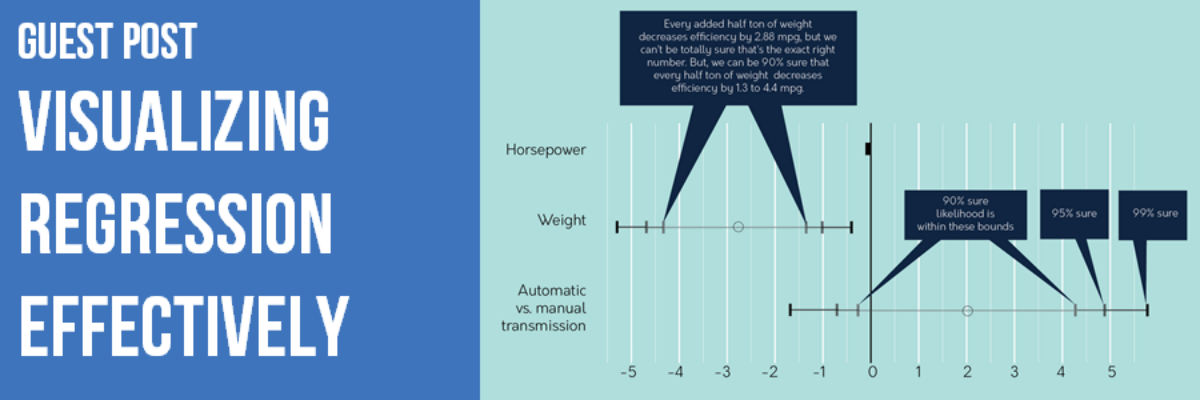
Guest Post: Visualizing Regression Effectively
Updated Note from Stephanie: This blog post generated a lot of discussion. Some of that is in the comments here, some of that has been deleted, some of it came from Twitter and via my inbox. Be sure to read the comments to get a sense of the critique. At…

