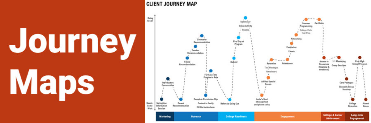
Journey maps are some of the most bad-ass visuals I know about. With origins in customer experience and human-centered design, a journey map shows how a client moves through your organization. Seeing the actual journey a customer takes can be eye-opening for people on staff who only work on one…
data visualization
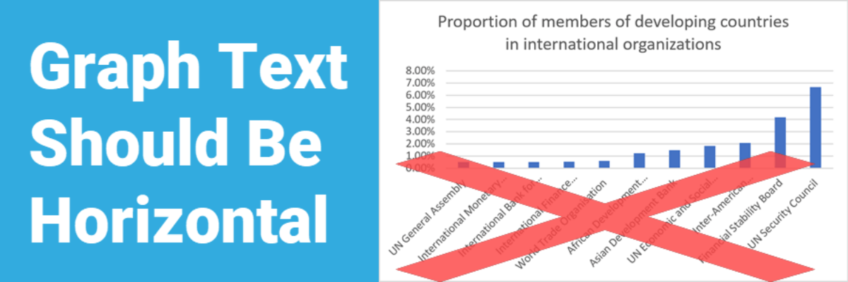
Graph Text Should Be Horizontal
In languages based on the Latin alphabet, we read horizontally, from left to right. Reading on a diagonal produces cramped necks. Reading vertical text is just not going to happen. So, as much as possible, the text in our graphs should be horizontal. Let’s walk through a demo. I was…
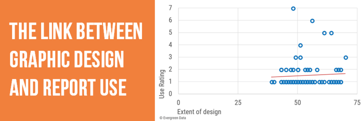
The Link Between Graphic Design and Report Use
Though I have a PhD, I left academia to become a consultant and it was the best decision I ever made. But I’m still a research nerd at heart so when I had a chance to run a study that examined the link between graphic design and report use, I…
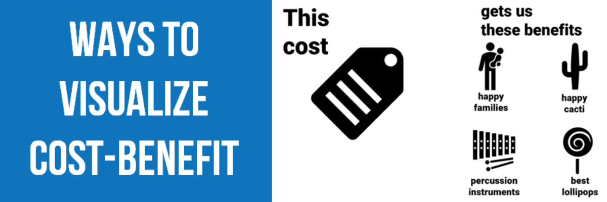
Ways to Visualize Cost-Benefit
Cost-benefit analysis a way of saying “Yes, this program has great impacts… but it’s super expensive.” You’ll often hear the results of cost-benefit analysis in the news, phrased as “For every dollar we spend on this program, we save $$$.” Clients at the University of Alaska, Anchorage (I HAVE THE…
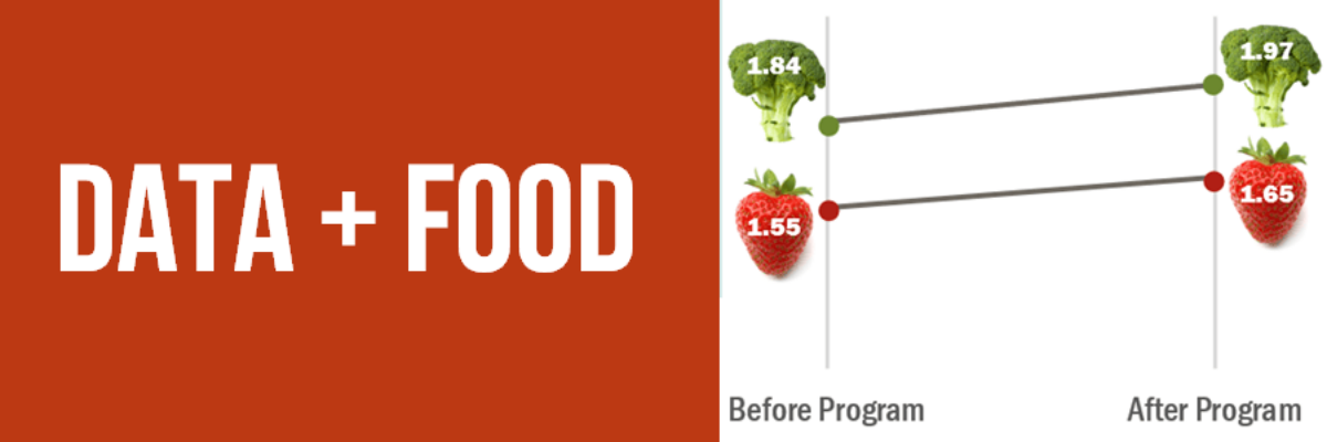
Data + Food
I like to think I’m a foodie but actually I just love to eat. We all do! Food gets people to the meeting. Food grabs folks’ attention. Food gets people talking (between bites, let’s hope). So let’s play to the player and figure out how to get people engaged in…
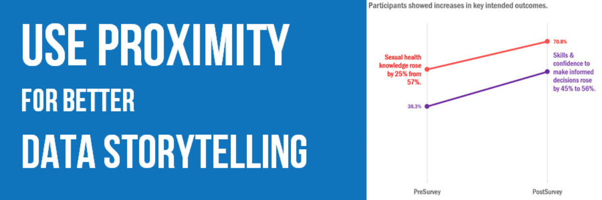
Use Proximity for Better Data Storytelling
Recent clients, Planned Parenthood Federation of America, faced a design problem so common they didn’t even know it was a problem. They were working on communicating some data from a program that aims to educate on healthy sexuality and reproductive health. They surveyed participants at the start and end of…
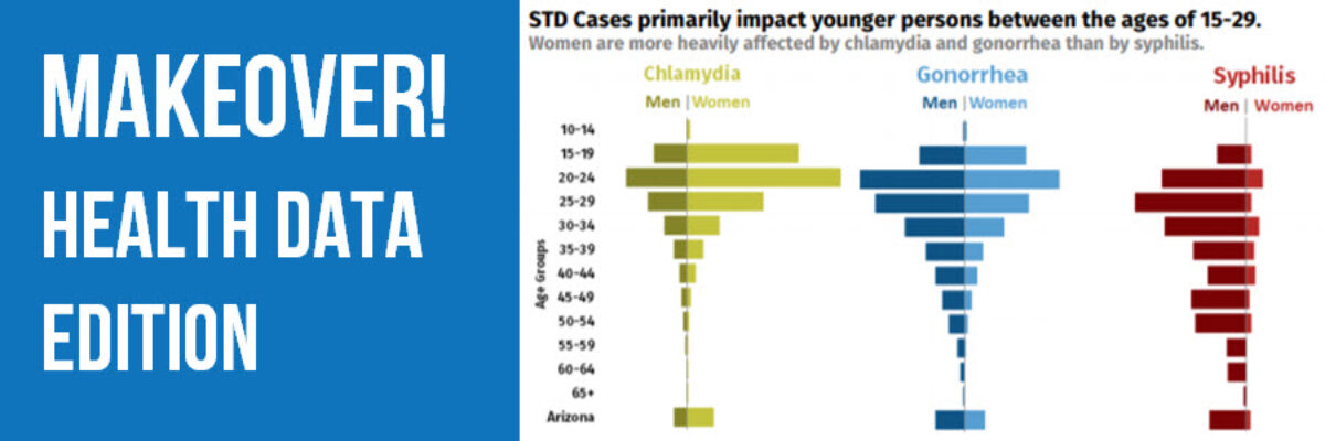
Makeover: Health Data Edition
By far, my favorite emails to receive are from clients bragging about the beauty and impact of their work after our workshop. I just got one of these the other day from Becca Scranton at Arizona Department of Health Services. After thanking me for the workshop, she wrote, “Thanks to…
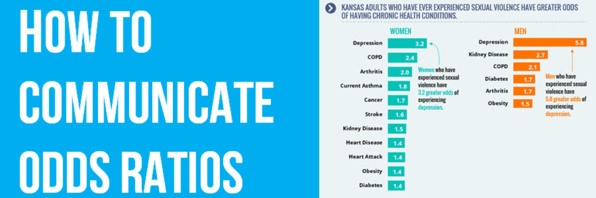
How to Communicate Odds Ratios
Odds ratios are tricky. It isn’t actually all that hard to come up with some decent ways to visualize them. The tricky part is interpreting the results in a way that makes sense to average readers. How do you put the phrase “odds ratio” into a clear and easily interpreted…
Announcing The Interactive Data Visualization Checklist
If you’ve been anywhere near the world of graph making in the past several years, at some point someone probably sent you the Data Visualization Checklist, developed first in 2014 by me and Ann Emery. We built the checklist based on the best available research I was seeing via…
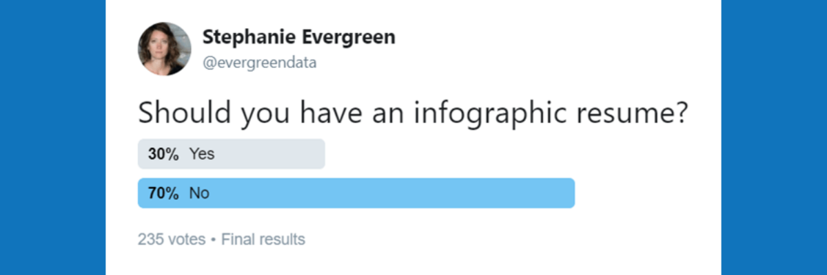
Should You Make an Infographic Resume?
A family member works in IT at a large corporation. She recently forwarded me this resume they received for a job opening. Apparently, it had been passed around the interview committee with the subject line “Best/Worst Resume Ever?”. I personally liked this one for the fact that I know…
