We are hard core believers that you should become the master of the tools you own. If your company relies on Microsoft, figure out how to use Excel to make amazing data visualizations. If your company invested in a site-wide license for Tableau, climb over that learning curve and master…
data visualization
The Dashboard Sketch Process
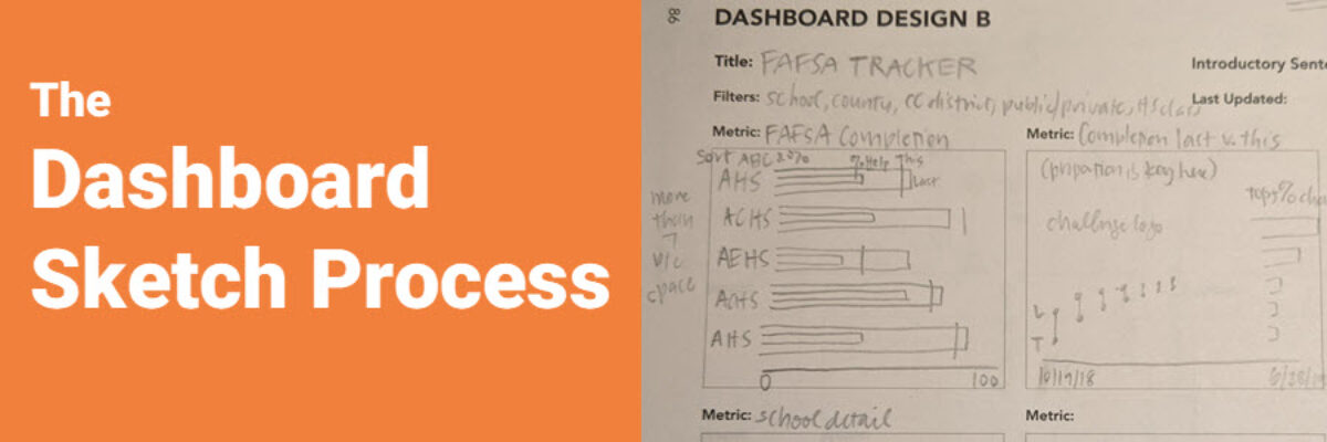
“I vote no.” This short answer speeds up the dashboard development process significantly. And I developed the question my client voted on in roughly 3 minutes, by showing her a quick sketch of some possible graph options. My client is in charge of a dashboard that tracks how high school…
Announcing The Chart Starter Series
So, hey, heads up: The Chart Starter Series is probably not for you. If you know my work well, you are probably already a dataviz whiz. The Chart Starter Series is for your colleague. You know the one. The one who keeps asking you to make their graphs. Tell…
Make a Pictogram in Excel
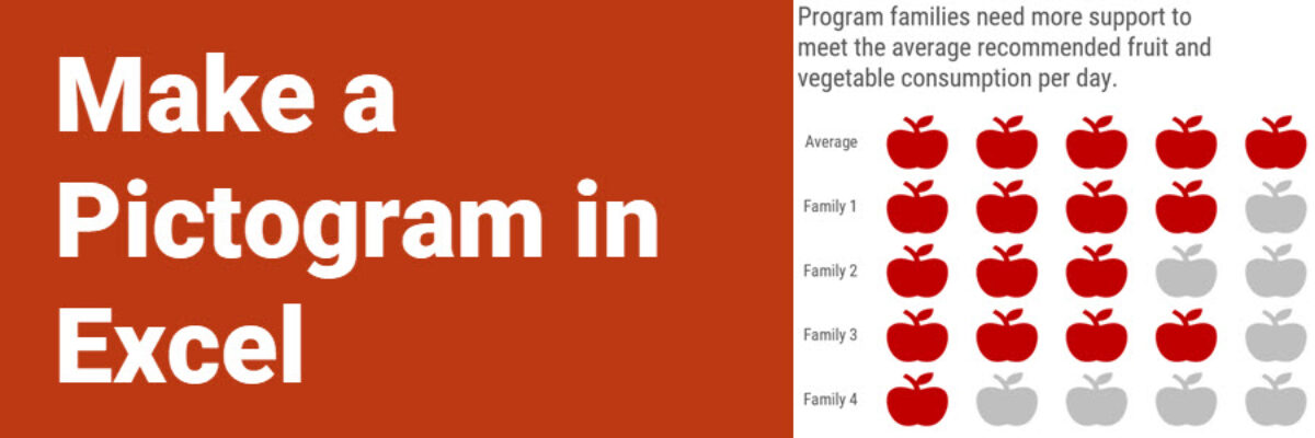
This graph type goes by a lot of names: isotype chart, pictograph, or pictogram. Whichever way, it allows us to use symbols rather than stick with the squares that make up the waffle chart. And it is especially well suited to representing small counts of things that can otherwise be…
Super Fast Small Multiple Graphs in Excel
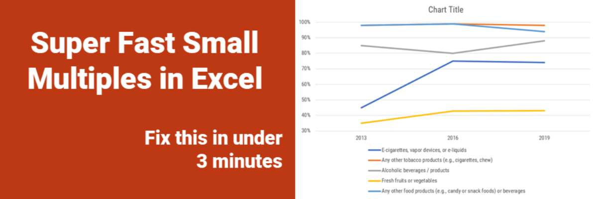
Every time I show this trick to even veteran Excel ninjas, their heads explode. So you have probably heard me preach the gospel of small multiples once or twice before. Breaking a clutter-y graph into a lot of smaller graphs that show one piece of data at…
No Unnecessary Lines
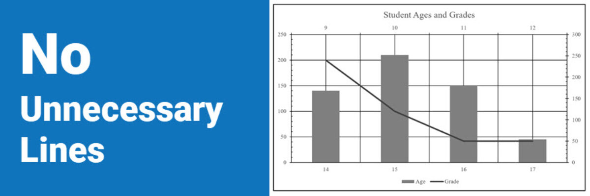
The Lines section of the Data Visualization Checklist helps us enhance reader interpretability by handling a lot of the junk, or what Edward Tufte called the “noise” in the graph. I’m referring to all of the parts of the graph that don’t actually display data or assist reader cognition. Create more readability by deleting unnecessary lines. The default…
Intentionally Order Your Data
Listen, no one cares about the order we listed the response options on the survey. But most graphs, especially those automatically generated from survey software, showcase the data in that order. And that isn’t useful for anyone trying to interpret the data. Instead, place the bars in order from…
My 2018 Personal Annual Report
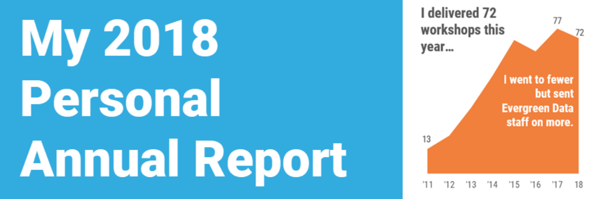
This is my last personal annual report. I’ll tell you why. This year most of my metrics went down. At first, due to cultural conditioning that says “more is always better,” I was like Oh no! Before I go further, let’s pause and break that down. I’ve been creating…
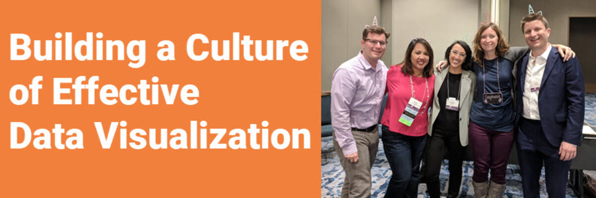
Building a Culture of Effective Data Visualization
The most frustrating part of attending one of my workshops is that you learn so many awesome ways of communicating data, you learn exactly what buttons to push to make it happen, you get hyped up on glee and data vizardry… and then the existing organizational culture stops you from…
We Need More Research on Data Visualization
Stephanie’s Note: Dr. Sena Sanjines just wrapped up her dissertation, part of which measured whether my Data Visualization Checklist is worth its salt. Here are her findings. My name is Sena Sanjines and I’m an evaluator in Hawai‘i slightly obsessed with figuring out what makes people use, or not use,…
