This blog post is part of a series called Asked and Answered, about writing great survey questions and visualizing the results with high impact graphs. Dr. Sheila B. Robinson is authoring the Asked series, on writing great questions. Dr. Stephanie Evergreen is authoring the Answered series, on data visualization. View…
data visualization
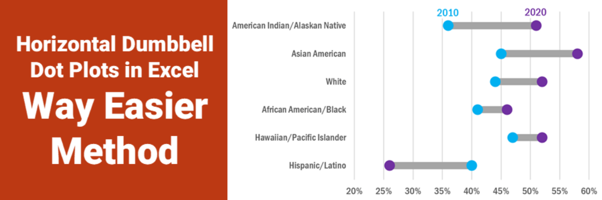
Horizontal Dumbbell Dot Plots in Excel – Way Easier Version
Ok, babes, prepare to be amazed. It used to be that making this viz was pretty tedious but I’ve recently refined a totally new hack (thanks to a lollipop chart example provided by Sevinc Rende, one of my mentees) that makes this soooooooo easier. It used to be Rockstar…
Asked and Answered: Visualizing Check All That Apply
This blog post is part of a series called Asked and Answered, about writing great survey questions and visualizing the results with high impact graphs. Dr. Sheila B. Robinson is authoring the Asked series, on writing great questions. Dr. Stephanie Evergreen is authoring the Answered series, on data visualization. View…
Asked and Answered: Visualizing Rating Data
This blog post is part of a series called Asked and Answered, about writing great survey questions and visualizing the results with high impact graphs. Dr. Sheila B. Robinson is authoring the Asked series, on writing great questions. Dr. Stephanie Evergreen is authoring the Answered series, on data visualization.
Announcing The Evergreen Data Certification Program
Have you ever signed up for an online course with really good intentions, only to find yourself barely checking in a couple months later? In The Evergreen Data Certification Program, we will not let you fade away. When you commit to The Evergreen Data Certification Program, you earn a…
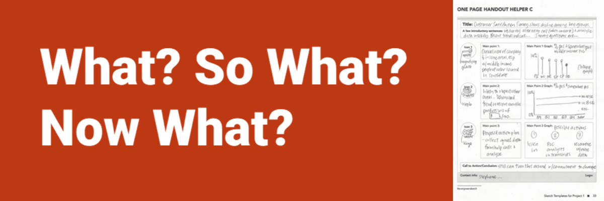
What? So What? Now What?
People who are short on time (i.e., most everyone) have these three questions on their mind, in this order. What’s going on? What does this mean to me? What are we (actually, YOU) going to do about it? The shorthand way of structuring that storyline: What, So What, Now…
Calling the Data Viz Curious
Ever spot those gorgeous graphs in the New York Times or the Washington Post and wish you could make them? You can. And you don’t need fancy software to do it. Good graphs, at their core, are based on a few fundamental principles of data visualization design, a structured…
Decade of Data Viz
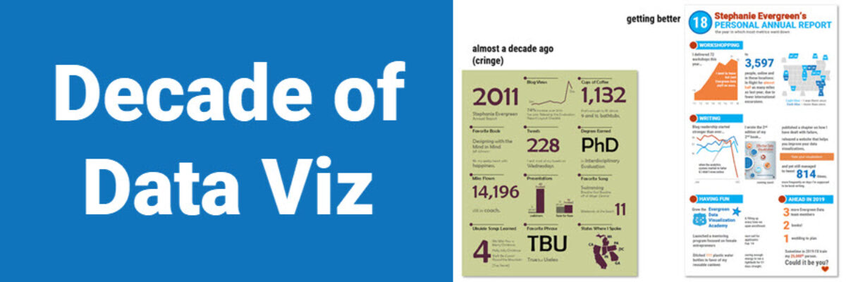
Well, that just flew by. Ten years ago, I was in the throes of writing my dissertation on Presenting Data Effectively, knowing I had focused on a topic that the world was hungry for, even if they didn’t know it yet. I had collected enough literature and data to know…
Four Ways to Show Projections
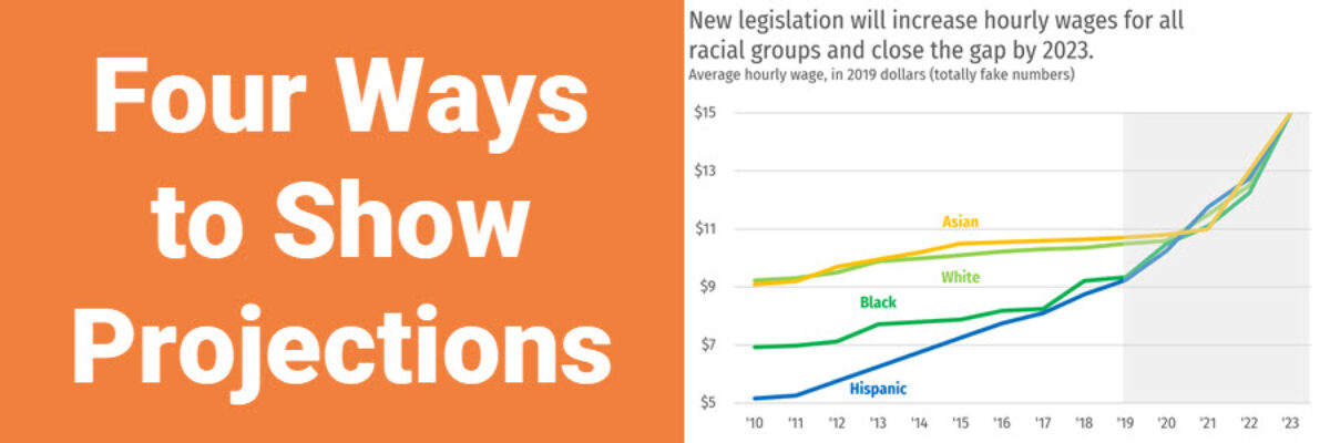
Of course we all want to know what will happen in the future. These days folks are looking at data like it has a crystal ball. To the extent that we provide our audiences with projected data, let’s talk about ways to visualize the projected data. Because here’s the thing:…
When Will Bad Infographics End?
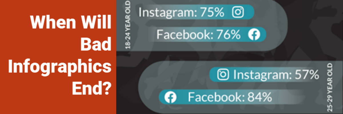
Back in November of **2010** I set up a Google Alert for “infographic.” Oh, I thought, these are an interesting development in how we communicate data. But either the quality of the design will drastically improve or these things will be a fad that disappears within a couple years.
