Have you ever accidentally taken one step too far down the internet rabbit hole? This has happened to me more than once when I’m trying to google the solution to why my chart isn’t working. I click into a Q & A forum that teases the answer – but the…
data visualization
COVID Data Viz
Star Wars or Star Trek? I totally wasn’t expecting this MD to pitch me that question on live TV. Good thing I have a teenage son who has spent years preparing me for the right answer. The docs on the Medical News Network brought me on to talk…
4 Chart Types that Fight for Equality
While ANY chart can fight for equality, if you plug the right data into it, these four in particular make the story jump off the screen.
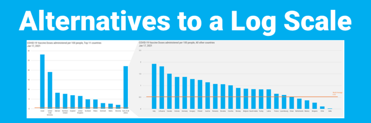
Alternatives to a Log Scale
Over in our private Academy Slack group, one of our members asked a solid, totally not snarky question about log scales. They’ve been common in visuals about COVID and there’s a fair question out there about how appropriate those are in graphs aimed at public consumption.
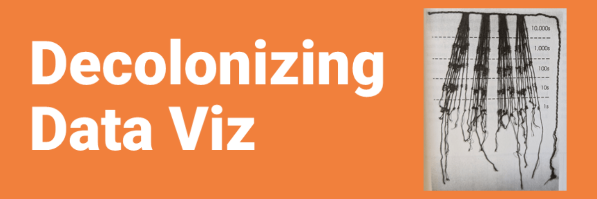
Decolonizing Data Viz
What is Data Visualization? A visual representation ofquantitative or qualitative data. so says Stephanie Evergreen. The strength of this definition is that it is so broad, lots of things fit under its umbrella. But perhaps that is also its weakness because it leaves what counts as data open to interpretation…
Communicating Data is About Handling Egos and Emotions
Behind every furrowed brow and annoying question about your slide is someone’s ego getting dinged. People don’t like their egos dinged. This tiny bit of emotional intelligence will give you massive insight into how to handle tough data communication scenarios we all find ourselves in at one point or…
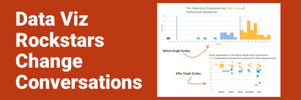
Data Viz Rockstars Change Conversations
Audrey Juhasz has been in The Evergreen Data Certification Program for about 4 months. In that time, she has learned some super do-able and highly effective lessons that have totally changed the way she and her team are able to talk to each other. This data viz rockstar is changing…
The Problem with “By the Numbers” Infographics
My heart breaks every time I see an infographic called By the Numbers. It’s as if someone in leadership said “Let’s report ‘our numbers’ this year – and put it in one of those infographics.” Someone in Communications got on board because they believe infographics grab attention. And some poor…
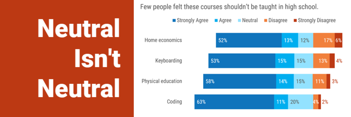
Neutral Isn’t Neutral
When you are asking your survey respondents to report their feelings or sentiments, it can make sense to provide a neutral response option. Sometimes. Other times I think we provide that option just because we think we should, because of convention. Dr. Sheila B. Robinson discusses when a neutral…
Asked and Answered: Visualizing Demographic Data
This blog post is part of a series called Asked and Answered, about writing great survey questions and visualizing the results with high impact graphs. Dr. Sheila B. Robinson is authoring the Asked series, on writing great questions. Dr. Stephanie Evergreen is authoring the Answered series, on data visualization.

