Tell me if this sounds familiar. Back when I was at the university, doing research full time, we’d produce reports where the front contained all our quantitative results and the back held our qualitative findings. We coulda been talking about the same themes in both sections but it was up…
data visualization
Questions to Ask When Examining a Graph
Does the story told in the headline match the data used to bolster it? It’s really common for people to read a tweet and take it as the truth. Especially when it comes from official accounts like the White House. And while the Trump White House was notorious for it’s…
When to Viz
One of the biggest barriers to making great data visualization is the time it takes to do so. But that’s typically because we wait to start visualizing until it’s late in the game. This post is on when to viz. The Typical Data Visualization Process Let’s say you want to…
Sharpen your Clutter Detector
Clutter shows up as all the unnecessary little things in your graph – anything that isn’t contributing to engagement with the data. You might think the little stuff can be overlooked but when you accumulate multiple graphs and their clutter into a dashboard, it feels too busy and overwhelming and…
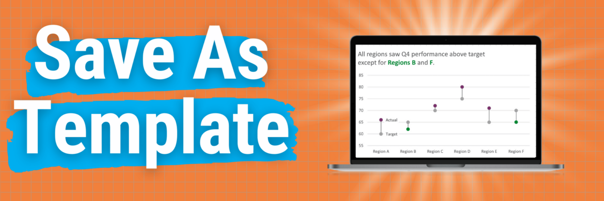
Save as Template
This is my A+ #1 100% best time-saving hack for making graphs in Excel. When you go through the process of making that one graph that’s totally perfect, you can save it as a template so it becomes, essentially, your new default graph. Here’s how. Right-click somewhere in…
Signs Your Data Viz Sings
I wish that every awesome data viz presentation ended with each coworker blasting a confetti popper over your head. The reality is that when your data viz sucks, you know it loud and clear. When it sings, you often can’t tell. This post is not going to provide an anatomy…
Signs Your Data Viz Sucks
You might have landed here because you thought this was going to be a post full of snarky commentary on mediocre graphs. It isn’t. In fact, I’m not going to include a single data viz. Because what makes a data viz suck or sing isn’t just about its outward…
Introducing the Power BI Chart Starter Series
Everyone wants a dashboard. But making a GOOD dashboard can be as hard as snagging a selfie with Beyonce. The friction I see most often is because the dashboard software is confusing to use. It’ll get you feeling like you’re groping around in the dark for the light switch.
Data Viz Audiences
When people aren’t 100% sure you are talking to them, they ignore you. (Heck, when I’m jogging and the dude in the car is clearly talking to me, I still ignore him.) You want your audience to immediately see themselves in your data and how that data story is relevant…
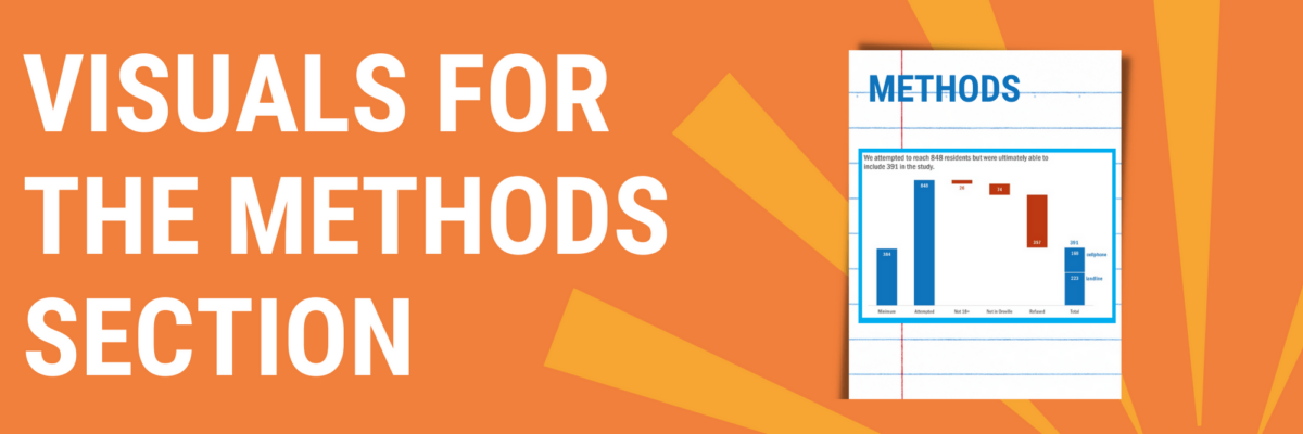
Visuals for the Methods Section
You can tell when someone is getting their data viz eye well-honed because they start asking where ELSE can I include visuals that will better explain my work? That’s Sue. She had grown comfortable with high-impact, story-telling charts in the Results section of her reporting but…


