My 2012 Personal Annual Report

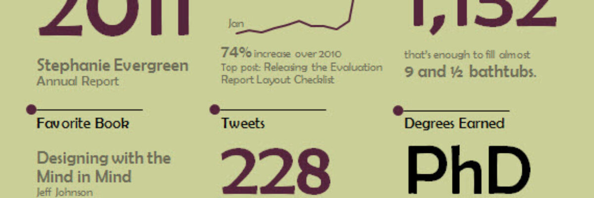
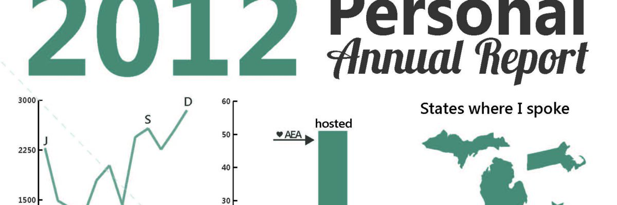
Yeah – It’s that time of year again! Here’s what I’ve been up to. Imagine if we could convince more clients to let us produce evaluation report summaries in this dashboard-esque format. Side note: I deviated from my normal routine and made this report…

Read More

Before & After Slides: Stay on the Side of Simplicity

My friend, Kurt Wilson, and I just wrapped up a contract to revise a set of slides – and the graphs within – for a big international client I can’t name. Here I’ll walk through one of the original slides and our revision of it. Keep in mind that these…

Read More

Making Back-to-Back Graphs in Excel

Let’s say we’re interested in comparing how two groups – oh, teachers and principals – responded to a survey. One way to visually display that comparison would be a bar graph, where each question had two bars, one for teachers and one for principals. It’s helpful in some ways, but…

Read More

More Images: The Dissertation Breakdown

At this time last year I was putting the final touches on my dissertation manuscript format and preparing for my defense. I looked at the extent of graphic design use in evaluation reports. I gathered about 200 summative evaluation reports from the repository at Informal Science Education, trained…

Read More

Beer Delivery Visualization

Time to tackle some of the more important parts of life. I saw this delivery schedule in a cooler at a DC Whole Foods. Bell’s Beer is from Kalamazoo and we take pretty big pride in our hometown beer. So we (I mean, I) get really geeked when…

Read More

Proper Placement of Chart Legends

In my dissertation study (probably the most boring four words to start any blog post), I saw a lot of evaluation reports that grouped all tables and graphs into the appendix. Tables, graphs, and other graphics really must be placed right next to the narrative describing them. Why? When we…

Read More

What Exactly is Happening in this 3D Chart?

When giving advice about chart styles, one of my friends likes to say “save 3D for the movies.” She’s right – research shows that 3D charts actually slow reader comprehension. I’ve long advocated for the use of ChartTamer as a friendly way to restrict data visualization to that which will…

Read More

Releasing the Evaluation Report Layout Checklist

So I made this lovely checklist of graphic design best practices as a product of my dissertation (Standing Rule: If you want to know the details of my dissertation, you’ll have to buy me a drink). It included input from a panel of graphic designers including Peter Brakeman,…

Read More

The Year of Data Visualization and Reporting

On the plane, heading back from the American Evaluation Association’s annual conference in Anaheim. Long plane rides such a great opportunity for reflection. What’s on my mind? The overwhelming success of the Data Visualization and Reporting Topical Interest Group. We had so much support in getting this group launched…

Read More