Guest Post – Charting Confidence Intervals

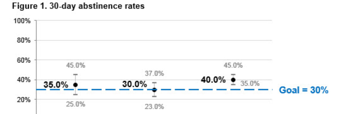
Hi there! I’m Angie Ficek and I’m a program evaluator at a small evaluation consulting firm called Professional Data Analysts, Inc. (PDA) in Minneapolis, MN. In a previous post, Stephanie wrote about adding standard deviations to a dataviz. I responded to her post with an example of…

Read More

Adding a Benchmark Line to a Graph

This simple line packs so much power. Adding a benchmark line to a graph gives loads of context for the viewer. Here’s how to make one right inside Excel. It’s so easy you might pass out. My data table looks like this: I have my data and I have the benchmark…

Read More

An Incomplete List of Females in Data Visualization

I rewrote this post 4 times, in an effort to give it a calm and professional tone. And then I thought “Ah fuck it, this is my blog and I can say whatever I want.” I’m writing this post because I just listened to an interview about data visualization. It…

Read More

Labels are Used Sparingly

This post is about how to avoid inducing claustrophobia in your data visualizations. Too much text on a graph clutters it up, making readers feel suffocated. So let’s address the checklist item Labels are used sparingly. Sometimes, too much text isn’t the issue. Take…

Read More

My 2013 Personal Annual Report

Holy crap, 2013 was a busy year! Look what I’ve been up to – and click around: [gview file=”http://www.stephanieevergreen.com/wp-content/uploads/2013/12/AnnualReport2013.pdf”] So, to recap, I’m prrrreeeetttttty sure I don’t have to publish one more thing until 2015. Whew. Some technical notes: Last…

Read More

How to Make a Diverging Stacked Bar Chart in Excel

Last week my friend Ann Emery posted a dataviz challenge on something I’d been wanting to figure out for a long time: how to make a diverging stacked bar chart in Excel (I’d also heard of them as sliding bar charts, but getting our dataviz terminology on the same…

Read More

How to Effectively Present Quotes

When it comes to qualitative data, we have far fewer dataviz tools at our disposal. Another time, promise, we’ll get into word clouds and what Stuart Henderson thinks of them. Today, let’s tackle a more common method of displaying qualitative data – quotes. In reports, quotes are usually shown…

Read More

Who Can Do Dataviz (or How a Field Evolves)

Wow, the action in the dataviz/tech world this past week has been awesome! A female programmer at a Python (that’s a programming language also used for dataviz) conference was fired after tweeting about the sexist jokes she was hearing from a largely white young male crowd, and Tableau’s…

Read More