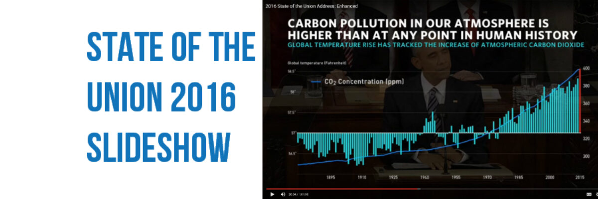
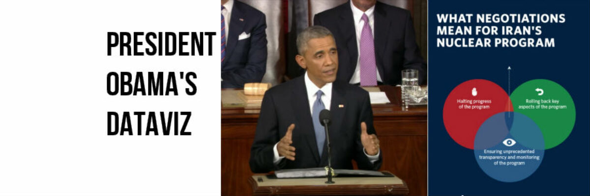
Dudes, the State of the Union is my Superbowl. I look forward to this event like some people anticipate the Oscars. This is my deal. Why? Because the enhanced version of the SOTU features a data-based slideshow, a perfect study in how graphics can help underscore a point. And, as…
data visualization
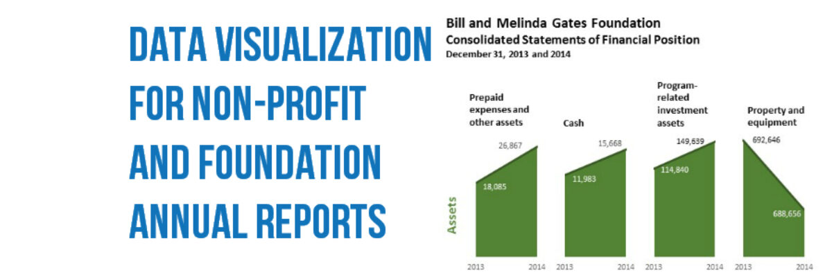
Data Visualization for Non-Profit & Foundation Annual Reports
Annual reports are where non-profits and foundations pull out their designer big guns. This is where they show off their muscles, like studs on the beach. The annual report is the place where an organization oils its accomplishments til they shine. The annual report is so important, most organizations still…
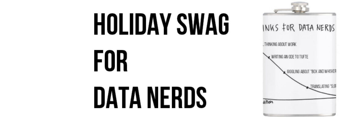
Holiday Swag for Your Favorite Data Nerd
Introducing new designs on practical, household items. I’m talking about graphs on flasks! Your favorite data nerd is going to love one of these. BAM shopping done. Both designs says “DRINKS FOR DATA NERDS.” They have a y-axis which is the amount of liquid remaining in the flask and an…
Professional Standards for Data Visualizers
To my fellow data visualizers: As a field grows in size and maturity, there comes a time to set forth professional standards of conduct, to help us both align our practices and communicate to our potential clients that we are an organized and respectable group of colleagues. Standards need at…
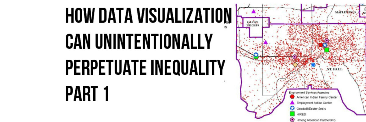
How Dataviz Can Unintentionally Perpetuate Inequality: The Bleeding Infestation Example
Sometimes, whether we know it or not, the choices we make when we visualize data can reinforce and even perpetuate racial disparity and it’s time that we talk about it. The lull of the computer monitor and the belief we are just working with numbers can make us lose sight…
Make a Slopegraph in Excel
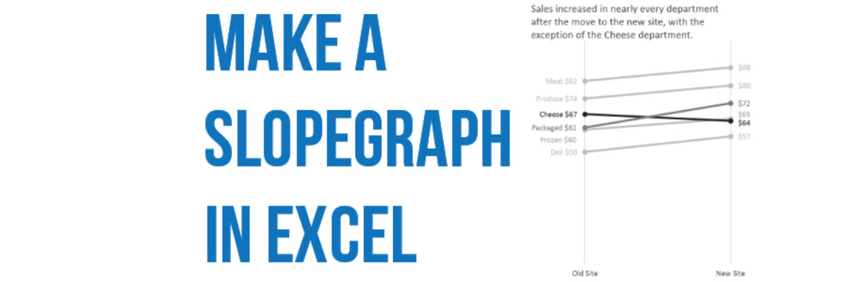
Slopegraphs are a newer graph type with powerhouse capabilities. They rely on Excel’s line graphing feature but they don’t necessarily have to show change over time. Slopegraphs play into our ability to judge slope fairly well. For this reason, they are perfect for highlighting the story of how just one…
I’m a Woman and I Need Data, Too
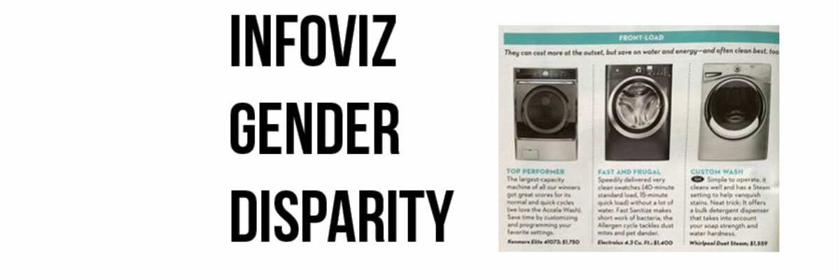
Dear Good Housekeeping, I needed a few new appliances. My old Shark vacuum cleaner bit the dust for the second time and in the same week my washing machine started eating all my towels. So I was interested in the spread from your Good Housekeeping Research Institute, reporting on its expert tests…
President Obama’s Data Visualization
I realize it’s completely taboo to write about current events six months after they’ve happen but I DON’T CARE. One of my favorite events of the year is watching the enhanced version of the State of the Union. Not the regular view – the enhanced view. One side of the…
When I Don’t Mind Radar Graphs
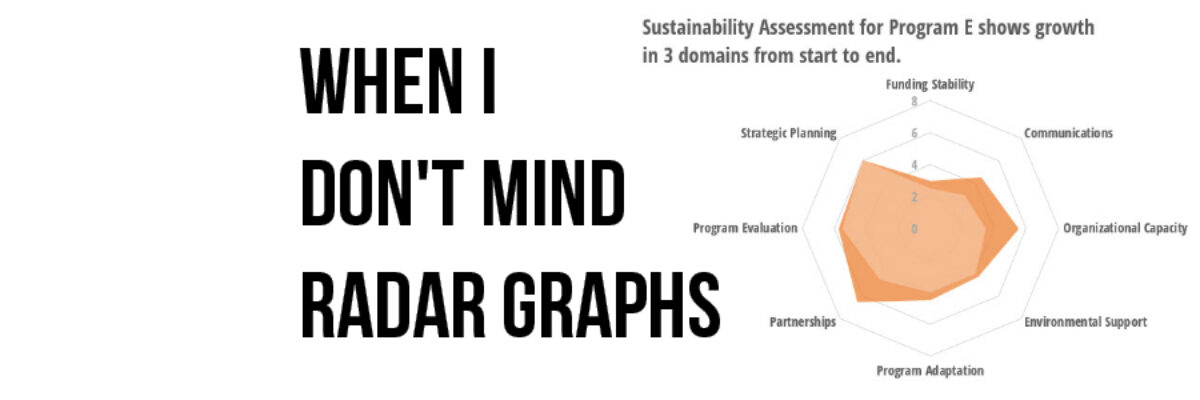
Most of the time, I think radar graph are deployed wrong. They are designed to show percentages along several categories – like a bar graph could – but the axis are distributed around a central point, such that the percentages link together and create a shape. Choosing a radar graph,…
Academia, The Last Bastion of Change
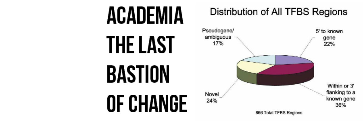
Wherever I travel, without fail, the people who are most resistant to making the necessary changes to present data more effectively are academics. I wish I was kidding. After all, I used to be one. Some of my best friends are academics. Even the young ones who are on…
