How to Show Ranking Data in Excel

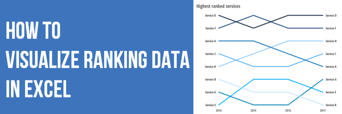
Danielle, a member of my Evergreen Data Visualization Academy, submitted a question to our monthly Office Hours webinar about how to show ranking data. She sent this survey question: There are eight categories below.  Rank each item to continue to the next page.  Rank the following services in order…

Read More

Two Alternatives to Using a Second Y-Axis

Almost as often as I see a pie chart with a hundred tiny slivers, I see line graphs using two y-axes. And it is just as bad. Graphs like this appear in every industry, everywhere I consult all around the globe. Using two y-axes is not a great idea…

Read More

The Data Visualization Checklist

HEY THERE: This checklist is now a website where you can upload your image and we will walk you through each checkpoint, helping you rate yourself. This post has been a long time coming. We knew that people had a thirst for better…

Read More

Strong Titles Are The Biggest Bang for Your Buck

If you do nothing else to improve a weak visualization, you’ll still seriously improve its interpretability by giving it an awesome title. Generally we use weak titles that don’t really tell us the point of the visualization: I think this is because we make our graphs in Excel,…

Read More

Evergreen Data Visualization Academy

The Data Visualization Academy is only open for enrollment twice a year. Come get select access to my best data visualization tutorials and advice. Four years ago today, I took the leap from salaried employee to independent consultant. Since then, I’ve worked with scores of organizations to help them use…

Read More

Exporting Graphs from Excel

I love when readers send me questions that I can turn into blog posts. The question: We often make our graphs in Excel and pop them in to reports or slides, but the transfer usually causes the formatting to get all wonky. How can we get print-quality graphics out of…

Read More

My New Favorite Graph Type: Overlapping Bars

Why have I fallen in love with this graph type? I think its because its such a great way to visualize the comparison between two things, when one is inherently a part of the other. In recent client projects, I’ve used these to show actual v. budgeted amounts. Or individual…

Read More

Guest Post: Best Practices for Control, Run, and Pareto Charts

Nicole contacted me with an email subject line: Thank you for the Data Viz Checklist! and she said she’d been using the checklist to overhaul some of her organization’s data visualizations. I’ve invited her here to showcase her before and afters. I’m Nicole Huggett and I recently transitioned…

Read More

State of the Union 2016 Slideshow

Dudes, the State of the Union is my Superbowl. I look forward to this event like some people anticipate the Oscars. This is my deal. Why? Because the enhanced version of the SOTU features a data-based slideshow, a perfect study in how graphics can help underscore a point. And, as…

Read More

The Most Important Question in Data Visualization

What’s your point? Seriously, that’s the most important question to ask when creating a data visualization. And its the first thing I ask a client who sends me data for redesign. What’s your point? The answers drive nearly everything about visualizing that data. Here’s how that conversation often goes: Client:…

Read More