We are hard core believers that you should become the master of the tools you own. If your company relies on Microsoft, figure out how to use Excel to make amazing data visualizations. If your company invested in a site-wide license for Tableau, climb over that learning curve and master…
chart
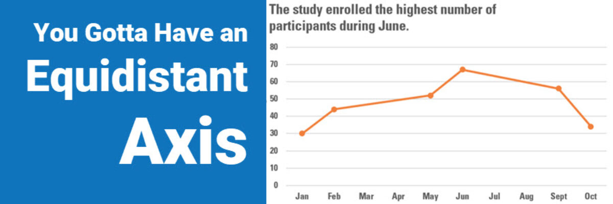
You Gotta Have An Equidistant Axis
Here’s the thing: The scale used on each axis must have equal intervals. It’s an easy mistake to make. Excel automatically spaces your intervals and labels equidistant from one another but it is assuming that your intervals actually are equidistant. In this graph, that’s not the case. We are missing…
Make a Pictogram in Excel
This graph type goes by a lot of names: isotype chart, pictograph, or pictogram. Whichever way, it allows us to use symbols rather than stick with the squares that make up the waffle chart. And it is especially well suited to representing small counts of things that can otherwise be…
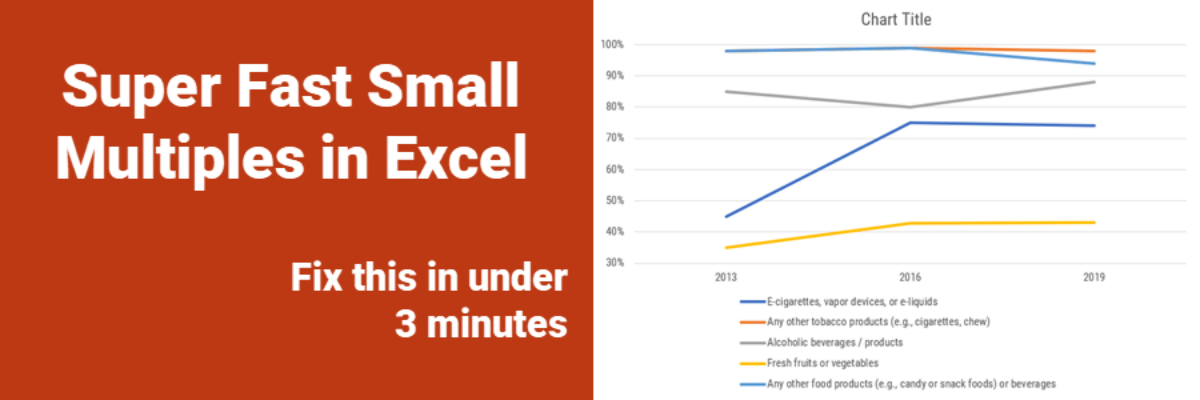
Super Fast Small Multiple Graphs in Excel
Every time I show this trick to even veteran Excel ninjas, their heads explode. So you have probably heard me preach the gospel of small multiples once or twice before. Breaking a clutter-y graph into a lot of smaller graphs that show one piece of data at…
Intentionally Order Your Data
Listen, no one cares about the order we listed the response options on the survey. But most graphs, especially those automatically generated from survey software, showcase the data in that order. And that isn’t useful for anyone trying to interpret the data. Instead, place the bars in order from…
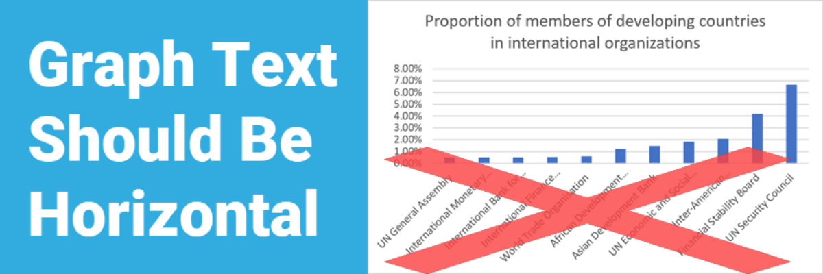
Graph Text Should Be Horizontal
In languages based on the Latin alphabet, we read horizontally, from left to right. Reading on a diagonal produces cramped necks. Reading vertical text is just not going to happen. So, as much as possible, the text in our graphs should be horizontal. Let’s walk through a demo. I was…
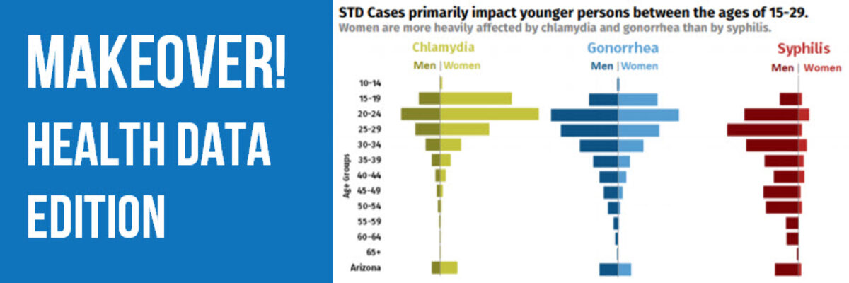
Makeover: Health Data Edition
By far, my favorite emails to receive are from clients bragging about the beauty and impact of their work after our workshop. I just got one of these the other day from Becca Scranton at Arizona Department of Health Services. After thanking me for the workshop, she wrote, “Thanks to…
Announcing The Interactive Data Visualization Checklist
If you’ve been anywhere near the world of graph making in the past several years, at some point someone probably sent you the Data Visualization Checklist, developed first in 2014 by me and Ann Emery. We built the checklist based on the best available research I was seeing via…
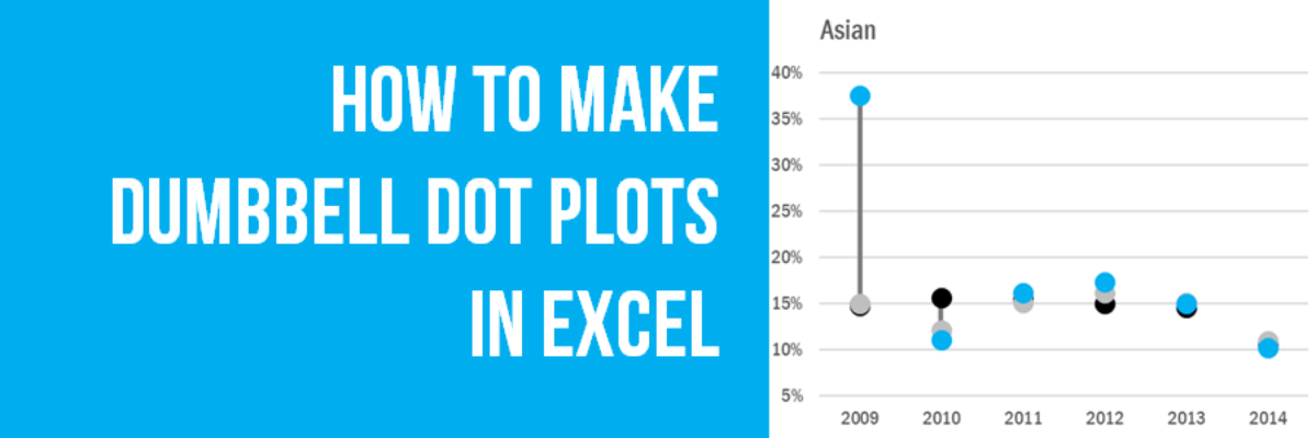
How to Make Dumbbell Dot Plots in Excel
Data visualization is so cool because it helps you see things that would otherwise take a looooooot of effort. Here’s an example. Some very sweet clients in Maricopa County, Arizona (that’s the greater Phoenix area, friends) had a habit of presenting super important data in the most hard to digest…
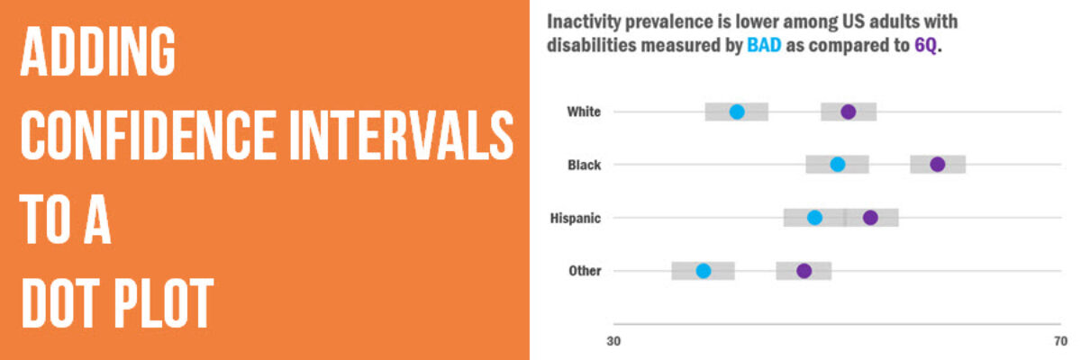
Adding Confidence Intervals to a Dot Plot
Evergreen Data Visualization Academy member Dana McGuire recently wrote me to ask about her dot plot. She said, “Would there be a way to show the bar or confidence interval somewhere? I have gotten positive feedback on the look of the graph overall, but it is a scientific conference…
