Title Charts Like A Journalist

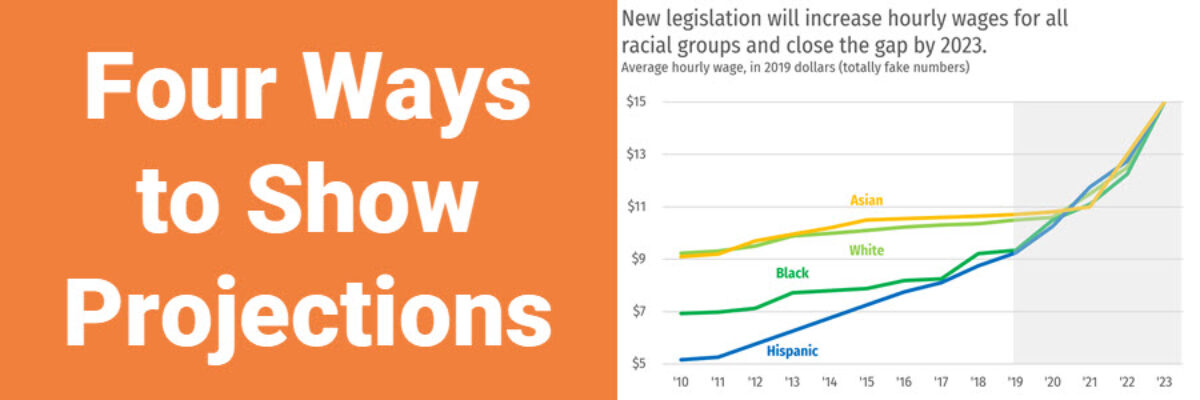
When you spend the bulk of young adulthood in research-focused academic institutions, like I did, you are steeped in a culture that tells you, explicitly or implicitly, that you can’t ever really make a claim. Taking a position on something can be seen as biased. Claiming an insight can be…

Read More

So COVID Interrupted Your Data Collection…

Kristi is a researcher in the Truman School of Public Policy and a rockstar member of my Data Visualization Academy. She was working on a study of an after school sexual health program when COVID happened, knocking her data collection strategy to its knees and leaving her without much…

Read More

Great Charts Make Even Better Entrepreneurs

Meet Tamara Hamai. She’s the hardest working entrepreneur I know. Her primary business, Hamai Consulting, partners with non-profits in the family and education space to get them useful data. If you get to partner with her, you are lucky. She’s got a knack for running complex studies and explaining…

Read More

Data Viz Rockstars Change Conversations

Audrey Juhasz has been in The Evergreen Data Certification Program for about 4 months. In that time, she has learned some super do-able and highly effective lessons that have totally changed the way she and her team are able to talk to each other. This data viz rockstar is changing…

Read More

Asked and Answered: Visualizing Demographic Data

This blog post is part of a series called Asked and Answered, about writing great survey questions and visualizing the results with high impact graphs. Dr. Sheila B. Robinson is authoring the Asked series, on writing great questions. Dr. Stephanie Evergreen is authoring the Answered series, on data visualization.

Read More

Asked and Answered: Visualizing Ranking Data

This blog post is part of a series called Asked and Answered, about writing great survey questions and visualizing the results with high impact graphs. Dr. Sheila B. Robinson is authoring the Asked series, on writing great questions. Dr. Stephanie Evergreen is authoring the Answered series, on data visualization. View…

Read More

You Probably Need Gridlines

A while back, I published a blog post on how Better Charts Tell Clearer Stories, in which I made over some breast cancer data from Komen into this graph: and when I posted this image on Instagram, someone commented that they didn’t understand why I had used gridlines, apparently…

Read More

Asked and Answered: Visualizing Check All That Apply

This blog post is part of a series called Asked and Answered, about writing great survey questions and visualizing the results with high impact graphs. Dr. Sheila B. Robinson is authoring the Asked series, on writing great questions. Dr. Stephanie Evergreen is authoring the Answered series, on data visualization. View…

Read More

Calling the Data Viz Curious

Ever spot those gorgeous graphs in the New York Times or the Washington Post and wish you could make them? You can. And you don’t need fancy software to do it. Good graphs, at their core, are based on a few fundamental principles of data visualization design, a structured…

Read More

Four Ways to Show Projections

Of course we all want to know what will happen in the future. These days folks are looking at data like it has a crystal ball. To the extent that we provide our audiences with projected data, let’s talk about ways to visualize the projected data. Because here’s the thing:…

Read More