Every time I show this trick to even veteran Excel ninjas, their heads explode.
So you have probably heard me preach the gospel of small multiples once or twice before. Breaking a clutter-y graph into a lot of smaller graphs that show one piece of data at a time can make interpretation a whole lot easier for your audiences. Cause it’s nice to actually be able to see things.
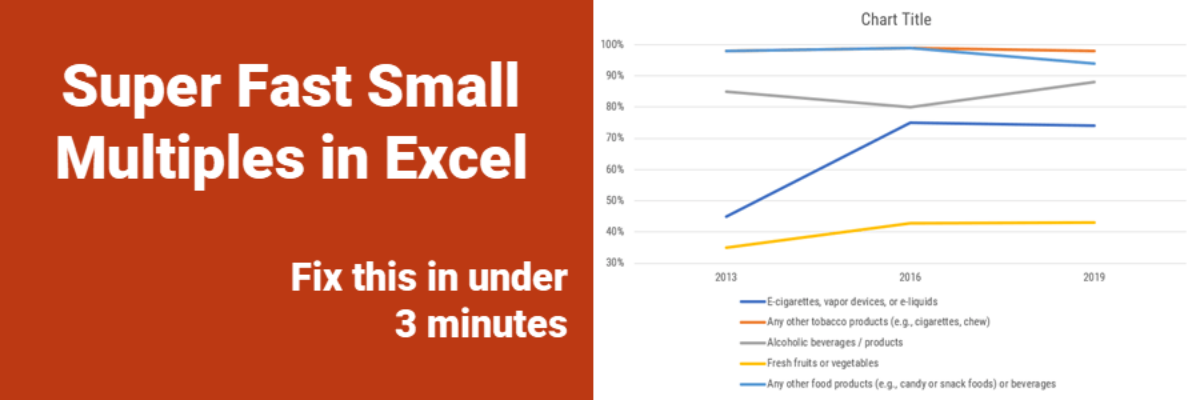
This sort of visual is challenging, what with the disconnected legend and some data values that overlap. Perfect candidate for small multiples – a series of small charts.

I’ll break the data out into 5 graphs, one line per graph. It could be 15 minutes of tweaks to each graph to work out Excel’s defaults and make all 5 look wonderful. You can probably handle 15 minutes, but what if this graph had 20 lines in it? Sounds tedious. Here’s the quick way to generate small multiples.
Make the first graph with just one trend line in it. Make it beautiful. Make it perfect. Then copy it and paste a duplicate right next door. When clicked into the duplicated graph, you should see that the data it is graphing are highlighted in blue back in the spreadsheet. See it?

Just drag that blue to new data and the graph will update.
I’m not even kidding. Try it.
Put your mouse on the edge of the blue space. Your cursor will turn into a double-headed arrow cross thing. Then click and drag the blue to the next line down. POW. You’re done.

So easy! If this move deletes the formatting you did to your first graph, take one more step. Go back to your first graph and click Copy (in the Home tab). Then click in your duplicated graph and select the drop down arrow under Paste. Click Paste Special and then click Formats.
You’ll be knocking out small multiples so fast, you’ll have time to write me an email about how great that was.
I taught this technique to Evergreen Data Visualization Academy members during one of our monthly Office Hours calls. Sue had submitted a complicated line graph and wanted advice on how to display it better. I fixed her line graph, live, and showed everyone on the call how to do this. Comments in the chat box included “WHAAAAAAA?!” and “Do that again!”
That’s the kind of help you get in the Academy. In addition to dozens of tutorials on how to make high impact graphs, I show you all my little secrets that will give you your life back. You get my hands-on help with your tricky data visualizations.
Enrollment in the Academy is only possible during short windows, open just twice a year.

If you have been looking for online training to help you improve your data visualization skills, join us. We will make your life better.
