guest post by Jenny Lyons

When presenting qualitative data, we want to balance visuals that are broad enough to display the full set of data but are also visualized in a way that allows viewers to pull stories from the data. This is a hard balance to strike, and a spectrum display can do so very well. A spectrum display compares the relationship between qualitative cases and themes, using a simple, at-a-glance visual.

Let’s look at an example and break it down. This one was originally cited in Stuart Henderson’s article “Visualizing Qualitative Data in Evaluation Research” (a great article if you haven’t read it):

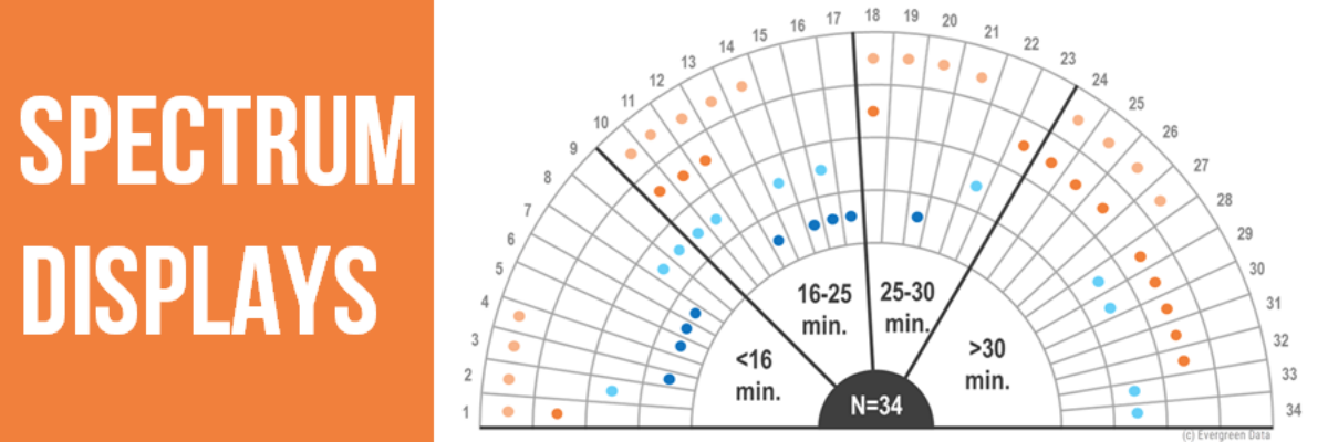
The spectrum display shows summarized data collected from open-ended interviews and observations of how 34 library computer users spent their time (Slone, 2009). The labels on the outside (P1 – P34) are different individual cases or people. The researchers were observing different activities like paying bills, searching, job, and email. Each ring in the spectrum display represents data for each activity. The kicker is that you must have a mutually exclusive variable, which, in this example, is time spent doing that activity. This is how the cases are ordered.

The benefit of using this visual is that it allows you to see data stories like: 1) Most people who used the computer for more than 30 minutes were doing job related things, and 2) Signing up and paying bills took less than 25 minutes for all participants but one. These data stories open the door to better understanding. This display can make those data come to life better than the typical qualitative reporting method of page after page of narrative text. Below is this same chart but employing other effective data visualization best practices like impactful titles, intentional use of color, and some de-clutter action.

There are two limitations to this graph type that I want to mention before we move along to making this. 1) The chart drills all our qualitative down into codes and symbols. It can be easy to lose the person behind the dots. 2) You need to have a mutually exclusive variable, which not all qualitative data sets have.

The reality is that there is no easy way to make this chart. It takes some creative thinking and PowerPoint hacks. Below are the steps that I take to make this in PowerPoint.

1. Make concentric circles for the number of activities or themes you are tracking (plus one). I inserted 5 circle shapes, with no fill. I made the difference in size decrease by 1 inch. Make sure the smallest circle has a white fill.

2. Then insert a smaller circle for the bull’s eye center.

3. We need enough rows for each participant, equidistant around the circle. Insert 34 horizontal lines that are the same width as the circle diameter. I am inserting 34 lines because there are 34 people that were a part of the research. Now, divide 180 by the number of people, in my case 34. I get 5.29. We need each line to the 5.29 degrees different from each other. The problem is PowerPoint does not let you enter decimals for degrees, only whole numbers. Therefore, we are rounding down to 5 degrees for most. To fill up the 180 degrees, 10 lines will have a difference of 6 degrees and the rest will have a difference of 5. This will not be 100% perfect but it is as close as we can get.  To change the degrees on a line, right click and go to Size and Position. Then, you can edit the degrees. Each line should add 5 degrees beyond the first line. The first line should have 0 degrees and be completely horizontal. After you get all the lines in there, align them to the middle and center. It should look like this.

4. Now, you will align these lines center and middle to the circles. You will need to bring the grouped circles to the front, then group. It should look like this.

5. Now, we need to make each of our 4 mutually exclusive category lines darker grey and bring them to the front. You might need to play with ungrouping and arrangement to get it right. This is what it should look like.

6. This is the basic structure and all you need to do is delete the bottom half and insert text boxes and dots. To delete the bottom half, make sure everything is grouped. Copy and paste it as an image, then “cut” the bottom half of the image off.

7. Let’s insert text boxes for all the text.

8. Now, add color coded activities in text boxes and corresponding dots.

9. The last step is to add a rock star title that emphasizes my two takeaway points.

In 9 steps, you are now on your way to making some awesome spectrum display charts! This chart gives you the power of presenting your whole data set while still displaying overall themes and stories in the data.

Check out other methods for visualizing qualitative data in our growing Collection.

We recently invented a process to make spectrum displays right inside Excel. And Tableau. And R. Come find the instructions in our Academy or The Evergreen Data Certification Program.

Learn something new?

Share this helpful info with a friend who needs an extra perk today or post it to your social where your third cousin can benefit, too.