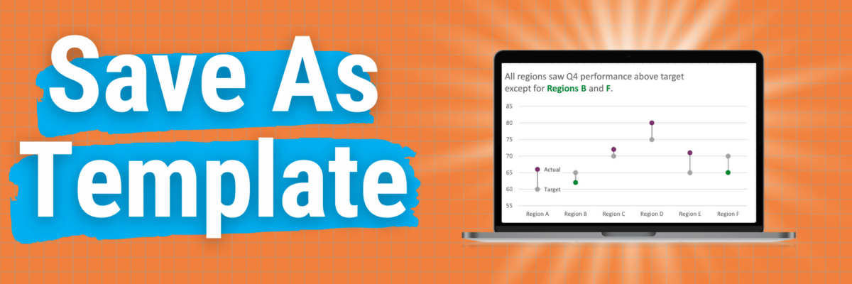
This is my A+ #1 100% best time-saving hack for making graphs in Excel.
When you go through the process of making that one graph that’s totally perfect, you can save it as a template so it becomes, essentially, your new default graph.
Here’s how.
Right-click somewhere in the background space of your graph. In the right-click menu, click on Save as Template. Yeah, it’s been there all this time and you probably just didn’t see it.
That’ll open a directory. Yours will be empty, but look how many templates I’ve saved over the years. One for every graph I make repeatedly.
Do not try navigating away from this directory path. Don’t go tryin to save this in a shared folder or anything. Your only job is to type the name of your chart where you are prompted and hit Save.
Nothing much will happen at first. But you can test out how you’ll use this in the future.
Just go back to your spreadsheet and highlight your data again, like you are making a graph from scratch.
For PC people, head to the Insert tab, like you normally would and look in the Charts family of buttons, just like usual.
This time, though, click on the big Recommended Charts button.
That’ll open a new window. You’ll see two tabs at the top: Recommended Charts and All Charts. Click in All Charts. In there, on the left, you’ll see a folder of Templates. Yeah, it has also been there all this time.
You’ll see previews of all of your saved templates in there. Click on your chart, click OK, and you’ll be pretty much done.
Mac people, above the typical Excel menu tabs, you’ll see *another* menu, like a super menu. It will also have an Insert heading. Click in there. That’s where you should see an option for Templates.
Either way, if your original data layout in your spreadsheet is different from how you have your data laid out in future charts, your template might pop in looking a little funky. If that happens to you, click on the Switch Row/Column button (on Macs this is Switch Plot).
You should see your finished graph, with the fonts, colors, and modifications you made to your original. Amazing, right? I know.
A few considerations:
- If you changed the scale of your chart, all of your future graphs using that template will be on the same scale. So sometimes I save my templates BEFORE I make final, unique modifications like changing my axes. Then, once I use the template, all I need to do is check my scale.
- The more you hack a chart, the more you may need to modify your template. Still, even the most complicated templates get me 85% of the way to the finish line.
- The template will only encode changes to as many data series as you have in your original chart. For example, if you made a slope graph with 4 lines in it, that’s 4 data series. If you made each line thicker and added labels to either end and then save it as a template, your template will only have those mods on the first 4 lines in future charts. You feel me here? So you might wanna spend a few minutes and make a massive slope graph (as one example) that has lots of lines all formatted like you want so that your template is covered.
Even with these considerations, you are going to save approximately a billion hours of your life by using templates. You’re welcome.
You can even share these templates with other people. Once you get into your directory of templates, you can copy them out of there and add them as email attachments or files on a flash drive. Your bestie just has to make any graph, right-click on it, select Save as Template and then drag all of your files into her directory. So cool, right?
Now here’s the deal. I just gave you a gift: many hours of your life back. In exchange for this gift, you must do something worthy with that time. Do not just scroll through Facebook. Plant a tree. Read a book to a kid. Share this blog post with someone else and spread the joy.


