By far, my favorite emails to receive are from clients bragging about the beauty and impact of their work after our workshop. I just got one of these the other day from Becca Scranton at Arizona Department of Health Services. After thanking me for the workshop, she wrote, “Thanks to you, we reworked our 2016 Annual Report. We cut out walls of unnecessary text, reducing what was once a 56-page report to 14 pages (excluding appendices). This year we purchased a Data Academy license for one of my epidemiologists. I look forward to continuing to improve our data and hope to apply your methods to all of the work we do.”
HIGH FIVES, BECCA!
Let’s take a look at how far they’ve come.
Their old report was looking like this:

and this

with an executive summary like this

and even though this is reporting on super important data like STDs, they were pretty sure no one was getting a lot out of their report.
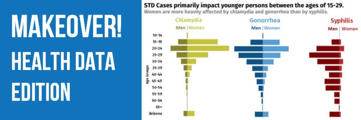
Fast forward through our workshop to the next reporting cycle. Just one year later, their report looks like this

and this

with an executive summary like this

YES PLEASE! Awesome work.
I asked Becca to share some of their behind the scenes secrets.
Q: What software did you use to make this?
A: Everything was done in Word and Excel. We also used Flaticon for some of the icons, others were created using shapes in word.
Q: How long did the report process take?
A: The report took about 2-3 months to write and the rest of the time was spent waiting for data to be finalized and approvals from management and the media team. We ran some preliminary numbers over the summer, but we really didn’t start the report until October. We also had to start and stop a couple of times because there were some bad habits that needed breaking. By early December, we were able to submit the report to our Manager and then to the media team for approval.
Q: The report is for 2016 but it is 2018. Is the delay due to getting the data, analyzing it, reporting it, something else, or a combination of those things?
A: Our annual data is ‘frozen’ during the last week of April and CDC doesn’t release their numbers until the end of September. During this time we have several other reports that take priority. We usually start working on the annual report in October and try to get it out by the end of November, but we almost always publish our final report in January/February. Knowing what we know now, I’m hoping to get the 2017 report out by early December.
Q: How did you convince the right people that this change in the visual nature of the report was necessary?
A: We were lucky to have the support of my boss and upper management. They really understand that we needed to make a change.
Q: What kind of reaction have you gotten so far to this report? Anything related to its high impact visuals?
A: We’ve gotten a lot of positive reactions. Our County partners have started coming to us for questions about data visualization, the HIV team is ‘competing’ with us to improve their annual report, and the STD Team (as well as other groups at ADHS) were recognized for their contributions toward data visualization by our Director just this week. We also seem to be getting better questions from reporters about our data. Earlier this week, we had a reporter submit questions by email. She actually referred to the data displayed on our STD data dashboards!
Folks, read those impacts again. HELL YES!
Check out the full report here. For kicks, check out their old report. Even the cover design is a major improvement.
Read more about our workshops for data analysts so you can experience the same communication shift as Becca’s team.
Academy membership is closed for enrollment until this Fall but you can learn more about what’s inside and sign up to get early notification.
