Journey maps are some of the most bad-ass visuals I know about. With origins in customer experience and human-centered design, a journey map shows how a client moves through your organization.
Seeing the actual journey a customer takes can be eye-opening for people on staff who only work on one small part of a project. Journey maps can show areas of strength and weakness. They depict the customer’s path.
There are a couple of different contexts for using journey maps, but I find them best used when you’re trying to explore and better understand something that is vague, open-ended, and specific to people’s unique experiences. In both the business and nonprofit industries, it’s easy to be out of touch with your customer.
You build a product or design a program meant to meet demand and need, but are you? Boat loads of stats can be run on product sales, program metrics, and even survey data, but at the end of the day, we often fall short from getting a true understanding of the people we are trying to serve and what it is like in their shoes.
This is where qualitative methods, specifically journey maps come in handy. In journey mapping, you are essentially mapping a customer or client’s journey through your organization. Every single touchpoint with your organization has an impact on customer’s interest, satisfaction, and loyalty.
Journey maps combine the powerful use of both storytelling and visualization. This process gives power to your customer and clients to create a shared vision and at the end of the day leads to stakeholders and organizations learning more about the experiences of their consumers.
When the Smithsonian Office of Visitor Services mapped out their customer experience with a journey map, they were able to identify pain points for first-time visitors, such as inadequate signage and confusing entry logistics. Samir Bitar, past Director, used this journey map to get support from decision-makers to initiate necessary changes, eventually leading to the acclaimed Trip Planner.

Listen here to an interview with Samir to get the scoop on how this whole thing went down.
You don’t need the resources of the Smithsonian behind you to make your own journey map. It is just that building one requires collecting data in a very specific manner. This is one of the few qualitative examples that is both a visual and data collection method rolled into one.
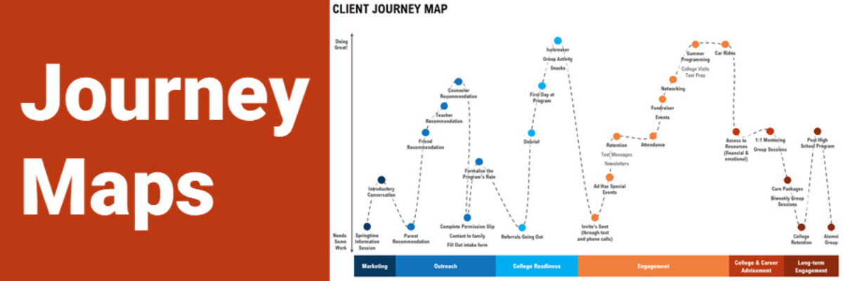
I partnered on a journey map project with a good friend and colleague of mine from a local non-profit agency that works to empower young women of color in middle and high school. We got a group of stakeholders from her organization’s leadership together for the journey mapping session. Together, they worked to build a shared understanding of their client’s journeys.
To start, each person in the room brainstormed touchpoints along the journey. Each touchpoint was written on a sticky note. As a group, we then organized the touchpoints along a continuum or journey, starting with things like initiatives they have to build awareness for their program and their formal intake process.
Touchpoint by touchpoint, they began rating each one based on their understanding of their client’s experience. Each touchpoint got a rating of 1-5, with 1 meaning that touchpoint needs a lot of work and 5 meaning they rock it. Imagine the 5-point scale is on the y-axis and the touchpoints arranged along the continuum according to their rating.

At the end of the session, we had a visual starting to show the peaks of successes and valleys of opportunities for improvement.

Now, to be true to the journey map process, you do not have to move the visual beyond this point. Your organization’s commitment to the process, budget, and time will all factor into how much effort you put into formalizing the collective journey. If you do choose to formalize the visual, all you need is PowerPoint and some time to insert boxes, lines, and text.

Before the journey map was visualized, staff had a hard time thinking through all the touchpoints their participants experienced from the program, let alone being able to rate them on how well the program was managing and executing the different components.
After looking at the visualized map, it became clear that touchpoints with the lower ratings actually happened more at the beginning of programming.
When looking further, they realized that some of the lower rating items were actually easy fixes. They could easily assign an intern to create a community referral packet that gives staff resources on how to refer participants to other community resources when they need it – things like mental health services, food banks, etc.
Going forward, staff plan to use this journey map to help in their strategic planning process. For example, if they want to focus on long-term engagement for participants, they can see that the touchpoints in that section were rated pretty low and they will need more program staff and resources dedicated to improving that part of their programming.
Overall, the process helped them identify how to use resources more effectively. They found that time-intensive and resource-dependent activities were being executed really well, but that they simply lacked some of the capacity to strengthen things they felt they weren’t doing so well.
This helped them identify gaps in staff time, professional development and training, and the need to make space for more roles.
Journey maps are so cool. I have even more ideas for graphing qualitative data, too. Download my Qualitative Chart Chooser.
