Ok, babes, prepare to be amazed. It used to be that making this viz was pretty tedious but I’ve recently refined a totally new hack (thanks to a lollipop chart example provided by Sevinc Rende, one of my mentees) that makes this soooooooo easier. It used to be Rockstar Level 9. Now it is Rockstar Level 5, if that.
We will create a dumbbell dot plot out of a stacked bar, where the first stack is composed of our first set of dot values and the second stack is composed of *the difference* between our first and second values (so that it would end at our second values on the x-axis scale). So let’s calculate the difference between the 2020 and 2010 scores.

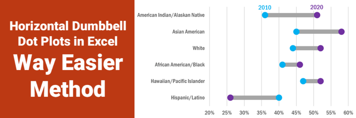
We would make a stacked bar of the 2010 data and the difference data, but you’ll see when you copy that formula down the rest of the spreadsheet, we run into a problem at row 7, where the 2020 score is lower than 2010. I purposefully added this twist just to show you what to do in these situations because otherwise this new method is so easy.
We’ll have to treat the data for row 7 as their own series. Highlight the 40%, 26%, and -14% and drag them to the right so they are in columns E to G. Label these columns and switch the difference calculation so that it is the 2010 data minus the 2020 data, to get a positive number.

Now, highlight the entire table, starting in A1, and insert a stacked bar chart.

Look up in your toolbar menu and click Switch Row/Column (Switch Plot if you are on a Mac) to get the racial groups going down the y-axis.
We won’t actually need the 2020 or the Rev 2010 data in this chart (we just needed those data points to calculate the difference) so click on those segments in your graph and hit the Delete key on your keyboard. You should end up here:

The segments most to the left (2010 and Rev 2020) will become No Fill. Right-click on one of the segments, select Format Data Series, head to the paint bucket icon and, under Fill, select No Fill.
With those segments still highlighted, look for your green Chart Design tab. On the left side of that toolbar, you’ll see Add Chart Element. Open that, hover on Error Bars, and select Percentage from that submenu.

You’ll have to add those error bars for each series, so once for the 2010 data and once for the Rev 2020 data point for Hispanic/Latino.
Then click on the gray Difference segments and add those error bars there, too. And then once more for the green Rev Diff segment at Hispanic/Latino. While there, change that bar segment from green to gray (same way you changed the others to No Fill – just pick gray!). Can you see the shape of your dumbbell dot taking place?
Let’s adjust those error bars so they are circles. Right click on one of the error bars to select all in that series. Select Format Error Bars. In the menu that opens, select No Cap and reduce the percentage to .5.

Then click in the paint bucket icon. In Begin Arrow Type, pick the circle shape. Pick a color. You can change the size of the circle by picking from Begin Arrow Size or by changing the line width. Repeat this process for all error bars in your chart, being mindful of the ones that switch places (Hispanic/Latino).
You could pretty much be done! For further formatting, you could decide to make the dumbbell stick a little thinner. Right-click on any one of them and select Format Data Series. Slide the Gap Width slider to the right to make those bars thinner.

Change the font, adjust the x-axis if you want, etc. I reversed by y-axis so that American Indian/Alaskan Native was at the top (right-click on that axis, select Format Axis, check Categories in reverse order. If that moves your x-axis to the top, look for the Horizontal Axis Crosses menu and select At Maximum Category.).
No matter what extra formatting you do, the legend is probably useless. Click on it and hit the Delete key. Add labels directly to the first set of dots using your favorite method – text boxes, data labels you hijack from elsewhere, whatever works.

The one drawback to this method is that it isn’t easy to put data labels directly in the circles – much easier to do that in the old version where we hacked a scatterplot. So keep your x-axis and gridlines here.
Are you totally impressed by how much easier this method is? I know, me too! Like Sevinc first showed me, you can modify this process for horizontal lollipops and dot plots, too. If you liked horizontal dumbbells before but avoided them because they were a pain in the neck to make, Welcome to Easy Town.
This method is so fresh it isn’t in any of my books. It is in my Data Visualization Academy and The Evergreen Data Certification Program.
