I’m guessing that 90% of the people who search on “Harvey Balls” and end up on this blog post are not here for the same reason I’m here. I’m here to talk to you about qualitative data. And this one can be a little NSFW.
Harvey Balls are an unfortunately named set of specific, graduated icons that help convey qualitative judgments. You may be familiar with a version of these if you are an avid reader of Consumer Reports. They use a set of icons – little, coded circles – to depict how a washing machine performed across several variables, like price, efficiency, noise, and quality.
We can adopt a set of Harvey Balls (oh boy) in our qualitative reporting to help our audiences get a quick visual assessment of where things stand.
They are most often used in a table format to show whether an item met certain criterion. These little visuals can give your audience a visual status update across a list of themes or other measures, without totally overloading their cognitive processing power.
Compared to something like a gauge chart, they take up much less room on the page. Personally, I find I often suffer from space constraints when visualizing qualitative data, so in some cases a more efficient data-ink ratio is useful.
If I just want to visualize maybe 1-3 themes or items, then maybe using something like a gauge chart that takes up more visual space works best.
When you have a longer list of items you need to display, you need a visual option like Harvey Balls that is more compact. Harvey Balls can easily be incorporated into tables to make your data come to life a bit.
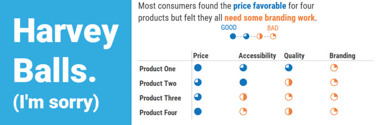
Let’s say you work for a market research agency and you were contracted by a company to do some research on new online business products. You conduct a series of phone interviews with potential customers and are presenting the results to your client. Here’s a great visual of the findings to use during your presentation:

I say this in almost every qualitative post, but the downside to visualizing our qualitative data in this manner is we lose the juicy, meaningful words that populate the Harvey Balls. Therefore, when you can, I suggest adding in some of the raw data to your visual:

Harvey Balls are an easily digestible way to show things like management response to recommendations (agree/partly agree/disagree), the degree to which policies were implemented (fully/somewhat/not a lot/not at all), or levels of quality (high/medium/low). Even meteorologists use them. Harvey Balls have so many applications.
If you’re wondering how to make these Harvey Balls, let us save you from a troublesome google search and tell you how super easy these are to make in Excel.
To get the Harvey Balls, click in the empty cell in your table and go to the Insert tab. Then find Symbol. Under the font, choose “Segoe UI Symbol”, and under subject find “Geometric Shapes.” There you’ll find the Harvey Ball options. You can simply hit the insert button here.

If you need more options than ¼, ½, ¾, and 1 then you could also make small multiple pie charts that insert and align them in the table. Or make up your own set of symbols, like the way Consumer Reports has, just be sure to tell people somewhere what your symbols mean.
You are probably dying to know why these icons have the name they do. Like many graphs with odd names (hello, Sankey) they were invented by a white dude. Named Harvey. So consider a phrase that has probably never crossed your mind: Try out some Harvey Balls.
Want even more ideas for visualizing qualitative data? Download my Qualitative Chart Chooser.
