Some might claim they look at a blank PowerPoint slide and see a source of hope and possibility, similar to how artists supposedly see inspiration in a blank canvas. I call bullshit on this. Artists did not just walk up to a blank canvas and envision their end product. They sketched.
Dali drew. Sketching was how historically famous artists studied their subjects to understand them at a deeper level and think through the mechanics of how they’d actually produce their artwork when it came to canvas time.
When Van Gogh started his artistic journey, his work was all very dark and dim, representing his subject matter of peasant life. Then he went to Paris one Spring and got inspired by color and figured he needed to incorporate this into his work. So he practiced. He made quick paintings that were experiments in complementary colors so he could hone his craft.

Of course now his studies and sketches are in museums and most of our won’t make it that far but we need to follow the same process because it works.
Historians recently uncovered what they believe to be Da Vinci’s practice sketch of the Mona Lisa.

Sketching doesn’t *just* help him figure out how her chin should be positioned, it’s also far less expensive. Paint and canvas are pricey. So artists sketch because it lets them quickly iterate – meaning try, fail, rethink, try again – in a less risky space so when it comes time to pick up the paintbrush or crack open your dashboard software, you have a plan that can be implemented efficiently.
Sketching saves you time & money. And keeps you from making costly errors.
This is a classic case of where the software’s shiny buttons messed everything up. What began as a rectangular stacked area graph was modified using the Mask tool in Illustrator, where a designer (probably unintentionally) added geographic associations with racial groups that are laughably untrue. My favorite is the suggestion that all Asians moved to Canada in 2010. This is a mistake caused in part by software that would have likely been sorted out before appearing on national television if it had been sketched first.

You get better insights when you first sketch because sketching facilitates reflection on the topic at hand. Sketching is where you work out the logical errors you didn’t know you had in your thinking. Because our software programs will let us do anything. But they aren’t human, so they can’t do the thinking that’s actually required to tell stories with data.
Research shows that sketching frees up our brain space so that we can think. Rather than trying to background process all the buttons and menus staring us down when we open software, the minimal distraction of pencil and paper helps our working memory processing so we can let our brains do their job.
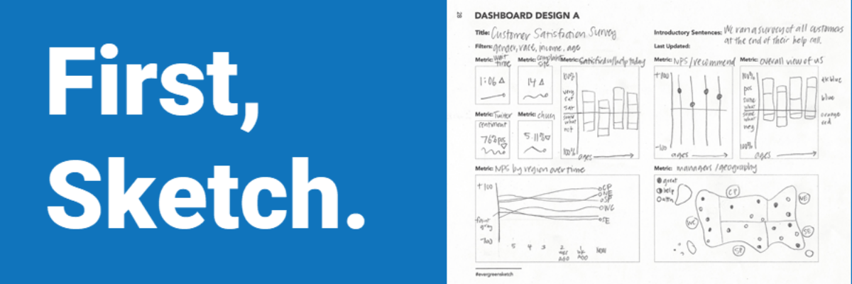
Let’s say you are charged with developing a dashboard to track key performance indicators related to a customer satisfaction survey. The most disappointing time sink of your life would occur by opening a dashboard software and trying to mess around to see what you get.
Because even if you are a master at your software, you’ll still spend weeks to months getting the draft dashboard made and then you’ll show the draft to your boss who will say, let me show this to the team and she’ll come back a week later asking for a zillion changes. Because people don’t know what they really want until they see something to react to. And you would have wasted weeks of your time.
Instead, sketch a mock up, using a predesigned template from my new book, in an afternoon. Multiple copies of three different dashboard templates are available in the sketchbook.

Use the graph paper – we also have dot grid paper – to sketch the visualizations so you are as accurate as possible, as realistic to the potential data as possible, when showing sketches to end users. We don’t want incorrect proportions to distract folks from judgments about whether the dashboard would be useful.
This is how you save yourself so much time and money. This is where sketching helps us be more data-driven because it keeps our end users – our audience – at the forefront of our development process.

The Data Visualization Sketchbook contains templates for a complete project reporting package. I’ve included a project profile page to help you document decisions related to fonts, colors, graphic elements, and what deliverables are due when. The sketchbook includes square and dot grid paper. Which is also an excuse to get out of the office for a bit.
We have three different handout helpers, depending on how many points you need to make. Like infographics but with more class.
And three different dashboard designs, dependent on how many metrics you need to report.
You’ll find a slide guide for your PowerPoints and a report structure to focus the look and feel of your longer written documents.
Plus, plenty of blank pages for you to sketch out your own thoughts if these inspire you to go in a different direction.
Give yourself the gift of generous, analog, thinking space. First, sketch so that your final product development process is fast, efficient, and accurate. Grab The Data Visualization Sketchbook on Amazon or directly from my publishers, SAGE.

