Here’s what happens to audience brains when presenters speak while showing text-heavy slides. Their working memory gets overloaded. Working memory is that part of the cognition system where we contemplate information, wrangle with it, try to digest it. But working memory has limits on its cognitive load. It can only…
Presentations
Successful Webinar Presenting
I host or give roughly 70 webinars a year, most over with AEA and others right here at Evergreen Data. Here’s what I have seen that makes for a good webinar presentation experience (as opposed to presenting the same content in person). Use a faster pace.
Top Four Mistakes Seen in Conference Presentations
With my book manuscript and an edited volume of New Directions in Evaluation (on dataviz) due this Friday, this week’s blog post is a repost from an original article I wrote for Presentation Magazine. My background is a garbled mouthful: interdisciplinary program evaluation. What does that even mean? It…
Presenting Graphs with the Slow Reveal
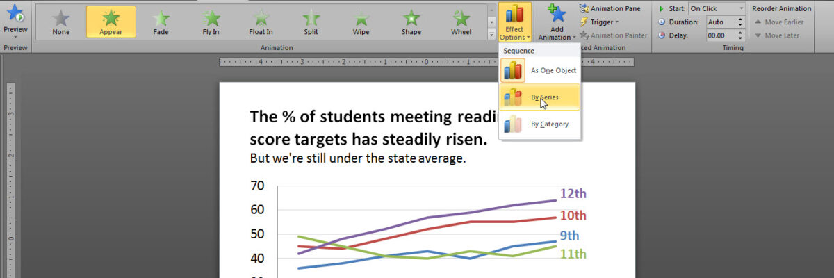
Over here I talked about how important it is that we gradually introduce components of complex graphics – one-at-a-time – so as not to overwhelm the visual field and working memory of our audience members. We don’t want to slam our content in their faces all at…
Slide Redesign: Rodney Hopson’s Keynote
I had the joy of working with Rodney Hopson, 2012 President of the American Evaluation Association, on the slides for his keynote talk. The transformation was so huge that I asked Rodney if I could write a blog post about it and the thinking we put into the new design.
Before & After Slides: Stay on the Side of Simplicity
My friend, Kurt Wilson, and I just wrapped up a contract to revise a set of slides – and the graphs within – for a big international client I can’t name. Here I’ll walk through one of the original slides and our revision of it. Keep in mind that these…
How I Feel About Slide Animations
Most people fall into one of two camps on this issue: There are the newbies, who use animation with abandon to kartwheel text onto a slide. And then there are the veterans, who are so sick of kartwheeling they’ve rejected any slide animation on any computer anywhere in the…
A Review of Presentation Platforms
PowerPoint tends to get a bad rap. You know, that whole “death by PowerPoint” thing. It probably isn’t what the marketing people at Microsoft are most fond of. But weak PowerPoints have much more to do with the user than with the platform. But what about alternatives – total breaks –…
Bonus Post: Picture “Evaluation in Complex Ecologies”
This year, the American Evaluation Association is loaded with a ton of great stuff. I’ll be speaking on the Potent Presentations Initiative and what makes great messaging, design, and delivery. I’m also really excited to see the closing session on Saturday, because AEA President Rodney Hopson is pulling together…
Bleeding your Presentation
It’s time to talk about bleeding. Bleeding is a technique used by graphic designers in which the image extends all the way to (or even beyond) the edges of a page or slide. In the slide below, the image is not bleeding. The picture of the tractor is…


