Well, here we are. In the Fall. At a time when, back in Spring, we might have thought we’d be gathering in person again. Now that awesome presentation you planned to give has gone virtual and you’re on Zoom instead of standing in real life in front of a crowd…
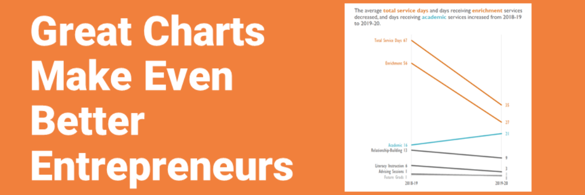
Great Charts Make Even Better Entrepreneurs
Meet Tamara Hamai. She’s the hardest working entrepreneur I know. Her primary business, Hamai Consulting, partners with non-profits in the family and education space to get them useful data. If you get to partner with her, you are lucky. She’s got a knack for running complex studies and explaining…
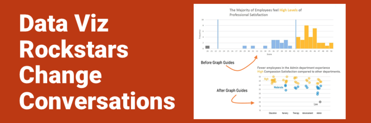
Data Viz Rockstars Change Conversations
Audrey Juhasz has been in The Evergreen Data Certification Program for about 4 months. In that time, she has learned some super do-able and highly effective lessons that have totally changed the way she and her team are able to talk to each other. This data viz rockstar is changing…
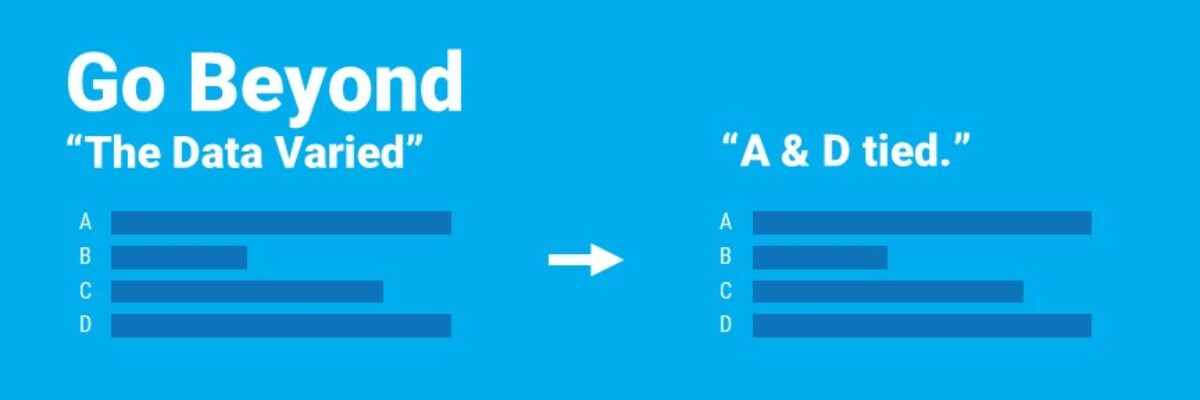
Go Beyond “The Data Varied”
The quickest way to tell a story with your data is to use the title space to literally tell the story. Identify the insights you see in the data and write them out as a full sentence, framing the take-away ideas, sharing with your viewers what you know. This step,…
10 Years of Blogging
Friends, I’ve been writing this blog for 10. Whole. Years. Actually, it is 10 years and 2 months. The exact date flew right by as I was busy pandemicking. This has been a long road. The very first post I ever wrote, published May 3 in the before times of…
So What?
In the introduction to our dataviz workshop at a Fortune 50, the Chief Operating Officer told the room of his employees that he was looking forward to seeing their work improve as a result of what they learned with us. Because, he said, what they wanted to see on the…
The Problem with “By the Numbers” Infographics
My heart breaks every time I see an infographic called By the Numbers. It’s as if someone in leadership said “Let’s report ‘our numbers’ this year – and put it in one of those infographics.” Someone in Communications got on board because they believe infographics grab attention. And some poor…
Shaky Data Viz Advice
The biggest a-ha moment that came from my dissertation was discovering what shaky ground we stand on in data visualization. When my friends heard I was going to study data visualization, they filled my desk with books from Edward Tufte, Stephen Few, and even Garr Reynolds. I was thirsty for…
How to Not Host a “Manel”
After a dust up on Twitter that I’ll explain below, I got so many white dudes in my DMs who wanted me to personally educate them on how to host a more inclusive set of keynotes and panelists at their conference. So I’m writing this post, without compensation, this one…
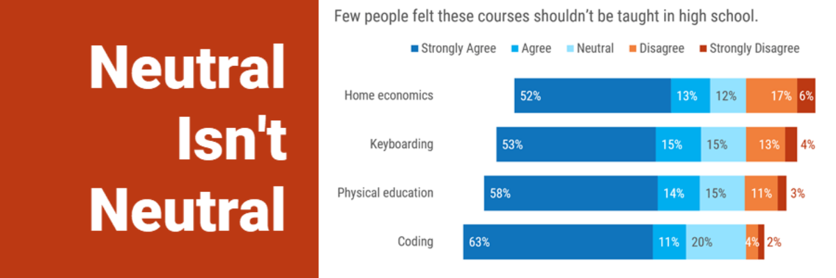
Neutral Isn’t Neutral
When you are asking your survey respondents to report their feelings or sentiments, it can make sense to provide a neutral response option. Sometimes. Other times I think we provide that option just because we think we should, because of convention. Dr. Sheila B. Robinson discusses when a neutral…

