Delightful, strategy-shifting, and totally free ideas for your next data viz

Visualizing Tiny Trends Over Time

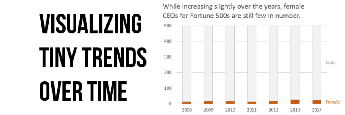
I say: Trend over time? You say: Line graph! I know, that’s how it goes, right? We are so used to seeing trends over time visualized as line graphs that even my 3rd grader can interpret them with ease. But sometimes it helps to have other options that better fit your…

Read More

The Most Important Question in Data Visualization

What’s your point? Seriously, that’s the most important question to ask when creating a data visualization. And its the first thing I ask a client who sends me data for redesign. What’s your point? The answers drive nearly everything about visualizing that data. Here’s how that conversation often goes: Client:…

Read More

Guest Post: Sid Ali on Visual – Yet Formal – Reports

Stephanie’s Note: So so often I get emails from readers asking for examples of how full reports can incorporate more graphic design while still maintaining credibility and seriousness, especially for more conservative audiences. Sid’s report is a nice example of how well-considered images can boost engagement and appeal. Nice work,…

Read More

Visualize Branching Questions with Nested Area Graphs

This, my friends, is a nested area graph. I got this idea from the smart people at Innovation Network. And it is super amazing at visualizing the sequence of survey questions that branch. The kind where it says “if you said Yes, proceed to question 32” and stuff…

Read More

Stop Asking if the Slides are Available

The thing is, if the presenter has done a great job, you really don’t want the slides. No really, you don’t. A long long time ago, Garr Reynolds taught me that if someone can look at your slideshow and tell all the things you are going to say, there’s no…

Read More

Guest Post: Chari Smith with a 1 Page Research Summary

Stephanie’s Note: Readers are always asking me for more examples of a 1 page research or executive summary and Chari Smith of CRSmith Consulting has a really nice one here that is visual and yet doesn’t involve a single graph! I have a long history of working with the…

Read More

Data-Driven Decisions in a Fortune 500

More and more, organizations are on board with the idea of becoming “data-driven.” Collecting data on key indicators is a big step ahead from where many organizations used to be. But being able to interpret that data and share it with others in an intelligent way is equally as important…

Read More

How a Dashboard Changes the Conversation

Presenting data effectively changes the kinds of conversations that can happen inside organizations. Better presentations shape an improved culture of decision-making. Let me tell you about a recent example of this. Late 2012 I got a call from an evaluation officer who was working at the Walton Family…

Read More

My 2014 Personal Annual Report

Holy smokes it’s been a big year! I finished up my last workshop of 2014 last week and as I got into the cab to head to the airport, a wave of major sleepiness hit me hard. I’ve been super crazy productive and worked with some of the most amazing…

Read More