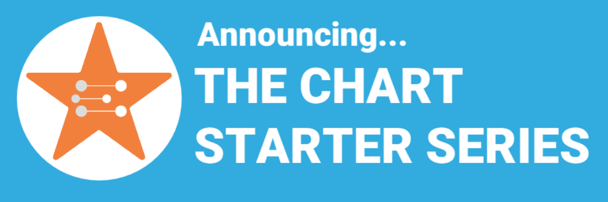
The Lines section of the Data Visualization Checklist helps us enhance reader interpretability by handling a lot of the junk, or what Edward Tufte called the “noise” in the graph. I’m referring to all of the parts of the graph that don’t actually display data or assist reader cognition. Create more readability by deleting unnecessary lines. The default…
Intentionally Order Your Data
Listen, no one cares about the order we listed the response options on the survey. But most graphs, especially those automatically generated from survey software, showcase the data in that order. And that isn’t useful for anyone trying to interpret the data. Instead, place the bars in order from…
2019 Call for Mentees
Did you see Vice? There’s a scene (this is no spoiler) in which a young Dick Cheney and Antonin Scalia share a sickening laugh as they agree to an interpretation of the Constitution that allowed a massive power grab for a president. It’s gross. It’s cringe-y. The most disturbing…
I Failed
This is not news. Today. Yesterday. Every day. I fail all the time. Last week I was playing games that pay real money and failed to get anything out of them. This week, I have so many data visualization fails that I’m already planning a conference talk called The…
My 2018 Personal Annual Report
This is my last personal annual report. I’ll tell you why. This year most of my metrics went down. At first, due to cultural conditioning that says “more is always better,” I was like Oh no! Before I go further, let’s pause and break that down. I’ve been creating…
Building a Culture of Effective Data Visualization
The most frustrating part of attending one of my workshops is that you learn so many awesome ways of communicating data, you learn exactly what buttons to push to make it happen, you get hyped up on glee and data vizardry… and then the existing organizational culture stops you from…
We Need More Research on Data Visualization
Stephanie’s Note: Dr. Sena Sanjines just wrapped up her dissertation, part of which measured whether my Data Visualization Checklist is worth its salt. Here are her findings. My name is Sena Sanjines and I’m an evaluator in Hawai‘i slightly obsessed with figuring out what makes people use, or not use,…
Journey Maps
Journey maps are some of the most bad-ass visuals I know about. With origins in customer experience and human-centered design, a journey map shows how a client moves through your organization. Seeing the actual journey a customer takes can be eye-opening for people on staff who only work on one…
508 Compliance Tools
If you aren’t worried about being 508 compliant, you should be. A part of the Americans with Disabilities act, being 508 compliant means that the stuff you post on your website should be accessible to anyone with a disability. Back when this was first announced, in 1998, it only applied…
For the Love of Font Size
Did you know that you regularly read type set in size 8, or even smaller? In printed materials, captions and less important information (think: photograph credits, newsletter headline subtext, magazine staff listings) are usually reduced to something between 7.5 to 9 points. We generally read that size type without much…