Back in November of **2010** I set up a Google Alert for “infographic.” Oh, I thought, these are an interesting development in how we communicate data. But either the quality of the design will drastically improve or these things will be a fad that disappears within a couple years.
Nine years later and it is clear that both of my predictions were wrong. My Google Alert for “infographic” contains hundreds of hits every single day and the designs are seriously bumming me out.
Let’s take a spin through a random selection of the infographics that landed in my inbox. I don’t mean to shame individual designers here, so I’m purposely not linking back to the original post nor including authorship.
This first one was so long, I had to max my zoom out and this is still only a portion of it. Just be a website.

And note how it is heavy on the graphics but light on the info. That’s become a mainstay of the bad infographic. Here’s another example of this trend:
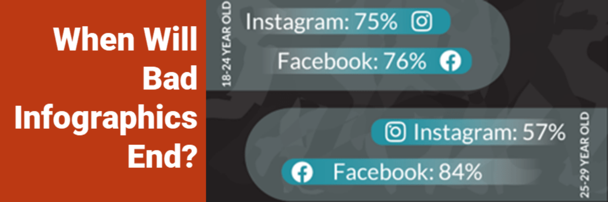
It feels “over-graphicked,” you know? And the graphics aren’t even good! Look at that 3D pie chart. Come on.
Weak data visualization is one of the biggest faults that undercuts an infographic’s viability. This one uses hard-to-notice donut charts and bar charts with a disappearing baseline (if you can even spot them).

One might be tempted to blame weak data visualization on graphic designers, who tend to avoid a deep understanding of the topic. A graphic designer with a strong data visualization game is as rare as a unicorn. But this infographic also violates *basic* graphic design rules like color contrast.
An increasing number of the infographics in my daily digest from Google are just a single graph, like this one:

And, again, the design needs some love. The legend is in sentences at the bottom of the figure, for cryin out loud. But is this even an infographic? Or are we calling single graphs infographics now to get on board the trend train?
Why Weak Infographics Are Still Happening
This is actually a sign of success. The proliferation of infographics means that the world is waking up to the need to effectively communicate data. Can I get an amen? We are democratizing data and this is a good thing.
And that means that a lot more people are tasked with making infographics who do not have backgrounds in graphic design OR data visualization (when what they need is both). These are folks who have jobs like data analyst or marketing associate.
With the democratization of data we also need a correlating democratization of data design. A lot of people need models, step-by-step guidance, tools, and – most importantly – the strategic thinking that helps one know how to tell a story with data.
Thankfully, we are seeing more and more classes emerge that teach folks how to DIY good infographics, but their rise has not kept pace with the need. The Data Visualization Academy is a good place to start.
What Makes a Good Infographic
- A balance of narrative and graphics. You can’t convey information without some words. And you can’t qualify as an infographic without some graphics.
- Adherence to graphic design best practices. That means attending to stuff like page layout, reading flow, color contrast, and font size.
- Adherence to data visualization best practices. Don’t over-rely on showing data as a percentage in a large font. Learn graph options. Don’t distort the data or make it hard to read the graph.
- Coherence. Meaning, the infographic should provide some insight in a story-ish fashion. All the parts should hang together into a whole that teaches the audience something.
This is what I’ve got so far. What else would you add to this list?
We do not often make infographics (we prefer to make handouts) but if you want to contrast the ones in this post to others that are more effective, check out our examples here and here.
